
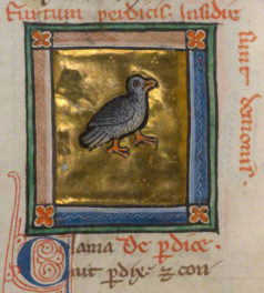
Left: Noah, from the Ancestors of Christ Windows, Canterbury Cathedral, England, 1178-1180. Colored glass and vitreous paint; lead came. Image © Robert Greshoff Photography, courtesy Dean and Chapter of Canterbury. Right: Initial K, Litany: The Trinity with Monk and Nuns (detail), from St. Albans Psalter, about 1130. Tempera and gold on parchment. Dombibliothek Hildesheim
Throughout 2013, the Getty community participated in a rotation-curation experiment using the Getty Iris, Twitter, and Facebook. Each week a new staff member took the helm of our social media to chat with you directly and share a passion for a specific topic—from museum education to Renaissance art to web development. Getty Voices concluded in February 2014.—Ed.
On the surface, Canterbury and St. Albans: Treasures from Church and Cloister seems like a simple exhibition to design. There are just two artworks in the show, stained glass from Canterbury Cathedral and a single book, the St. Albans Psalter. The reality is that this was one of the most complex exhibitions I’ve ever handled as an exhibition designer.
Canterbury and St. Albans is the result of a rare coincidence. One 12th-century stained glass window nearly fifteen feet tall, two partial windows, and two centerpieces had been removed from Canterbury Cathedral and would be loaned to the Getty. The St. Albans Psalter, on loan from the Cathedral Library in Hildesheim, Germany, had been disbound for conservation, which presented the opportunity to show nearly seventy of its pages simultaneously.
For me, what was most intriguing about this pairing was that the monumental paintings of the stained glass and the intimate illuminations of the psalter share the same drawing styles and gestures. The overarching goal of the exhibition would be to allow visitors to look at the pages of the book and the stained glass at the same time and notice these remarkable similarities.
Early on we decided that the stained glass would occupy one entire wall of the Getty Center’s Special Exhibitions Pavilion, while each bifolium from the manuscript (two non-sequential pages) would be framed. Hanging the pages on the wall was not an option, as it would cause the bifolia to lose their sense of being a book, and would prevent the visitor from looking at the pages and the stained glass at the same time since the objects would be on different walls. We decided instead to design “lecterns” for groupings of two and three bifolia, and place these directly in front of the stained glass. In this way the visitor can look down at a page, then up at the glass, and make the comparisons that—until this exhibition—have never been possible.

Digital rendering of the installation.
21st-Century Lecterns
When we began designing the lecterns, we realized it was all about angles. I started by creating a 3D model to work out the basic design elements, such as the width of a lectern with one, two, or three framed bifolia. The legs needed to be thick enough to completely cover the floor outlets in the gallery, so I designed two or three slat-like legs that provide stability and allow electrical cabling for the light fixtures.
For the lighting that would (gently) illuminate the manuscript pages, we used LED strips in a custom-made fixture that runs the length of each lectern. We prototyped this fixture in the Sicily exhibition at the Getty Villa, though it was attached to the wall in that installation.
The angle between the framed bifolia and the light fixture was critical. We wanted visitors to be able to stand at the lectern and look down at the art in a way that was similar to reading a book. But we were also thoughtful of our visitors in wheelchairs, and so kept the artwork low enough and at an angle that would allow a seated person to see well. We keep a wheelchair in our studio to test these types of design relationships. To test the angles, we built a Foamcore prototype with a working light.
Once I figured out the relationship between the visitor and the art, I needed to figure out the relationship of the art and the light. The working light allowed me to move the fixture back and forth until I got the appropriate light “spill” on the artwork. Finally we took the prototype up into the gallery and tested it with an actual framed bifolium—and, it worked!
A Wall of Stained Glass
The stained glass wall presented an entirely different set of design challenges—and a couple of last-minute adaptations. The wall that would hold the glass would need to be approximately 40 feet wide by 20 feet tall, but I wanted to keep it as shallow as possible so that it would recede into the gallery wall and feel more architectural. It ended up being only six inches deep.
The stained glass wall was built from six pylons, each 20 feet tall, attached to the gallery wall behind it. Five large painted frames, to hold the stained glass armatures, were then attached to these pylons. And finally, a 15-piece facade was pieced together to cover all of the construction.
Construction at that scale is difficult enough, but the particularly tricky part was that the armatures were being fabricated in Canterbury and wouldn’t be shipped until a month before the opening. In the meantime, our colleagues in England sent mylar tracings that we turned into CAD drawings, making sure to be as accurate as possible since the armatures were all slightly different.

The installation complete! Foreground: St. Albans Psalter, about 1130, Alexis Master. Tempera and gold on parchment. Dombibliothek Hildesheim. Background: Panels from the Ancestors of Christ Windows, Canterbury Cathedral, England, 1178–80. Colored glass and vitreous paint; lead came. Courtesy Dean and Chapter of Canterbury
An additional wrinkle was presented by the fact that two of the three top sections of window would not be coming on loan. We decided to install a sepia graphic to represent the missing pieces, and contracted a photographer in Canterbury to shoot these portions of the windows. Due to their placement in the upper clerestory of the Cathedral, however, it was impossible to get accurate dimensions. In the end we designed the entire wall based on tracings and our best guess for the size of the graphics. Luckily, we were accurate.
The lighting of the stained glass also required creativity. We’d prototyped LED strips for the smaller stained glass windows in the exhibition Florence at the Dawn of the Renaissance and, while they worked well, we weren’t sure how they would perform with the much greater expanse of glass in the Canterbury windows. To investigate, we had a printed transparency of the stained glass made, and used it for a full-size lighting mockup. Through this test we determined that a single strip running the length of the two inner mullions of the armatures would be sufficient to create a beautiful glow.
We planned to simply tape the light strip to the back of the armature and point the light toward the back wall, which would be painted white to reflect the light. In this way we could keep the individual points of light from being seen through the glass.
Not surprisingly, here too there was an important unknown: we weren’t exactly sure how thick or dense the medieval glass was. As it turned out, the glass was more opaque than we anticipated. During the installation, we added light strips to the sides as well as horizontal mullions. This proved sufficient to make the glass “sing,” as one of the Canterbury conservators put it.
In the end, the entire exhibition team was able to pull together the monumental and the miniature to create a truly unique experience. I hope that visitors to the exhibition will not only wonder at the beauty of the stained glass seen for the first time up close, but will be able to compare the magnificent and intricate paintings in the St. Albans Psalter with the remarkable painting of the stained glass.


Do you make video format available for those of us unable to travel yet eager to feast our eyes, as well?
Thank You.
Constance