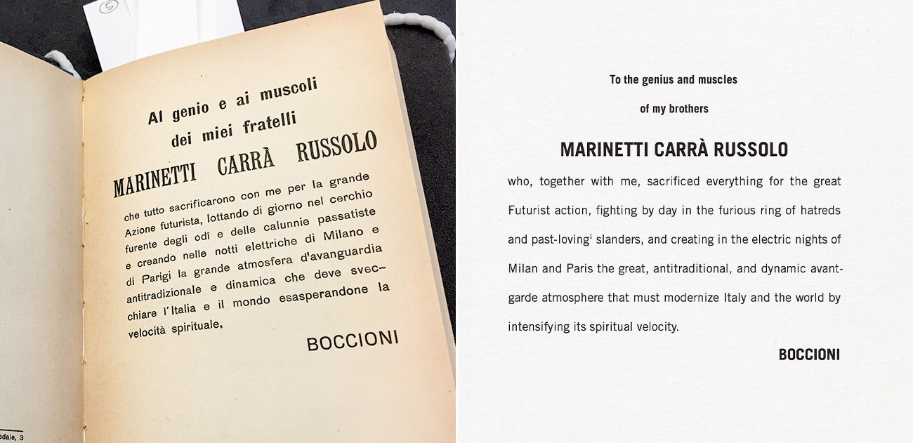

Cover of Umberto Boccioni Futurist Painting Sculpture (Plastic Dynamism) published by the Getty Research Institute
The rules of capitalization have been abandoned. Punctuation marks decorate sentences rather than continue or end them. Body text appears bigger and bolder than the headings. Normally editors weed out these types of errors.
But we let the irreverent use of language and typography flourish in the Getty’s book Futurist Painting Sculpture (Plastic Dynamism), an English translation of a collection of manifestos originally published in 1914 by the Italian Futurist artist Umberto Boccioni.
Boccioni’s combinations of letters and characters break the rules of grammar and punctuation. Why did we let such editorial mischief run amok?
Belligerent Artists
Italian Futurists wrote forcefully, and their writings and performances sometimes turned belligerent. They staged live serate, or night performances, in public piazzas. Boccioni drew a caricature of one such performance.

A Futurist Serata, 1911, Umberto Boccioni. Ink on paper. Caricature of the Futurist serata at the Politeama Garibaldi in Treviso, 2 June 1911. Published in Uno, due, tre (Milan), 17 June 1911
An orchestra facing center stage plays at a deafening volume while the Futurist Francesco Balilla Pratella conducts. Their mustachioed leader Filippo Tommaso Marinetti stands in the center; behind him, the Futurist painter Carlo Carrà directs an onslaught of participants toward the artists’ paintings.
While comical, these depictions of Futurist performances and activities hold some truth. Reports of riots forming while Futurists recited excerpts from their published manifestos are not hearsay. And the Futurists also kept the spirit of their performances alive by repurposing manifestos they had read and previously published, making sure they were featured in newspapers days after the performances.
Editorial Judgments
The Futurists inserted textual representations of emotions, sounds, sights, and concepts in their manifestos. For the Getty’s edition of Futurist Painting Sculpture—which would not be a facsimile of the original—we had to decide how to maintain the Futurists’ graphic representations of prose.
At the beginning of the editorial process, copyeditor Tobi Kaplan and I leafed page by page through a photocopy of Boccioni’s 1914 book and marked each place where typographic emphases, such as words in bold and italics, occurred. Then, as we reviewed and edited the manuscript (in the good old Microsoft Word), we retained these typographic emphases and communicated them to the book’s designer.

Detail of page 74 of Umberto Boccioni’s Futurist Painting Sculpture (Plastic Dynamism), 2016, showing three asterisks used to separate paragraphs
For example, instead of using a short horizontal rule to indicate a break in the text, we preserved the Futurists’ use of three asterisks. We often had to make judgment calls, assessing whether the presence—or absence—of an element was consistent in the original.
You may have noticed that the title of the book, Futurist Painting Sculpture, seems to be missing one or two elements—a pair of commas, or perhaps the word and. We decided to leave the title as it appears in the original 1914 edition. However, in the introduction to the Getty’s translated edition, scholar Maria Elena Versari traces what happened to the commas in the title of an early version of the original volume. To find out why the Futurists ultimately omitted punctuation from the title, you’ll have to read the book!


Umberto Boccioni showed that art could be abstract and not irrelevant.