
Front cover of Artists and Their Books / Books and Their Artists.
What is a book? Does it need to have paper pages? Does it have to be read from the first page to the last? How big is too big?
These are questions that artists’ books prompt us to ask. Artists’ books, as the term implies, are books made by artists, and they rarely look like something you would find at a bookstore. They can expand and challenge how we think about the book form.
They are also the subject of a new book from Getty Publications, Artists and Their Books / Books and Their Artists. Originally conceived as a stand-alone publication, the volume ended up inspiring an exhibition of the same title (at the Getty Center June 26–October 28, 2018)—an unusual order of events in the museum world. Then again, many aspects of this book are unusual, from the use of all original photography to the remarkably complex page layouts.
In five installments that will be released starting today through July 31, we’ll be exploring the process of making the book Artists and Their Books / Books and Their Artists from idea to design, and from printing through marketing. The post starts with the inspiration for the project: the impressive collection of artists’ books held by the Getty Research Institute (GRI), and a senior publications editor who saw a great opportunity.
In the series:
- How an Idea Became a Book (that Inspired an Exhibition) (June 26)
- Designing the Book: A Work of Art in Itself (July 3)
- Making the Book: From the Big Picture to the Small Details (July 10)
- Securing Rights of Reproduction: Invisible, but Crucial, Work (July 17)
- Selling the Book: Creating the Pitch (July 24)
How an Idea Became a Book (that Inspired an Exhibition)
When Elizabeth Nicholson joined Getty Publications as a senior editor in 2011, she was excited to learn that the Research Institute housed over 6,000 artists’ books. Years before, she had edited a catalogue on artists’ books and fallen in love with the medium. “Having spent my career weaving language and images into enticing museum books, I am fascinated by an art form that takes this same activity beyond its usual boundaries,” she says.

Elizabeth Nicholson, senior editor, in her book-filled office.
But beyond personal interest, what Elizabeth saw in the Research Institute’s collection was an opportunity to fill a gap in scholarship and publishing. Artists’ books have not often been published in museum catalogues because their complexity makes them difficult to photograph in ways that convey the experience of “reading” and engaging with them.
For instance, Barbara Fahrner’s The Philosopher’s Stone is more puzzle than book; this irregular, polygonal book is held together by pins, and if you are not careful when unfolding it you might not be able to piece it back together! Capturing this complicated experience of folding and unfolding in a two-dimensional format like a book is challenging, to say the least. Art historians frequently neglect artists’ books as well, even though they have been a part of nearly every major art movement since World War II.

The Philosopher’s Stone, 1992, Barbara Fahrner and Daniel Kelm. Approximately 6 × 8 × 6 in. The Getty Research Institute, 94-B18918. © 1991 Barbara Fahrner and Daniel E. Kelm
Soon after starting at the Getty in 2011, Elizabeth approached Marcia Reed, chief curator and associate director of the Research Institute, with the idea for a book about the Institute’s artists’ books collection and found a champion for the project.
Marcia was at the Research Institute in 1985 when it acquired the archive of librarian and art collector Jean Brown, which contained over 4,000 artists’ books and formed the backbone of the artists’ books collection. At the time, she was unfamiliar with the medium despite being a rare book and print curator, and having a background in the history of book illustration. But when she saw Jean Brown’s collection she “was very excited to think about how artists’ books simultaneously and interactively expanded the possibilities of both activities of reading and viewing.”
Over the years Marcia had studied and expanded the collection, and so was eager to write about it. She enlisted fellow curator Glenn Phillips in the project, and they sought the input of other curators and researchers at the Research Institute to choose a diverse selection of artists’ books to include.
Their goal was not to assemble the definitive tome on artists’ books, but to showcase a wide array of artists working with the medium in different ways. Over 90 artists were selected, including many West Coast artists, reflecting the particular strengths of the Research Institute’s collection.

Although much of an editor’s job involves digital files, certain steps require reviewing hard copies. This stack contains just a portion of the page proofs needed for this project.
The Getty Publications editorial committee approved the book as an “elective publication,” meaning it was not tied to any particular event and so had no firm publication date. Like Elizabeth, the Committee was excited to publicize the Getty’s holdings in this field. The authors and editor worked on it intermittently over several years as their busy schedules allowed. Designer Catherine Lorenz and photographer John Kiffe also began to squeeze some art direction and photo shoots into their rare spare work hours.
When Marcia noticed some space in the Research Institute’s exhibition calendar, she proposed a new exhibition based in part on the book, and suddenly the project moved from slow and flexible to already behind schedule! The publication kicked into high gear this past fall (2017) to make sure the books would be printed in time for the exhibition opening this June.
By early March, more than 100 works were photographed, two essays and 87 catalogue entries were written and edited, 212 pages were designed and proofed, every spread was separated and color corrected, and rights and permissions were cleared for each object. The Acknowledgments page of the publication bears witness to the many indispensable hands and eyes who made this book possible.
Elizabeth’s role in this project has been project editor, which she describes as “the center of a large wheel, keeping everyone connected and the project moving forward.” In other words, her job has been to keep the overall vision of the book in mind while making sure no tiny detail was overlooked. She has kept the wheel rolling by shepherding the proposal and budgeting process, collaborating with design and production, supervising copyediting and proofreading, and acting as a liaison with permissions, marketing, and publicity.

Book 91, 1982, Keith A. Smith. 97/8 × 141/8 in. Barrytown, NY: Space Heater Multiples. Getty Research Institute, 94-B1617 © Keith Smith, Courtesy Bruce Silverstein Gallery, New York
It’s also been an opportunity for her to revisit a topic that inspired her years ago while being introduced to new artists and works, and learning from leading experts in the field. “The most fun part was spending time in the Special Collections reading room with Marcia and Glenn, turning each page of Keith A. Smith’s Book 91 and seeing the embedded strings make new configurations, or watching as a picture of a sunflower morphed into a night sky as we paged through a book by Anselm Kiefer,” she says.
Being able to share such interesting artworks with new audiences was Nicholson’s main goal. “Artists and Their Books is an invitation to explore this unusual medium and collection, and it is designed to present solid scholarship in a way that is welcoming to all kinds of readers.”
Part of what makes this particular book so accessible and welcoming is its gorgeous layouts and the hundreds of images. Creating an enticing design for this book was no easy feat, however. The critical role of design is the focus of our next post, which will follow senior graphic designer Catherine Lorenz through her work.
Designing the Book: A Work of Art in Itself
Senior graphic designer Catherine describes the process of designing a book as taking all of the elements—images, text, structure—and making visual sense out of them for the reader. She’s been doing this for 13 years at the Getty, where she has been able to design books on everything from photographer Robert Mapplethorpe’s archive to design in Los Angeles, from ink drawings by the seventeenth-century draftsman Guercino…to, now, artists’ books!

Senior graphic designer Catherine Lorenz.
At its core, publication design means conceptualizing what a reader’s experience of a print book will be, and then ensuring that each detail of the book contributes to that concept. Catherine was assigned to work on Artists and Their Books / Books and Their Artists when it was still in its very early stages and there was no set release date. This meant that she could experiment with her design concept more than is possible on a typical book project.
Catherine came up with a complex and challenging idea for Artists and Their Books. She wanted the featured artists’ books to “float” on the page, unconstrained by the frame of a photograph. She wanted “it to feel like you could pick the object up off of the page.”
Artists’ books often play with inverting expectations of books. Drawing on this idea, she decided to place the catalogue entry texts, which usually float on the page, into boxes. In short, she wanted her book on artists’ books to be a work of art in itself.

An early draft of the catalogue entry for Dennis Adams’s Recovered—10 on 10, Adams on Garanger, 1993, Marc Garanger. 25½ × 25½ in. Brussels: Maîtres de forme contemporains. The Getty Research Institute, 2802-005. © Dennis Adams
Catherine usually receives images from the author before she begins designing a book, but in this case she also had the opportunity to shape the look of the photographs. Many of the objects slated for inclusion in Artists and Their Books had not been photographed before, and Catherine worked with Getty photographer John Kiffe to photograph each one. Walking into the Research Institute photography studio was like “burrowing through a tunnel of artists’ books,” says Catherine; the many objects waiting to be photographed for the catalogue created tall stacks lining the passageway to the studio.
Wanting to capture the experience of flipping through them in person, Catherine and John carefully considered how to light and position these artists’ books that are tactile and often subtle. For instance, Sol LeWitt’s Book of Folds consists solely of previously folded, now-creased pieces of off-white paper. The photographs that appear in Artists and Their Books make careful use of light and shadow to demonstrate the texture of the pages and shape of these folds.
Because Catherine would also be creating collages of images for each object in the catalogue—some showing the book closed and then opened, others showing several images of a book’s interior—the photographers also faced the challenge of keeping the angle of the lighting consistent while taking many different photographs of each one.

The final version of the catalogue entry for Dennis Adams’s Recovered—10 on 10, Adams on Garanger, 1993. Catherine swapped photographs in and out, moved text boxes, and pared down this arrangement in consultation with the curators and editor.
As Artists and Their Books went from a stand-alone book to one that accompanies an exhibition, new deadlines were set, and Catherine began intently designing the spreads—the layout of two facing pages when they are spread open—even as the images and texts were still coming in.
Catherine worked to edit, compose, and recombine hundreds of images into beautiful and tantalizing pages. Each spread features one artist’s book and anywhere from one to 13 different photographs of the object, which Catherine layered through collage. She tweaked shadows, arranged shots of the books taken from different angles, and created a sense of what it might be like to interact with the book.

This image of LA Liber Amicorum (2012), a book of drawings by L.A.–based graffiti artists, is an example of how each book was photographed. LA Liber Amicorum, 2012. 12½ × 19¼ in. The Getty Research Institute, 2013.M.8. Gift of Ed and Brandy Sweeney. Works shown by Prime; Blosm and Petal: © Bretado and Zar Bejuane; Elika; and Axis: © Axis 2012
With the contents of the book shifting, some of the layouts Catherine designed were ultimately cut, while changes were made to others up until the final deadline to send files to be printed. Catherine also estimates that less than half of the photographs taken ended up in the final book, a testament to the number of images John and his team took to ensure the designer and curators had great raw materials to work with.
The volume of materials and inventiveness of the design set this book project apart from other projects Catherine has worked on for Getty Publications. While those issues made for a challenging process and a lot of hard work, it also allowed for a more rewarding result in the final publication.

A layout Catherine created after editing and arranging different photographs.
Hearing Catherine and the rest of the book team, including senior editor Elizabeth Nicholson and senior production coordinator Suzanne Watson, speak about the project, it is clear that what pushed it forward was their dedication, shared vision, and collaborative teamwork.
In particular, Catherine stresses that her designs would not have their impact without the important work of Suzanne, who managed the many steps required to manufacture a printed book—the focus of the next addition to this blog post.
Making the Book: From the Big Picture to the Small Details
Senior production coordinator Suzanne Watson is modest about her role in producing the publication Artists and Their Books, but designer Catherine Lorenz puts it succinctly: “Suzanne takes my ideas and my designs, and she makes them sing.”
A production coordinator does what the title suggests—coordinates all aspects of production. She wears many hats: scheduler, liaison, proofer, and negotiator, to name a few.
Coordinating the production of a book, especially one as complex as this one, requires juggling and moving fluidly between the big picture of the overall process and the small details.

Suzanne Watson poses playfully in the color proofing room in the Getty Publications suite.
Production coordinators are assigned to a project early in its development because, working with the editor and designer, they set up the general schedule for the team. The schedule includes internal deadlines for finalizing text and designs, as well as for the manufacturing processes of proofing, printing, binding, and shipping.
The production coordinator also works closely with the details. Suzanne says that she shapes the “container” of the book; she works with the designer to select materials, from the paper stock to the types of inks to be used, all while keeping in mind the design, intended impact, and budget.
For a book on artists’ books, in which the focus is on other beautifully made books, the choice of paper and binding were especially important. Luckily, Suzanne was particularly sensitive to the physical elements that compose the book, perhaps in part because she worked at a letterpress book printer before coming to the Getty.
Working with the designer and the printer, Suzanne selected a slightly textured, warm white paper, which contributes to the effect Catherine hoped her designs would achieve—the feeling that you could reach into Artists and Their Books and experience these artists’ books yourself.
She also specified a “lay-flat” binding, which allows for images printed near the gutter or seam of the book to be easily visible, as well as neon-green head and tail bands to play off the cover design, which features a book with brightly colored pages.

Suzanne’s choice of head and tail beams to match the cover of Artists and Their Books / Books and Their Artists is one of many subtle, creative choices she helped make for this book.
Of all the aspects of making Artists and Their Books, the color proofing was particularly important to balance. Color proofing in book publication is the process of looking at a sequence of proofs to make sure that the final printed pages are balanced, consistent, and true to the experience of the object in real life. During this step, the production coordinator also makes sure that there are no surprises, such as unusual shadows, mottling, or uneven edges.
The book has 88 “crossovers,” a term meaning that one image spans both pages of a spread. A typical exhibition catalogue may have six to eight. This design feature is the most challenging in terms of color proofing and printing because the images on the left and right side of the spread must match exactly in color and alignment. That’s difficult to do because book printers arrange multiple pages on a sheet in a particular way so that when one printed sheet of pages is folded, bound, and trimmed, the pages appear in the right order. Because the two sides of the spread are not necessarily printed side by side, the production coordinator must work carefully with the printer to ensure a close match for each crossover.

Hamady’s Hunkering: the last gæbberjabb296 number eightand ix/xviths or aleatory annexations or odd bondings or fortuitous encounters with incompatible realities or love, anguish, wonder: an engagement or a partial timeline of sorts or bait and switch or finally, a pedagogical rememberance27, 2005, Walter Hamady. 10 3/8 × 7 1/8 in. Mount Horeb, WI: The Perishable Press. Edition of 108. The Getty Research Institute, 2714-062. © MMV The Perishable Press Limited
As a “book on books,” Artists and Their Books also features many images of neutral-toned paper, so Suzanne was particularly attuned to how such hues would reproduce. Neutrals are some of the hardest tones to replicate in a four-color printing process—the typical way color images are printed in books—and the goal was to ensure that the color would be true to the objects and at the same time stand out against the soft white paper of the book.
Suzanne also spent a lot of time fine-tuning shadows and bringing out small details, such as stray threads along the edge of one artist book, to make the books as true-to-life and striking as possible.

Chisolm Hours, 1988, Sue Ann Robinson. Approximately 14 ½ × 12 in. Rochester, NY: Visual Studies Workshop. Limited edition. The Getty Research Institute, 91-B35779. © Sue Ann Robinson and Visual Studies Workshop, 1987
Working with images was critical to this book and an important part of Suzanne’s job. But in order to include any of these images, we first needed the permission of the artists to reproduce their work. For that, rights coordinator Nina Damavandi, the subject of the next part of this post, worked with artists, galleries, and institutions to make sure we had the legal permission to publish images of every work included.
Securing Rights of Reproduction: Invisible, but Crucial, Work
Nina Damavandi, rights coordinator for Getty Publications, says of her role in book projects: “When I do my job well, the work goes unnoticed.” Indeed, the role of the rights coordinator can be somewhat hidden in the final publication, but it is critical to the end result.

Nina Damavandi
Nina works with museums, photo libraries, artists, and other organizations and individuals to ensure that Getty Publications has the legal right to reproduce images in our books. She also assesses the quality of images that come in (putting to use her knowledge of photography gained while earning her BFA and MFA), and tracks credit lines to make sure each image is properly tied to its source and the copyright holder.
All of the books Getty Publications publishes are illustrated, but the unusual subject and design of Artists and Their Books presented some particular challenges for Nina. Since Artists and Their Books features mainly contemporary works from the Getty Research Institute’s collections, Nina needed to be in touch with many of the makers directly. And, while working directly with the artist can be exciting—and many artists featured were enthusiastic about this project—it can also bring challenges. For instance, some artists are particular about how their work is reproduced and requested final approval on text and layouts. In such cases, Nina must work to accommodate the artists’ requests while still preserving the wishes and choices of the book’s author, editor, and designer. This, in part, is why Nina says her work takes place behind the scenes.
Fortunately, with this book there were very few changes that had to be made at the artists’ request, and those that were made were generally minor. In fact, some artists who reviewed the pages about their work caught mistakes before the book went to press!
Another challenge Artists and Their Books presented was due to the necessary teamwork of bookmaking. This is perhaps especially true of artists’ books, which have frequently been a medium for collaboration among artists, as well as between artists and publishers. With so many creators, identifying who retains rights to the work—and therefore who Nina must be in touch with to reproduce it—can be difficult.
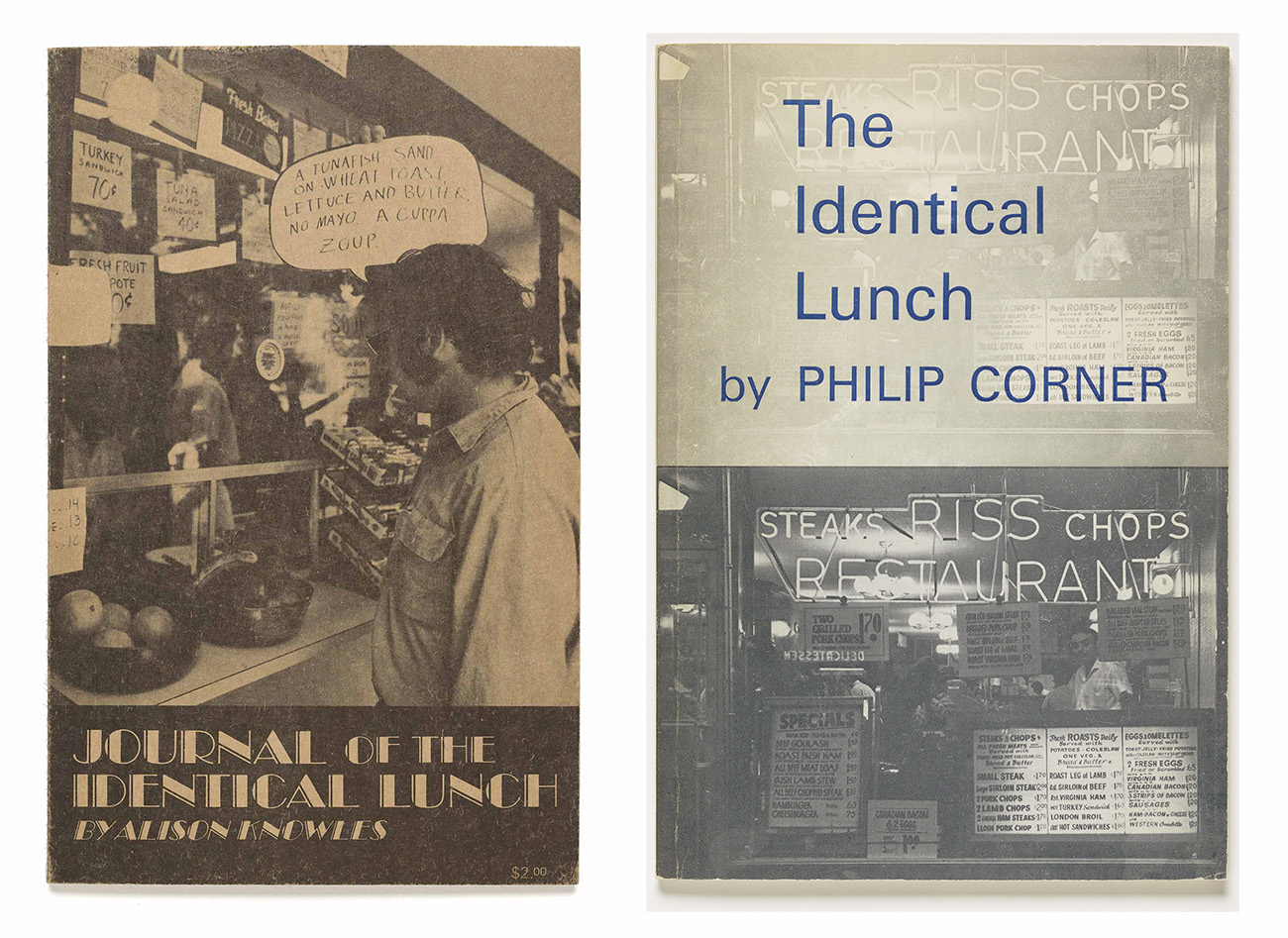
Left: Journal of the Identical Lunch, 1971, Alison Knowles. The Getty Research Institute, 91-B35085. © 1971 Alison Knowles. Right: The Identical Lunch, 1973, Philip Corner. The Getty Research Institute, 94-B16117.1973. © 1973 Alison Knowles
One issue in determining who owns the rights to collaborative works is that agreements between contributors are often informal, and all participants may no longer be alive or remember the exact circumstances of the collaboration. In these cases, Nina conducts research, such as tracking down artists’ estates, living relatives, or other publications that have recently published the work. When in doubt, she always errs on the side of caution.
Sometimes who Nina needed to contact about rights was dictated by the way that a layout would appear in the book. For instance, a layout of David Lamelas’s project Publication (1970) featured letters on language and art composed by artists and critics (including Robert Barry, Daniel Buren, Victor Burgin, Gilbert & George, Lucy R. Lippard, and Lawrence Weiner) in response to a prompt by Lamelas. Rather than contact each of the more than 30 participants, Nina reviewed the photographs selected for inclusion in Artists and Their Books and contacted artists whose letters would be reproduced. If the layout changed and other artists’ letters were to be reproduced, then Nina would contact them.
But, ultimately, the aspects that made this project a challenge also made it enjoyable for Nina since what she likes best about her job is that, with each book, she gets to look at many images of artworks from a unique and specific area of art history.
Learning about art from experts is also what appeals to publicity coordinator Miranda Sklaroff, whose role will be discussed in the next (and final) installment of this post.
Selling the Book: Creating the Pitch
“Many book lovers go into editing and focus on the granular details of a text,” publicity coordinator Miranda Sklaroff says. “I was more excited to work with the finished book and figure out how to condense its message into a short pitch.” Working in publicity for a publisher has been a way for Miranda to read books, digest them, and talk about them.
Miranda is part of the sales and marketing team at Getty Publications, which is responsible for making sure our books find their way to readers around the world. It is thanks to this team that the book shows up in Google search results if you google relevant keywords, or appears on the shelf at your favorite bookstore.
Although not experts in artists’ books, the sales and marketing team was particularly excited to work on Artists and Their Books / Books and Their Artists. (The topic had a personal resonance for Miranda as well—her sister is an artist who makes artists’ books.) Like the other members of the Publications department, they enjoyed thinking about how artists relate to and create books as objects, expanding their understanding about their own work.

Publicity coordinator Miranda Sklaroff and associate publisher Maureen Winter.
Sales and marketing kicks into high gear near the end of the publication process, but they also shape the publication from the start. Associate publisher Maureen Winter, who heads up the team, weighs in early on to set the retail price, make format suggestions, and confirm the size of the print run. Sometimes, feedback from our sales representatives—whose job it is to convince bookstores and museums in the United States and internationally to sell the books—shapes the presentation of the book. The cover of Artists and Their Books / Books and their Artists was redesigned based on their comments.
Miranda really gets down to work on a book just as the advance copies are coming in—usually only a few weeks before the book is available to the public! (Miranda’s fun fact: a book’s publication date is actually a marketing tool used to schedule press around a book so that reviews and articles come out when a book is new but already available in a few stores.)
In addition to biannual trips to New York City to meet with national media outlets about reviewing or publicizing our books, Miranda works with the book’s editor and author to identify important scholars or publications specific to the author’s field to target for additional reviews and coverage.
Part of the challenge of sales, marketing, and publicity is to understand what sets a book apart, and then to shape that idea into a convincing pitch for a variety of people like reviewers, conference attendees (senior marketing coordinator Kim Westad organizes a Getty Publications sales booth at a number of professional conferences), and potential readers.
Miranda’s conversations with authors often provide some of the best points for her pitch. She can learn from them what they think is special about their book, and their motivations for writing it. This is one of her favorite aspects of the job.
Miranda has three main parts to her pitch for Artists and Their Books / Books and Their Artists. The first is that this book takes something that is familiar (a book) and explores how artists’ interpretations of that concept can make it unfamiliar. She thinks that even book reviewers who don’t necessarily focus on fine art books will be excited about Artists and Their Books because it explores the book medium—which any book reviewer can relate to—and because the featured artists frequently reference literature in unusual ways.

One of Miranda’s favorite spreads: Labor Is Entitled to All It Creates, 2012, Andrea Bowers. 18 × 15 × 8 in. Los Angeles: Susanne Vielmetter Los Angeles Projects. Edition of 2. The Getty Research Institute, 3023-849. © Andrea Bowers
The second part of her pitch comes from the impressive scale of the Research Institute’s holdings of artists’ books. She sees the book as publicizing this important but relatively unknown collection, and believes that others will be excited to learn about it as well.
Finally, she finds the design and photography of the book to be a selling point that speaks for itself; simply flipping through its pages quickly engages possible reviewers.
Maureen developed a similar pitch for our sales reps to get them excited about the book and to give them ideas for how to present it to their customers. She is excited about this book’s ability to appeal to a general audience; with a focus on images of books, a varied artist list that includes some big names (like John Cage, Kara Walker, Carolee Schneemann, and Ed Ruscha) alongside less familiar ones, and a low price point for a hardcover art book, Maureen envisions this book to appeal to anyone interested in art, books, or design (and it makes for a beautiful gift!). Moreover, as noted above, there are few other books about artists’ books because they are very difficult to photograph, so it should strongly appeal to the artists’-book enthusiast, too.
Ultimately, sales and marketing will draw on these ideas as they continue to market Artists and Their Books / Books and Their Artist, a beautiful volume about unusual, visually arresting, and complex artists’ books that is sure to appeal to not only to the art historian or artist, but any book lover as well!


Terrific story – I enjoyed reading it. Thanks.
As a book artist, I am beyond thrilled to see the Getty focus on this artform. While I missed seeing the exhibition, I plan to have a copy in my personal library.
Must see this exhibit. Great article. Taking 3 book art workshops this spring/summer.