
Still Life, 17th century, Paul Liegeois. Oil on canvas, 29 x 38 3/8 in. Norton Simon Art Foundation, M.1979.49.P. Photo © Norton Simon Art Foundation
True blue, royal blue, ultramarine: During the Renaissance, these were all names for the most prized of all pigments, lazurite, derived from the semiprecious mineral lapis lazuli. Mined and processed since the sixth century almost exclusively in Afghanistan, and imported to European markets through Venice, it was worth more than five times its weight in gold. It was used sparingly, often reserved for the richest patrons by the most prosperous artists.
Look at this sumptuous still life, for example, painted in mid-17th-century Paris by Paul Liegeois, featuring his signature royal blue drapery. He achieved the effect with thin glazes of ultramarine oil paint applied over a layer that was highlighted with white lead. When light penetrates the thin blue glaze, the white reflects it back, intensifying a deep blue hue.
We often take for granted the dazzling range of colors in old oil paintings as we stroll through an art museum. Early Renaissance panels are full of jewel-like shades. Mannerists like Bronzino used shocking, acidic color combinations as they stretched the limits of naturalistic representation. Grand Baroque era artists like Caravaggio set vivid hues against dramatic dark shadows. In truth, these colors were hard-won. Time-tested, layer-by-layer techniques were required to ensure that a limited range of natural colors would maximize their visual impact. Creating a colorful oil painting was not yet the spontaneous act we envision the likes of Monet performing as he captured fleeting light and color effects.
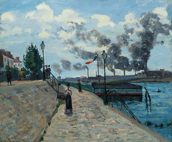
The Seine at Charenton, 1874, Jean-Baptiste Armand Guillaumin. Oil on canvas, 21 1/4 x 25 3/8 in. Norton Simon Art Foundation, M.1968.16.2.P. Photo © Norton Simon Art Foundation
That spontaneity required two remarkable advancements—a scientific understanding of the laws of light and color, and a new palette of colors that could be used to exploit these laws. As luck would have it, both happened around the year 1704. Sir Isaac Newton published his revolutionary text Opticks, and a German chemist discovered a vivid new blue pigment with amazing properties.
I’m fascinated by how those two developments come together. I am a museum conservator, not a curator. I bring a scientific and technical perspective on the methods and materials of art to the preservation of the collections. I am also a painter, and it was my passion for decoding the mysteries of “old master” paintings that led me to art conservation.
In mounting the exhibition A Revolution of the Palette: The First Synthetic Blues and Their Impact on French Artists at the Norton Simon Museum in Pasadena, I seized the opportunity to share my investigative processes with museum patrons. Given the opportunity to choose masterpieces from the collection and study them under the microscope, I looked for evidence of how painting in oils had changed between the end of the Baroque era and the mid-19th century, thanks to a single color: Prussian blue.
That blue was an accident. In 1704, a chemist and color maker named Heinrich Diesbach was rushing to manufacture a batch of Florentine lake, a red pigment derived from boiled cochineal insects, alum, iron sulfate, and potash. Lacking this last ingredient, he borrowed some from the alchemist Johann Conrad Dippel, not knowing it had been contaminated with so-called “animal oil”—a foul concoction of blood and other animal-derived ingredients that Dippel sold as a “cure-all.” Diesbach returned in the morning to discover a deep blue substance, thanks to the presence of an iron-cyanide contaminant. The two men quickly realized the commercial potential of this new pigment, and independently began producing batches of it to sell to painters at the Prussian court.
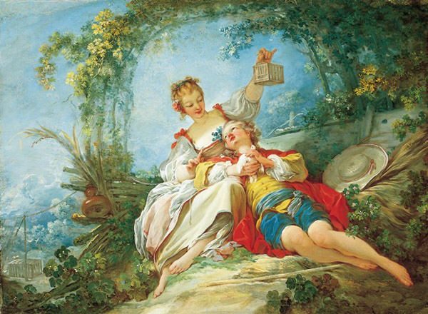
Happy Lovers, 1760-65, Jean-Honoré Fragonard. Oil on canvas, 35 1/2 x 47 3/4 in. The Norton Simon Foundation, F.1965.1.021.P. © The Norton Simon Foundation
By 1710, the first samples of Prussian blue pigment arrived in Paris, where Antoine Watteau is known to have shared it with his fellow painters Jean-Honoré Fragonard and François Boucher. Both were early and enthusiastic adopters of the new blue for their compositions; so was Canaletto in Venice, who found it indispensable in achieving his atmospheric effects.
This fête champêtre (scene of a garden party) by Bonaventure de Bar, an intimate of Boucher’s circle, was painted in 1728. A glimpse under the microscope reveals rough, irregular particles typical of early Prussian blue, scattered in a thin glaze over the sky and clothing.
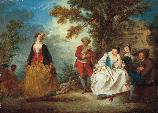
Fête Champêtre, about 1725, Bonaventure de Bar. Oil on panel, 7 7/8 x 10 3/4 in. The Norton Simon Foundation, F.1970.01.P. Photo © The Norton Simon Foundation
Although Prussian blue lacked the clear, “true blue” hue of lazurite, Prussian blue had unique properties that allowed painters to work more spontaneously. Only a small amount was required to impart a strong tint to other colors, including white. Painters could now mix a much wider spectrum of colors on their palette.
Painters could also take advantage of new knowledge. Artists were keen to depart from the old conventions of representing space and form, which depended more on metaphysical and philosophical arguments than scientific facts. The Enlightenment, the Age of Reason, had now begun.
In Opticks, Newton wrote about his findings about light and color. For example, he had separated a beam of sunlight into its component colors with a prism. Word spread of Newton’s work, thanks to highly vocal supporters like Voltaire and vehement opponents like Goethe.
Artists began to experiment with color harmonies to create illusions of depth in new ways. Color wheels and other diagrammatic representations of color theory revealed sophisticated relationships, and artists soon realized that colors diametrically opposed on the color wheel, known as complementary colors, had a special “harmonic” relationship. Placing one next to the other, or partially covering one with the other, results in optical effects simulating three-dimensional depth. One color tends to “advance”—or “pop,” as we sometimes say now. Thanks to the discovery of Prussian blue, painters had, for the first time, a palette of oil paints that could let them reproduce the full color wheel, and thereby experiment spontaneously on the canvas to achieve marvelous optical effects.
In France, these new possibilities came to fruition in Rococo painting. With its playful subject matter, delicacy of color, and exuberant brushwork, this art movement became known in the early 18th century as peinture moderne. Deceptively simple, these paintings reveal a mastery of the new scientific principles of color theory. Boucher, Fragonard, and others experimented with advancing and receding complementary colors. Color harmonies were everywhere, in the deepest shadows and the most brilliant sunlight. Black was all but banished. Practices popularly credited to the French Impressionists have their origins more than a century earlier as Rococo artists took advantage of an expanded palette.
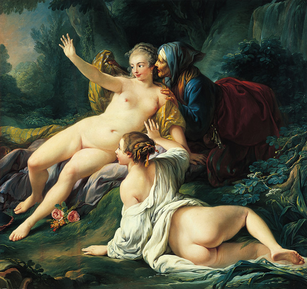
Jupiter and Semele, about 1760, Jean-Baptiste Deshays de Colleville. Oil on canvas, 62 3/4 x 66 3/8 in. The Norton Simon Foundation, F.1970.04.P. Photo © The Norton Simon Foundation
Look, for example, at a painting like Jupiter and Semele by Deshays de Colleville, Boucher’s son-in-law. His masterful brushwork, characterized by deftly placing and blending strokes of varying colors and hues directly into each other, juxtaposes complementary colors in carefully orchestrated variations. As a result, his figures project forward from the Prussian greens and blues of the forest backdrop.
The Norton Simon exhibit moves forward from the full blossoming of the Rococo era through the French Revolution, after which the new Republic desperately sought to develop new products and revive the shattered economy. A centerpiece of this effort was the nationally subsidized quest for new paint pigments inspired by the brilliant ceramic glazes seen on French royal porcelain, resulting in the discovery of cobalt blue and its variants, and ultimately the attainment of the “holy grail” of an inexpensive “true blue,” a.k.a. “French ultramarine.” The exhibition concludes with the Impressionists, who went even further with optical color manipulation and spontaneous brushwork. They enjoyed the advantage of myriad oil paint colors now sold in convenient, re-closable metal tubes, easily taken outdoors for true plein air painting.
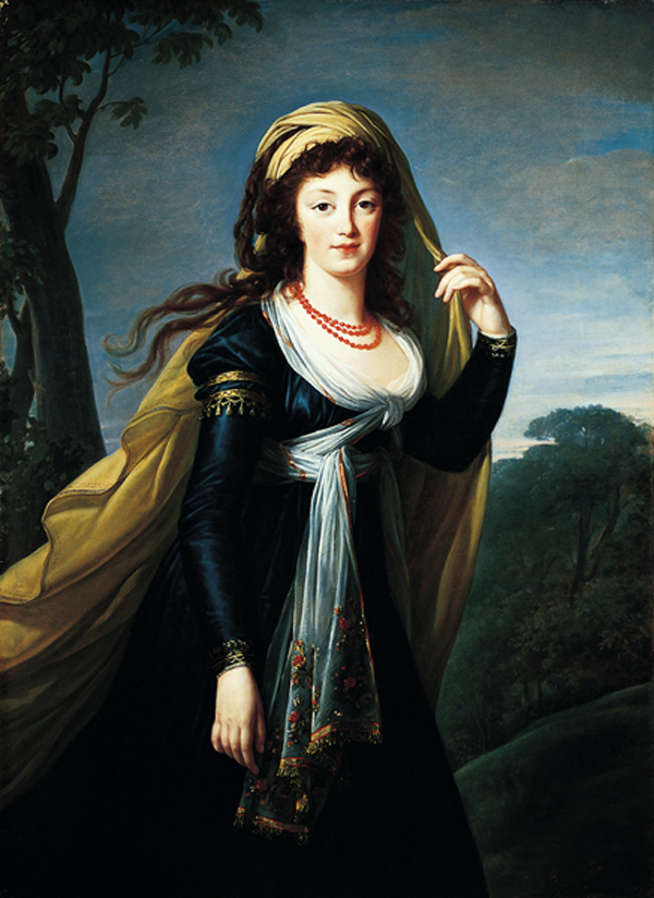
Portrait of Theresa, Countess Kinsky, 1793, Marie-Louise-Elisabeth Vigée-Lebrun. Oil on canvas, 54 1/8 x 39 3/8 in. Norton Simon Art Foundation, M.1969.03.P. Photo © Norton Simon Art Foundation
In helping viewers read the surfaces of paintings from this remarkable period, I have rekindled my own desire to look, to experiment, to study for a new series of paintings. But more than that, I have gained renewed optimism regarding the potential for an accidental discovery to occur at just the precise moment when it can be best exploited to the benefit of all.
Prussian blue was made in the “laboratory” of an alchemist at the right time to resonate with the dissemination of a grand scientific revelation and to catalyze a whole new direction in human expression. Serendipity happens, and sometimes the result is revolution.
Text of this post © Zócalo Public Square. All rights reserved.

See all posts in this series »

Thanks for the very interesting article.
Please note that the first name of Diesbach was not Heinrich but Johann Jacob. For more details please see: Bartoll and Jackisch: Prussian Blue – A Chronology of the Early Years in: Zeitschrift für Kunsttechnologie und Konservierung, 2010, 24 iss. 1, 88-102.
Great article. I notice difference between oil and acrylic PR. blue. Former has rainbow effect. What is Klein blue compared to ultramarines? Thanks!