The Walker Art Center’s new Online Scholarly Catalogue joins a growing number of museum catalogues that are reinventing art publishing for the 21st century

View of the Walker’s new OSCI publication, On Performativity. Image courtesy Walker Art Center
What is a page? What is a book? These are just two of the questions facing the cohort of museums participating in the Getty Foundation’s Online Scholarly Catalogue Initiative, which is helping the field move into online publishing. Today, the Walker Art Center launches its OSCI publication, On Performativity, which provides another spellbinding answer to the question driving this initiative: How can we rethink the museum catalogue for the digital age?
At one point, I think we all knew what a museum permanent collection catalogue looked like: high-quality reproductions printed on glossy paper, the latest scholarly research about the collection, a hefty tome both serious and beautiful. But behind these lovely books often lay a series of agonizing decisions for authors, editors, and publishers. A familiar authorial lament was, Why can’t I have just 100 more words? One more comparative image? One more paragraph for my essay/catalogue entry/technical analysis? While the printed page delivers the promise of words and images, it is also a sharply demarcated and unyielding territory. The printed page is both brick and wall, defining the contents and perimeters of catalogue.

LACMA’s OSCI publication displayed on an iPad
So what happens when you take down those walls? When the boundaries of the page become elastic? We can ask these questions thanks not only to the Internet but also to the advent of responsive design, which allows web content to be resized and reconfigured across various devices, from iPhones to tablets to desktop computers.

View of the Walker’s new OSCI publication, On Performativity. Image courtesy Walker Art Center
The page becomes a new landscape and a dynamic environment. It invites innovative design solutions. The Walker’s volume is a great example. Click on the Table of Contents to see what I mean. Images and quotes leap from the page. The reader negotiates a winding, enticing path through the chapter titles, deciding which door, so to speak, to open next. Try expanding and collapsing your browser window; the catalogue moves with you, intuiting the territory you have assigned to it on your device. Columns and blocks of text, images, and layout markers realign, refreshing your view of the catalogue. Scroll down and discover new content uniquely suited to an online catalogue, such as videos of Yves Klein’s Anthropométrie de l’époque bleue (Anthropometries of the Blue Period) or Eiko & Koma’s Naked. Explore the latest scholarship encapsulated on the table of contents in snappy abstracts.
As Robin Dowden, head of technology and director of new media initiatives at the Walker, explains, “Our aim was to take some of the best storytelling innovations from our favorite long-form journalism sites and smartly bring them into the scholarly realm: seductive imagery, rich media, snippets of content that draw you in. Our catalogue is intended as a blend of book and magazine. This allows the publication to serve two audiences: it meets the expectations of scholarly readers, with intellectually engaged texts supported by deep research, but also reaches out to broader audiences.”
Once you have explored the Walker’s On Performativity, the first volume in the Living Collections Catalogue, you can compare some of the other OSCI publications and see how the collaborative teams of designers, editors, authors, publishers, and technologists have taken the page “out of the box.”
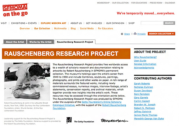
Cover of SFMOMA’s OSCI publication, the Rauschenberg Research Project
Landing pages for SFMOMA’s Rauschenberg Research Project and Tate’s Camden Town Group in Context, or the explore page for the Seattle Art Museum’s Chinese Painting & Calligraphy, all exploit the matrix format we have come to associate with web search results to organize the catalogues’ contents. Gone is the flush-left, vertically organized list of chapter headings; instead the space is neatly divided into fields of images and title headings, each of which is a portal to deeper content and longer journeys of discovery. Or in the case of the Art Institute of Chicago’s catalogue devoted to Monet, notice how the columns reflow with width of your browser window (a feature that is part of the OSCI toolkit, open-source software that was developed by the IMA Lab for this project but is already in use by other OSCI teams).
The Art Institute of Chicago also wanted to overcome one of the limitations of the printed catalogue—the constant flipping back and forth from text pages to the find the related image—so they designed their catalogue pages so that the key image is ever present. The Los Angeles County of Museum of Art offers a different design solution to the desire to keep the image front and center by creating a lightbox for each catalogue entry that includes all the images discussed in that essay; this lightbox can be found on each “page” of the essay. The National Gallery of Art created a tool by which the reader can choose how view the catalogue; turn on the “reader mode” button and the image will seemingly magically appear beside the relevant text.
Screenshot of the National Gallery of Art’s OSCI publication, with red arrow pointing out “Reader Mode” feature
These are just some of the discoveries that await. I invite you to spend some time with these catalogues, and come to your own conclusions about what constitutes a page in the digital age.


Comments on this post are now closed.