Joseph Valencia and Paul Martineau reviewing copy prints for an exhibition wall layout
As the Multicultural Undergraduate Intern in the Museum’s Department of Photographs, one of my duties this summer has been to assist with the development of exhibitions. Working with curator Paul Martineau has shown me some of the complexities of this work. Exhibitions take years to develop, and even after major decisions have been made—such as the topic, themes, and key objects—there is still a long and detailed process of review and revision.
Here are three considerations that show that even minor design choices can have an impact on how visitors enjoy and understand an artist’s work.
Planning Wall Space
It might sound obvious that curators and designers plan an exhibition gallery by gallery, but they also give the same careful consideration to the layout of each individual wall. Do the objects look good together? Do they tell the right story?
In the exhibition Robert Mapplethorpe: The Perfect Medium, slated to open March 2016, over 100 photographs will be exhibited both chronologically and thematically across six gallery spaces. Thanks to digital tools used by the Museum’s talented designers, curators can visualize the arrangement of objects long before they are hung on the wall.

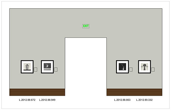
An early elevation for the exhibition Robert Mapplethorpe: The Perfect Medium
Consider the flower photographs on the wall shown above. On the exhibition checklist, these objects seemed fine together. Once digitally assembled into an elevation, however, it became clear that something was awry: the photographs were too close to one another, making the layout appear crowded. Solution? Find suitable replacements in keeping with the theme.
Remembering that the thirteen prints of flowers in Mapplethorpe’s Y Portfolio are smaller in size, Paul suggested that I identify four new photographs for consideration. After seeing these inserted into a new elevation, it was clear to us that the change was for the better.

Revised elevation for Robert Mapplethorpe: The Perfect Medium, with smaller photographs providing more visual breathing room
The early and more experimental Y Portfolio prints from 1977–1978 complement the refined photographs of flowers from the late 1980s on the surrounding walls. Together, these images offer insight into the trajectory of Mapplethorpe’s technical development and visual sophistication.
Orienting the Frames
The orientation of photographs is just as important as the space between them. In the exhibition The Thrill of the Chase: The Wagstaff Collection of Photographs, which accompanies the Mapplethorpe show, objects will be arranged chronologically and will vary in both size and subject matter. A goal of this exhibition is to survey the expansive collection that the Museum purchased from the esteemed collector in 1984.

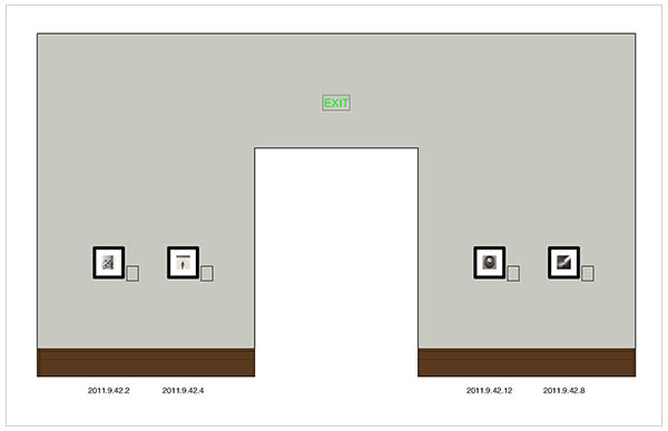
An early elevation for the exhibition The Thrill of the Chase: The Wagstaff Collection of Photographs
The wall shown above posed a problem. The horizontal photograph located at the top left corner jutted out awkwardly, making it seem out of place. Before making any changes, we evaluated whether or not the photograph could be reframed with a vertical orientation.
Unfortunately, we found that the photograph had been mounted horizontally and could not be placed vertically in the same size frame. Given this, we decided not to remove or replace the horizontal image, but rather to swap the two images at top left with the two below them. This easy switch kept us from having to rearrange the entire wall, and preserved the visual relationship between the photographs by Gaudenzio Marconi and Horatio Ross.

Revised elevation for the exhibition The Thrill of the Chase: The Wagstaff Collection of Photographs
Contextualizing the Subject
The most important consideration of all is how to present the show’s content. With Robert Mapplethorpe: The Perfect Medium, much thought was given to where and how to display the artist’s X Portfolio, the contentious series of pictures made in 1977–1978 that document sexual practices of New York’s S&M community.

Case design for Robert Mapplethorpe’s X Portfolio
Rather than framing the prints and mounting them on the wall, a decision was made to exhibit them sequentially in a long wall case. This discreet presentation is considerate of visitors who may not wish to view them.
Located in the final room of the exhibition, this placement aims to shape the visitor’s appreciation of Mapplethorpe’s most explicit imagery. At that point, visitors will have seen the majority of the exhibition, and will be better equipped to understand the role these difficult pictures played in the artist’s career.

See all posts in this series »


I am so proud of my creative and talented grandson Joseph! Application is everything and this is truly a wonderful example of education, passion and hard work, What an interesting and descriptive article, I did not know how much detail and review is involved.