Throughout 2013, the Getty community participated in a rotation-curation experiment using the Getty Iris, Twitter, and Facebook. Each week a new staff member took the helm of our social media to chat with you directly and share a passion for a specific topic—from museum education to Renaissance art to web development. Getty Voices concluded in February 2014.
In late 2009, a team of us at the Getty Museum began planning an unusual exhibit, one that was about close, sustained, mindful looking. This exhibit, The Life of Art: Context, Collecting, and Display, would tell the history of a small number of objects—only four, in fact—from the time they were made until the time they arrived at the Getty. Our goal would be to foster close looking by showing that much about an object’s history and function can be deciphered just by looking closely. My job as the exhibition designer was to create an environment conducive to looking, and to deliver text and images in a way that would lead visitors on a visual journey through each object.
Walking through the galleries in the Getty Center’s South Pavilion with the team in charge of planning the show—design director Merritt Price, education head Toby Tannenbaum, and curator Jeffrey Weaver—We hunted for four objects with physical attributes that told their stories. We listened with wonder as Jeffrey described the incredible tales behind objects that most of us may pass by quickly as we walk through the galleries. Ideally, we hoped, after seeing the exhibition visitors would go back into these spaces with a new desire to unlock objects’ stories simply by taking the time to look at them.
In the end, we chose these four objects:
- A porcelain lidded bowl
- A gilded wood side chair
- A silver vessel known as a fountain
- A gilded bronze wall light
In The Life of Art we wanted to examine these four objects from distinct points of view, such as display, function, history and technique. We also wanted the content to relate directly to a specific, visible part of the object—such as the screws, metal plates, and punched text on the back of the wall light, which we mounted on Plexiglas so you can see it from front and back.
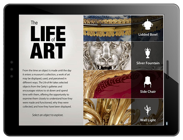
We didn’t plan to use digital media at all in the gallery, but we soon found that, even with only four objects, we simply had too much story to tell. We also worried that the information could quickly overwhelm both object and visitor. Luckily (!), the project was delayed by a year, which gave us time to reassess. We decided to develop content for iPads that could be used in the gallery, online, and as a downloadable app.

Not surprisingly, an app about close looking required the whole team to do a lot of our own close looking. We researched iPad apps from across the world in order to understand the format’s capabilities. We mocked up test content on iPads and then compared it to traditional touch monitors to make sure the results fit our goals. Unlike traditional monitors, the smaller iPads could be put nearer an object without overwhelming it, thus enhancing the goal of closer looking. Also, we were able to exploit the camera to add augmented-reality functionality, a feature not available with a traditional touch monitor.

The iPad’s camera allows interactive looking, in this case at the gilded wall light.
We also spent an incredible amount of effort tailoring the content to make sure every piece related to closer looking. We struggled to figure out how to design content that was engaging, yet would keep the visitor looking at the object. We wanted the visitor to use the screen, but also to look away from it.
We designed the gallery space to feel lounge-like and to encourage visitors to stop and take some time with the objects. At first we devised three separate tables and a separate display for the chair, but it became clear that the exhibit would work better if all the objects were placed on one large table, which would encourage a feeling of community. We bought comfortable chairs and placed banquettes in the corners to encourage visitors to relax and spend time in the space. The banquettes are also used for group talks and tours and education programming.

Installation view of our “community table” uniting the four objects in The Life of Art
It’s been a little more than a year since The Life of Art, conceived as a long-term temporary show, opened. Looking back at it, I am particularly proud of the collaboration between our Curatorial, Education, Design, and Collection Information & Access Departments that produced such a cohesive and comprehensive result. In the future I’d like to take the idea one step further and leverage the success of the iPad app that we created to develop another educational app that prompts closer looking, but is not necessarily tied to a specific object. In this way, anyone could use the app for any object in any museum around the world.


Comments on this post are now closed.
Trackbacks/Pingbacks