If you’re a frequent visitor to Getty.edu, you may have noticed that parts of our website have rung in 2020 with a major facelift. This represents the beginning of a multi-year overhaul that will make the website easier to use and better communicate what Getty is, does, and has to offer.
What’s Changed?
The 12 new pages rolling out today include the home page and the main visit page, as well as landing pages for each core part of Getty: Museum, Research Institute, Conservation Institute, Foundation, and Publications. These new pages set the direction and foundation for the redesign of the remainder of the website, which we are pursuing in phases.
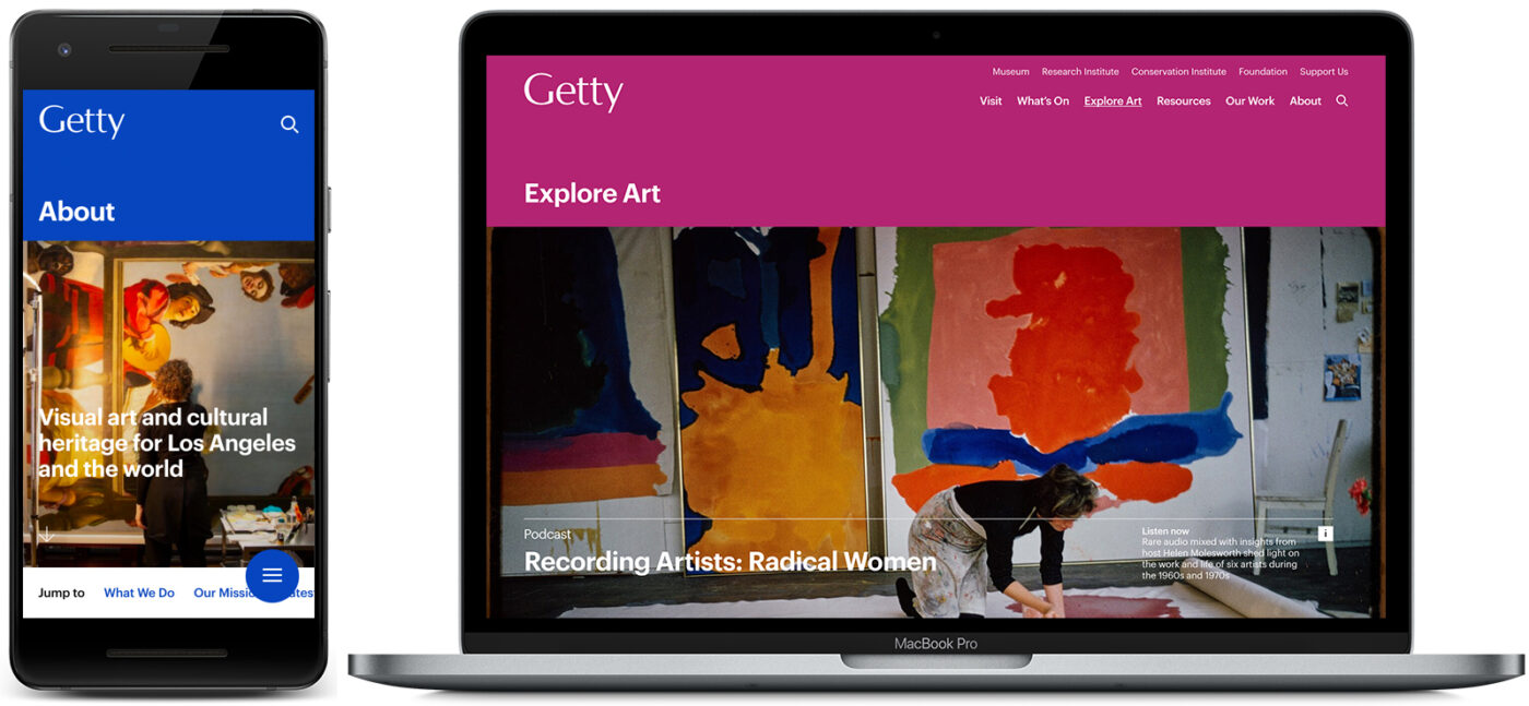
The new design is cleaner, bolder, and brighter. It features modern typefaces, a contemporary layout, and vibrant colors that recall aspects of a visit to the Getty Center and Villa. The pages are fully responsive, working equally well on your computer, tablet, and phone. The new pages currently support the three most used web browsers (Chrome, Firefox, and Safari).
We’ve also introduced new primary navigation that organizes content into more user-friendly categories. This new information architecture responds to users’ primary complaint about the site: that it is hard to navigate, with content on the same topic distributed across multiple parts of the site.
We heard you loud and clear, and look forward to continuing to listen to user feedback and testing as we refine and build out the new site over the coming months and years.
New Features
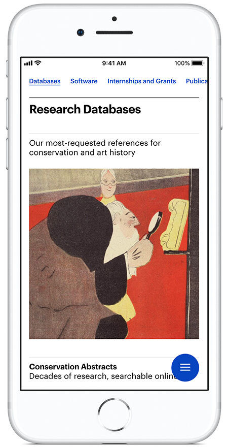
The new Resources section—beginning with the single directory page launched today—will be a central place to find Getty’s many offerings that support research, conservation, and study
The new pages make it easier to find our most-requested information—such as directions and opening hours—and surface content that was previously difficult to find, such as collections, databases, grants, news, and information on visiting our library.
Three new pages, which we’ll expand into full-fledged sections as the redesign continues, offer rich and comprehensive content at a glance:
- Resources offers a directory of Getty’s extensive tools for students, scholars, teachers, and conservation professionals, including digitized collections, research databases, K–12 lesson plans, open-source software, and links to grants, funding, and publications. Bookmark it at getty.edu/resources.
- Explore Art brings together a rotating selection of digital content about art and cultural heritage that aims to inspire, including videos, podcasts, articles, and spotlights on fascinating finds from our collections. Bookmark it at getty.edu/art.
- Our Work spotlights Getty’s philanthropic initiatives in L.A. and around the world, and is the place to go to find projects we’re leading and funding that make contributions to conservation, research, and professional development. Bookmark it at getty.edu/our-work.
The new portal pages are a click away in the new main site navigation. From pages that still use the old designs, you can find them via a redesigned footer that also provides a directory of top resources across the site.
Under the Hood
In addition to design and content changes, we made some big changes in our workflows, systems, and technology stack behind the scenes. While invisible to most users, these changes provide the tools we need to build and maintain a modern, flexible website for our users. Among them:
- We’ve adopted structured content to separate content from visual design, enabling it to be managed with greater ease and published on multiple platforms.
- The new build uses the open-source JavaScript framework Vue.js and pulls content from a modern structured content management system—one that keeps content separate from code and design to enable reuse and effective maintenance.
- Code is stored on GitHub and combined with content from the CMS when it is deployed via cloud-based server infrastructure.
- The new design system aligns with Getty brand guidelines and uses components that are flexible and reusable across the site. The design system used across all new pages was developed with product agency Area 17. (For fellow web nerds: Figma is our design tool, and Storybook our UI library.)
- Images are served using IIIF, an international standard for serving images in the cultural heritage field, and are managed in our institutional digital asset management system.
Perhaps the biggest change of all, and one we’re proudest of, is a shift in the way we work. The redesign team is embracing iteration and continuous improvement and committing to content and user-experience strategy using goal-driven and evidence-led practices. We are also working to embrace universal design, to ensure that the site is fully accessible for all users.
This new approach, in fact, is a key reason we’re launching a small set of pages now, while the redesign is still in active progress; we’re eager to see how you use the new pages and to fold what we learn into our planning for the next phase of work.
What’s Next
Redesign work will continue actively over the coming years. Our next steps are to refine and test the new pages, including auditing for accessibility across the new design system. Making the website accessible to all users has been a key commitment throughout our design and build process, and we look forward to building on this commitment in future phases.
Also on the list: to build out a fuller information architecture and upgrade sections of the site that we know are of greatest value to users. We’ve also begun plans to improve the search experience across the website, building on the streamlined search interface introduced in the new pages.
We’ll post updates as the work progresses. If you’re a colleague at a peer institution, you can also find us at a demonstration at the Museums and the Web conference in Los Angeles in April.
If you have suggestions or questions about the new pages, we’d love to hear from you in the comments below. (And if you see a survey pop-up on our site, please take it!)

So – users of Internet Explorer and Edge internet access systems are not included in “Making the website accessible to all users has been a key commitment throughout our design and build process, and we look forward to building on this commitment in future phases.” So – at least post that somewhere rather than just having us view a blank screen with a rotating symbol … and make a commitment to correct the above to say “Making the website accessible to a select group of users ….”
Hi Jim, Thank you very much for writing in and noting this issue. The website now supports Microsoft Edge, and a fix for Internet Explorer (IE) is also in the works. Please try the site again in Edge and let us know if you experience any issues.
I saw your interview on the CBS evening news today about replicating famous paintings with common household objects. It appears to be a timely recommendation for those of us that may have more leisure time than usual. It should be good publicity for the Getty Museum.