
The design of every book starts with the content. In the case of the photographs exhibition Light, Paper, Process—well, all I can say is wow!
The exhibition brings together seven of the most remarkable photographers working today and shows them at their most experimental. Each artist plays with process and pushes the medium to its boundaries. The images included in the exhibition—and the book—challenge our assumptions about what photographs are and even how photographs look.
I first heard about this project from the production manager for the book, my colleague Stacy Miyagawa. She’d reviewed some of the works from the Museum’s Department of Photographs that were to be in the exhibition. She came back starry-eyed, “Catherine, you have to design this book!” She was so right.
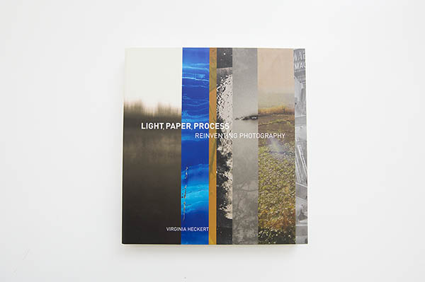
A few weeks later, I ran into the curator, Virginia Heckert, in the cafe. We were talking about how difficult it is to represent all seven artists in the exhibition without diluting them or changing their meaning. She mentioned that it would be nice to have “just a sliver” of each artist on the cover.
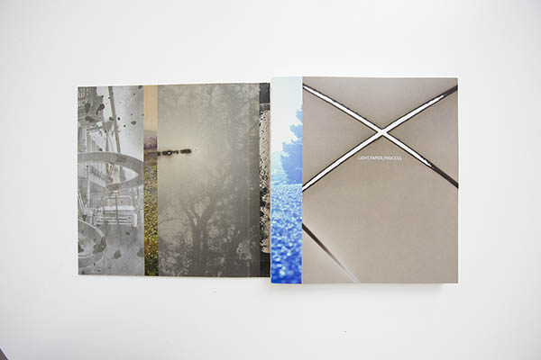
Well, that was it. I saw the whole book from that single idea. This concept of slivers directed the design from that point on: image slivers slide from the front onto the back, and then into the inside of the book. They become visual tabs as well as pagescapes that divide and organize the book. The curator’s concept came from a deep knowledge of the works as a group, yet encapsulated something from each. I grew to love these seven photographers’ work and to see it in my own way. It was amazing how smoothly it all came together after that.
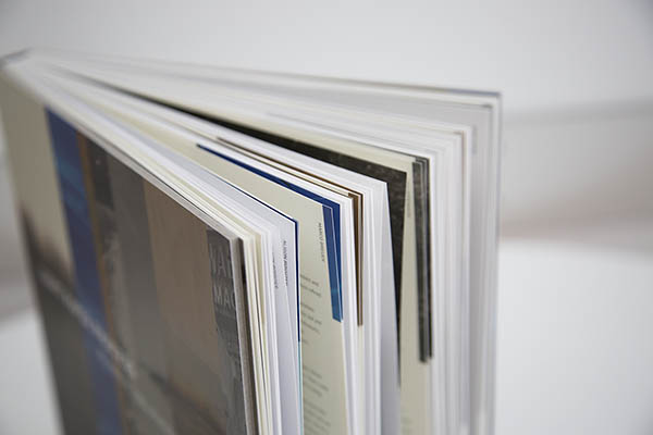
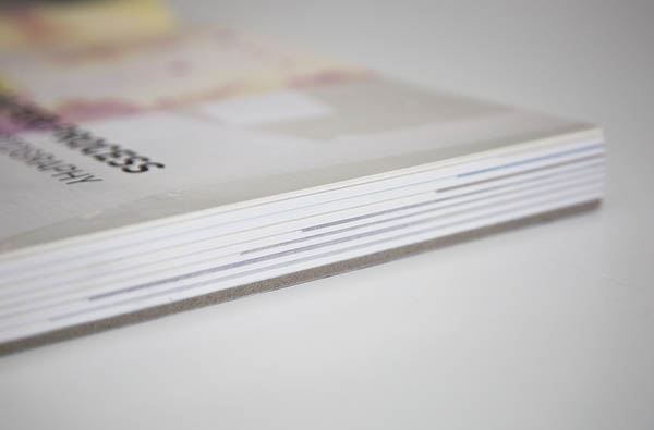
Even our choice for the binding sprung naturally from the initial concept. Stacy and I pulled together design samples that we thought conveyed the general spirit of the content and sent them to the printer, Trifoilio in Italy. They suggested a binding different from any we had sent, but one that truly captured the exhibition and catalogue. Their idea was to have the binding come away from the pages, revealing how the book is put together, just as the essays and curatorial work behind Light, Paper, Process provide deep insight and a behind-the-scenes look into each artist’s practice. The idea was simple, but different. We approved the binding immediately.

This is one of my favorite books I’ve ever worked on, but I don’t feel like I can take much credit for it. The artwork pulls the weight. I just designed a container to display and clearly communicate the remarkable images and scholarship within.
Designing a book is always educational and interesting; it’s a unique experience and a team effort. That’s why I love doing it. But I must admit that some books come together magically. As I said in the beginning, everything comes from the content. When the book itself has such a strong concept behind it, the pieces come together as if it was simply meant to be.


Comments on this post are now closed.