Working at the Getty isn’t like working at most other places. Sure, we have the same challenges as most employees—budget constraints, fluctuating deadlines, occasional ego clashes—but we get to work on cool projects, with inspiring content, and in a gorgeous mountaintop environment. I’ve been a web developer here for almost 16 years, and I’ve had the privilege of working on many projects that I remember fondly (Devices of Wonder, California Video, and Tango with Cows come to mind), but this year is special. Because for the first time, three of my projects were recognized with MUSE awards from the American Alliance of Museums.
What are the MUSE awards, you ask? Well, to quote from their website:
MUSE awards recognize outstanding achievement in Galleries, Libraries, Archives or Museums (GLAM) media. The international Alliance Media & Technology Professional Network’s annual awards are presented to institutions or independent producers who use digital media to enhance the GLAM experience and engage audiences. The MUSE awards celebrate scholarship, community, innovation, creativity, education and inclusiveness.
Pretty sweet, right?
Now when I say “three of my projects,” I just mean that I worked on them—but definitely not in a vacuum. Every one of these sites was built by a team of talented and hardworking colleagues, and in each case, it was a completely different team. (Except for me, of course.)
Unless you’re a consultant or contractor, you probably work with the same people all the time—way back when I worked in insurance, I worked exclusively with my account-management team. As a web developer with the Getty, however, I get to work with all kinds of people across the whole organization, and these three award-winning projects are perfect examples of that.
Pietro Mellini’s Inventory in Verse

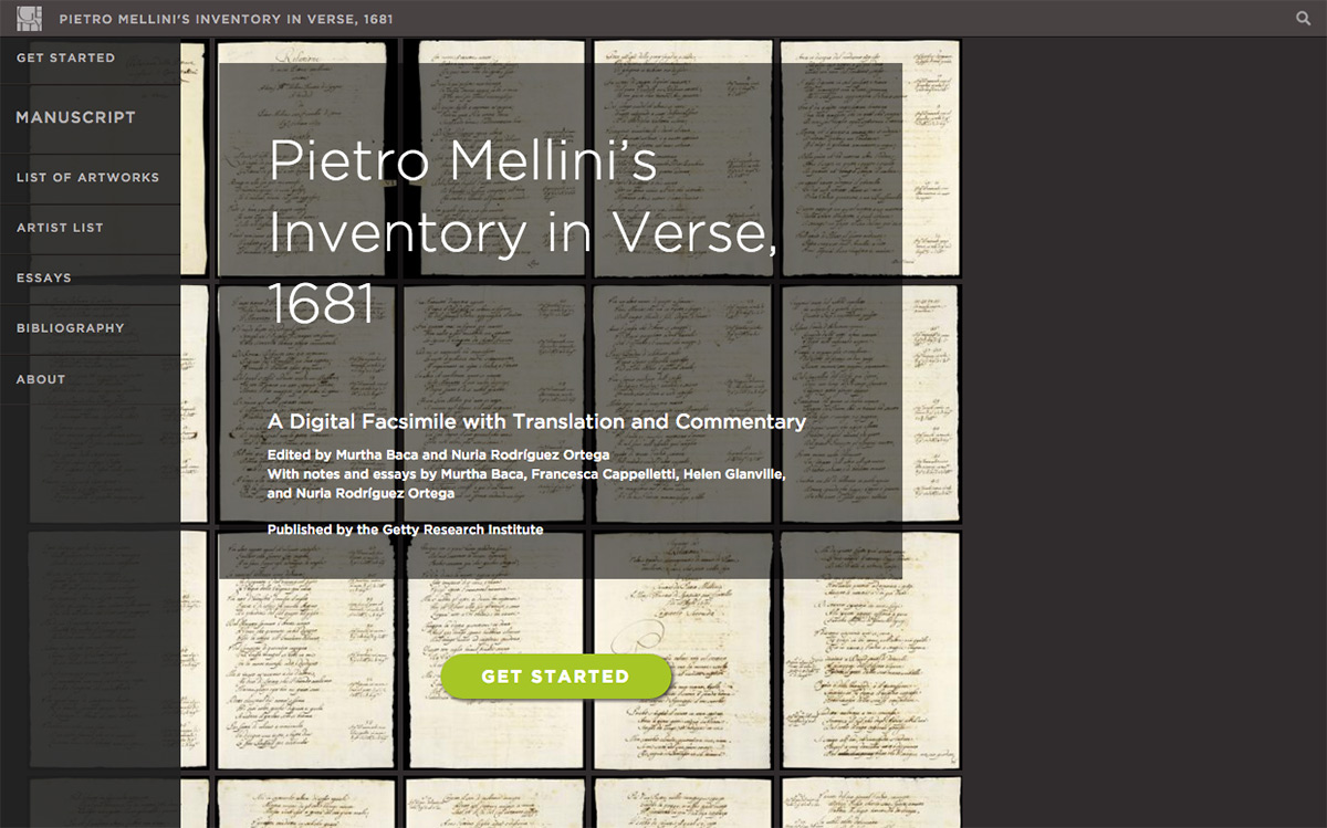
Pietro Mellini’s Inventory in Verse, 1681, recognized with an honorable mention in the Open Culture category, was the result of about seven years of hard work by oh-so-many people. It started as a project built in Drupal 5 by members of the Getty Web Group (though not me) and the Getty Research Institute, to create a space for scholars across the globe to digitally collaborate on the translation and interpretation of Pietro Mellini’s art inventory, which, as the title suggests, is written as a poem.
After years of work it was time to publish all of their findings, but the nature of their dynamic collaboration and the interconnectivity of all the material would be poorly served by something as linear as a print book—and so this digital publication was born.
By this time there had been several staff changes both in the web group and in the Getty Research Institute’s digital teams, so a totally new group of people (including me) built the publication site in Drupal 6. And if you haven’t looked at it yet, you really should, because it’s amazing. There are essays and footnotes and little factual tooltips, but by far the best part is the manuscript itself. You can look at each page individually and compare the transcription side by side with the facsimile of the page, or the English translation if you prefer. You can click through to the images that are referenced in each verse, and you can even see the conversations the scholars had about particular sections by clicking on the yellow highlighted texts.
This was a huge undertaking, involving the commitment and talents of many people in the web group and the Research Institute, and, unlike most of my projects, multiple developers—me, JP Pan, and Tom Scutt. Mostly we worked on different parts of the publication, but we also helped out whenever one of us got stuck with something. We made a pretty good team, if I do say so myself.
The finished product is a truly scholarly work, completely citable, but also fun to browse for the non-scholars. It was the first of its kind for us at the Getty, but hopefully not the last.
#GettyInspired

On the other end of the spectrum, #GettyInspired, winner of the gold award in Public Outreach, was built on a far shorter timeline, with fewer cooks in the kitchen. It had been in the planning stages for five or six months before it hit my radar, but when I came on board as developer, I had less than a month to get it ready for launch.
Thank Matt for WordPress! (That would be Matt Mullenweg, creator of WordPress. One of my heroes. Please don’t judge me.) It’s by far my favorite platform, because it’s easy to use, easy to customize, and most of the plugin developers are super-responsive.
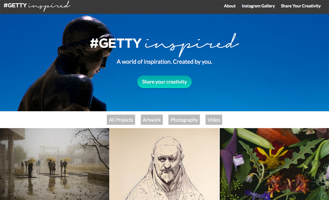
The purpose of this project was to invite our visitors, both physical and virtual, to share their own photographs, artworks, writing, and other creations inspired by the Getty and its art, architecture, and gardens. My first step was to create a single submit page that would allow users to upload their photographs starting several weeks before the official launch. (Can’t launch without actual content, right?)
After that I spent my time—all of my time, actually—building the full site. It slices, it dices, it allows users to upload their photos directly into post templates (making it so much easier for the editors on the backend), while also allowing our digital media team to share amazing videos of interviews of local artists. Above all, it shares the creativity and ingenuity of our visitors with the world. (I even have some of the shared works as wallpaper on my laptop.)
From concept to launch, this project came to fruition in just six months, and I’d say that little miracle was due to the clear vision and hard work of our small and lightning-fast team of only six people.
The Art of Food Mobile Tour

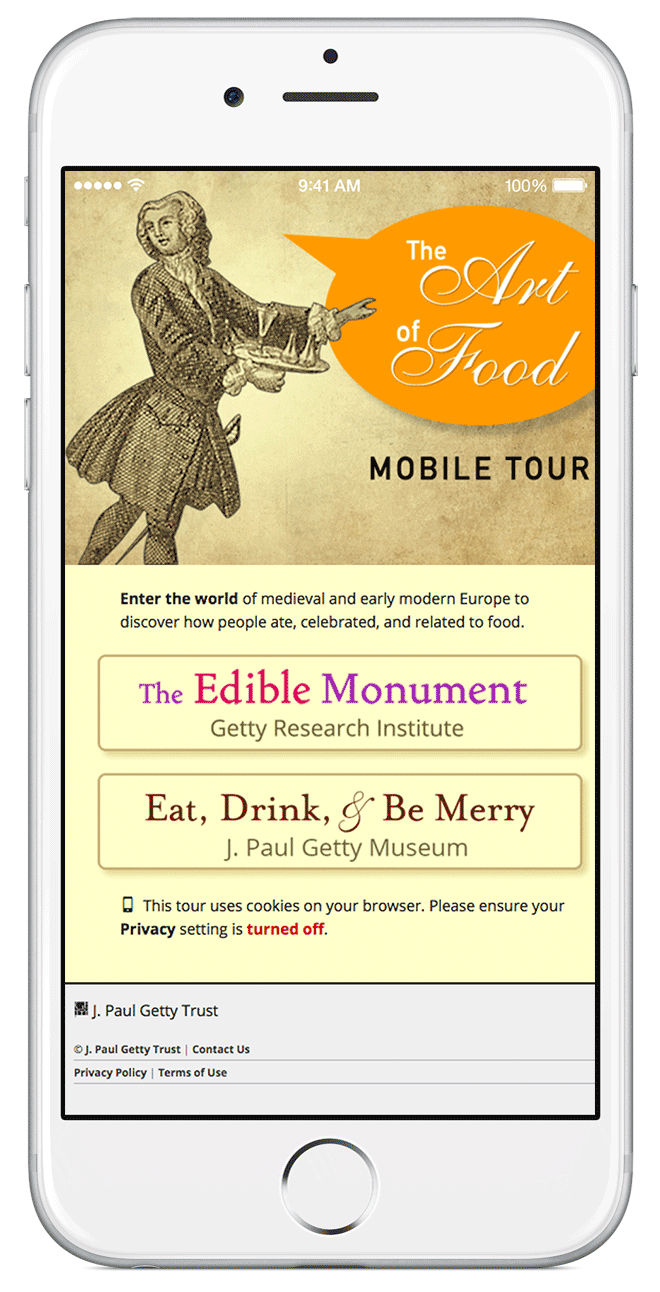
And finally there is The Art of Food mobile tour, which received an honorable mention in the Games & Augmented Reality category. This recognition came as a surprise to me, not because it’s not fabulous and well-deserved, because it is, but because it’s pretty low-tech for online gaming these days.
This project was very different from the other two, because it was specifically tied to two exhibitions, so we had a clear and non-negotiable launch target. We started the planning meetings for this a full year in advance, and also unlike the other two projects, I was involved in every step from the very start—which is kind of cool, really, because I’m usually brought in closer to the end. It was also different because the stakeholders were from two different Getty programs—the Research Institute and the Museum—and that actually doesn’t happen nearly as often as you’d think.
Together we devised a digital scavenger hunt designed to invite gallery visitors to look more closely at the objects than they would normally, and to actually see what was going on in the prints, rare books, and manuscript pages of the exhibitions The Edible Monument and Eat, Drink and Be Merry. We picked characters from the objects to be our users’ guides, and we had a grand old time creating stories for them to tie the chosen objects together into comprehensive narratives for the times in history they represented.
And then I had to build it. Hoo boy, so much javascript! I built the pages in Foundation 5, because who doesn’t love pre-built CSS classes? But the javascript….so!many!conflicts! Many times I wanted to rip my hair out, but really, I was having the time of my life figuring out the logic of every borrowed plugin and piece of code (“animatedcollapse.js” was a lifesaver!). And the accomplishment of getting every script to behave exactly as I wanted—well, there are reasons developers develop, and this little moment of euphoria is definitely high up there.
Launching this project, working with these people, and sitting in the galleries to watch visitors actually engage with it, was a joy entirely different from the other two projects, but really every one of them had their ups and downs, challenges and triumphs. And that’s what I love about working at the Getty—working with so many different people, on so many different platforms, and building products with completely different goals and audiences. It’s why I’ve stayed for sixteen years, and why I don’t imagine leaving any time soon.
The awards are just a bonus.


I really enjoyed your explanation. Thank you.
In 2007 and 2009 I tried to accomplish what you have, but here in Italy it was tooooo early. I created two online project for the Accademia Museum in Venice, but we did not have the support of the art society because digital Art was not an option yet. Now that Italians have reached the knowledge, and every single project manager proposes and creates digital Art progects (not all of them convincing) I passed in a new era of my life: I’m studing gardening and plants at the University and love it! Your post though gave me a little nostalgia. Ciao!