
Final design of the Explodity interactive
When the Getty Research Institute set out to publish Explodity, a new book about the Russian futurist poetry known as zaum, it was clear that print alone wouldn’t do the job. Zaum blends text, typography, and sound, and to “read” zaum poetry, you also have to hear it and see it. As a scholar (the book’s author, Nancy) and a digital specialist (the project manager, Alicia), we worked together to create an online experience that would complement and extend the book. In this post, we share how that digital experience took form.
Scholarly Origins of the Project
The distinctive interplay of word, image, and sound in Russian futurism has not been studied by art historians and literary critics, so it might be useful to explain how and why I (Nancy) came to this topic. A big impetus was my training in musicology and, specifically, in the European avant-garde and American experimental music. Indeed, I began my scholarly career as a musicologist interested in the relationship between music and the visual arts. I’ve written about Paul Klee and Anton Webern, the collaboration between Erik Satie and Pablo Picasso on the ballet Parade, and the graphic musical notation of John Cage and Morton Feldman.
The application of this multidisciplinary approach to the Russian avant-garde came later. In a graduate seminar with professor John E. Bowlt, I had studied the paintings of the great Suprematist Kazimir Malevich. After I joined the staff of Getty Research Institute, we acquired an archive of letters from the Russian constructivist El Lissitzky to his wife, Sophie Lissitzky-Kuppers; also at the Research Institute, I discovered a treasure trove of handmade Russian futurist books around which I organized an exhibition, Tango with Cows: Book Art of the Russian Avant-Garde, 1910–1917.
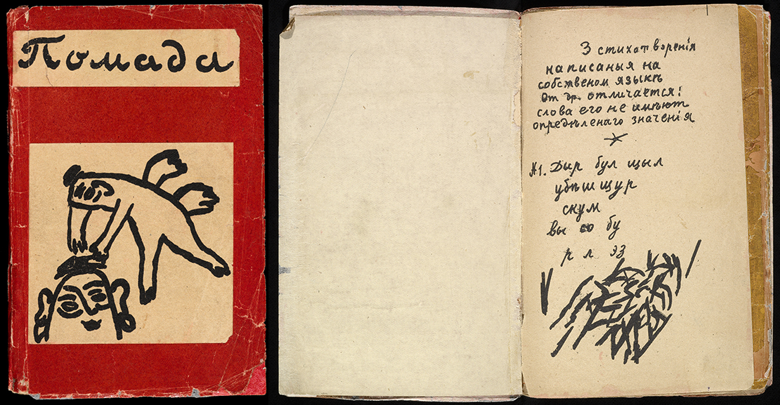
Cover and spread from Pomada (Pomade), 1913, Alexei Kruchenykh, poetry, and Mikhail Larionov, lithography. Lithograph. The Getty Research Institute, 88-B26240
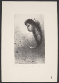
In working on the Tango exhibition, I discovered that futurist books were fusions of the verbal, visual, and sonic, and hence were meant to be heard, as well as read and looked at. The intricate collaborative process involved a new role for painters as “handwriting artists,” who invented calligraphy and imagery in response to the sonic and semantic indeterminacy of the poetry. For instance, a transrational or zaum (“beyond the mind”) poem by Velimir Khlebnikov, “Nash kochen’,” from the book Mirskontsa (Worldbackwards), prompted Mikhail Larionov to handwrite the verse in a mirror version as a verbal-visual expression of “reversibility” and to insert a drawing of a rooster that is only legible if we rotate our heads. The seeming nonsensicality of Khlebnikov’s poem contributes to the topsy-turvy, “reversible” theme.
As a result of the importance of sound in futurist books, we created sound stations in Tango, as well as a kiosk with four virtual interactive books. For the new book, Explodity, we wanted to take this further. We’ve inserted a printed URL in several places in the print publication, prompting readers to visit an interactive website containing recordings of ten poems analyzed in the book. You will read about this remarkable website in the text that follows.
Creating a Digital Zaum Experience
When I (Alicia) was assigned the task of developing a digital companion to Nancy’s Explodity book, we already knew that a key element—indeed, perhaps the most important aspect—would be to provide users access to audio recordings of the selected poems in the book. But what was the best way to deliver that digital audio—a simple list of audio links on a webpage? An app? A video?
My task as a content producer and project manager on this project was to come up with the best interpretive media, develop a plan, and make it happen. The decision had already been made to publish Nancy’s book in the traditional print format; my challenge, therefore, was to bridge physical and digital incarnations in as seamless a way as possible. The form we ended up with—a print book paired with an interactive website—wasn’t obvious from the beginning. For a detailed account of our process, read on; or jump straight to the final product, which we’re launching today.
Step One: Figure Out What the Reader Needs
Sometimes a digital tool is developed solely to address a pressing problem that was not foreseen in an analog project—not enough wall space in a gallery, for example. This “triage mode” rarely yields the best results. Fortunately, the Explodity interactive was different: a genuine need and user benefit was identified from the very beginning.
To give the project shape, we started by extracting the key content elements. At our first meeting, Nancy described the unconventional zaum poetry that would be the focus of her book, which she had only just begun writing. After much discussion, it became clear that there were six main elements that a reader needed in a digital product:
- Visuals—digitized versions of the actual poems from the artist’s books
- Audio—fresh new recordings of the poems (quality audio didn’t already exist)
- English translations—for English speakers to understand verbal component
- Russian transliterations—to accentuate the sounds of zaum and to allow English speakers to follow along with the audio
- A visual guide—to help readers see, sound by sound, the Russian transliterations while listening to a poem
- Credits—to cite all the original futurist books with the zaum poems and to credit the artists and poets who made them
Step Two: Be Honest about How, and Where, People Might Find Your Digital “Thing”
We knew what our digital “thing” should contain, but what shape should it take? How would the target audience find it? Who was the audience, exactly?
To gain clarity, I developed personas for our proposed target audiences, with simple use-case scenarios and user flowcharts for each. Alexandra was an emerging scholar and a digital native who spends a lot of time researching and communicating online; Victor, a mid-career scholar, was an associate professor of Russian at San Francisco State University; and Omar was a self-taught artist who recently began to perform at poetry slams.
Findability was another important consideration. For the digital project to be successful, it needed to exist independently of—and work in conjunction with—the printed book. It needed to include enough context about Nancy’s book and the subject matter—futurist book art and zaum poetry—to be enjoyable and understandable on its own, and it needed to be findable and shareable online for our target audiences (and others) interested in the subject matter but unaware of the existence of the print book. Anyone searching online who was even remotely curious about Slavic languages, avant-garde poetry, sound poetry, or Russian literature should stumble across our digital project. Moreover, it needed to be compelling enough to lure the book’s readers from the physical world to the virtual one.

Russian nesting dolls. Photo: © BrokenSphere / Wikimedia Commons. Licensed under a Creative Commons Attribution-Share Alike 3.0 Unported license. Source: Wikimedia Commons
The build-it-and-they-will-come model that worked for Kevin Costner in a fantasy sports film is not a viable option for lone websites, apps, or videos on obscure scholarly topics. Add to this the possibility that not all of the book’s readers will bother to leap into the virtual realm, and my concern was that we’d be left with an audience that resembles a set of Russian nesting dolls: a niche within a niche within a niche, in which the digital audience would be as small as the tiny babushka doll at the center.
Here’s where the initial idea for video came in. A video seemed like a good fit because it’s relatively easy to promote video online. YouTube is the second-largest search engine in the world, processing over three billion searches a month; and because it presents users with suggested videos to watch based on their interests, the possibility of catching the attention of interested parties is greatly increased.
I carefully examined how each persona I had created—Alexandra, Victor, and Omar—would find and use such a video. And then I started the development process.
Step Three: Develop a Failed Video Prototype
Now the real fun began. I literally went to the drawing board, cutting out images and pasting them on large sheets of paper, drawing lines from one to the other to visualize connections, and fooling around in InDesign to come up with ways of presenting all the requisite elements in a legible, intelligible, and interesting format.
I decided to mock up a few of the poems into a test video, without any professionally designed elements. I knew that eventually I’d need to solicit help from a designer and possibly a video editor. But first I would make a few video samples.
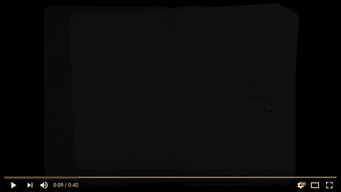
GIF showing a sample from an early video prototype. The English words at left appeared line by line as the poem was read aloud in the original Russian.
The concept was to show a futurist book spread open on the screen, with the Russian poem on the recto, and use the blank verso to overlay the transliterated text. The transliteration would roll out, karaoke-style, as the audio played so that viewers could follow along. The translation would be presented immediately afterward. Then, once all the poems had been heard and seen, there would be screen or two with all the necessary credits. I also tried showing both texts at once (transliteration and translation), but—even in the few instances where all the text fit—the result was a dizzying experience with too much for the viewer to take in.
This video could have worked. It included all six of the necessary content elements, and I would have made sure that it was aesthetically up to par and that it functioned smoothly. But I had a growing apprehension about the video format: it would trap users in a liner narrative and not allow them freedom to explore the material, without the option to choose what to listen to, read, or see. A viewer might be interested only in the sixth poem, “Tianutkoni,” but she would still have to watch the entire video to get to the poem, and then would have to hit the pause button on the parts she wanted to study. This lack of interactivity bothered me.
Step Four: Recruit a Team
The digital Explodity assignment was supposed to be a small project, one that I could quickly develop on my own. An opportunity to get creative and explore new tools. The institutional resources alloted to the project were low—quite low…as in, just me.
Even though I was flying solo, I felt the project deserved more. I was fascinated by the subject matter; both the poetry and the illustrations appealed to me from the start. They were wonderfully full of contradictions: complex yet stripped-down, bleak and foreboding but also playful and hilarious. At this point I acknowledged that this digital “thing” could not be a video; it had to be interactive. And to make it interactive, I needed a team. So I set out to find collaborators.
Luckily, the Getty Museum’s UX designer, Cathy Bell, requires little convincing when an exciting creative opportunity comes her way. She immediately recognized the potential of this project. I also recruited Greg Albers, digital publications manager in Getty Publications, who was supportive of our endeavor from the onset. For a while, the three of us bravely pushed ahead, experimenting with a possible design and functionality. Ultimately, we devised an interactive website pairing books and poems with audio for each. It became our template for moving forward.
This solution seemed ideal to us because it would allow readers to explore components at will, alone or in combination: narrations of the poems; Russian transliterations and English translations; and the type, layout, and lithography of the artist’s books themselves.
A few months later, there came another “wait, we can’t do this alone!” moment, and we realized we would need a skilled web developer to actually build the thing. And so entered Mantas Andrijauskas, a fantastic addition to the team who had recently joined the Getty’s Web Group.
Over time, we were able to get more institutional resources allocated to what had originally been a small undertaking. Our project blossomed into something much more ambitious and robust.
Step Five: Iterate! Fail! Start and Stop!
The commitment to “fail early, fail often”—in other words, to uncover problems early, when they are easier to fix—definitely applied to this project.
The failed video prototype was relatively quick and easy to make and yielded a wealth of valuable lessons, like how to accommodate transliterations and translations within the image of the open book. But our “failures” didn’t stop there. Once our team was established, we began a rigorous process of iterating, rethinking, and redoing.

Early designs of the landing page, prior to user testing. Testing revealed that in both designs, the call to action (“Choose a poem to explore”) was too far from the text. The early red background (left) was misleading because it suggested the Russian Revolutions, which began several years after the books were created. The design at right shows an early attempt to make the poem titles (in red on white) more clickable-looking.
There is no better way to uncover the strengths and weaknesses of a digital product than to conduct user testing—observing how a person interacts with a product or prototype. Without this outside perspective, it’s easy to make (wrong) assumptions about how a certain feature will be understood by users.
To test the ease of use and effectiveness of our design, we created a clickable prototype that included the landing page and one poem page. Since the functionality would be repeated for each poem, it wasn’t necessary to prototype all ten poems. The test results were just what we hoped for—meaning that the usability problems became immediately obvious. We learned that:
- Users didn’t know the scope of the interactive, which left them feeling uncertain about whether they had clicked through everything. We numbered the poems, thus communicating the scope of the interactivity at a glance.
- Non-Russian-speaking users didn’t intuitively recognize the poem titles as titles; as a result they didn’t know where to click. We provided stronger visual indicators—including mouse-over color variation on the poem titles that light up as users scroll over them—to signal that the poem titles were clickable headers.
- The call to action, “Choose a poem to explore,” was too far from the clickable titles. We moved it closer to the clickable titles.
- Users wanted access to the full digitized versions of each book. We added links to the digital item.
Step Six: Launch the Finished Product
Launched today, the interactive “Explodity poem reader” is a companion website to Nancy’s book Explodity: Sound, Image, and Word in Russian Futurist Book Art, published by the Getty Research Institute.
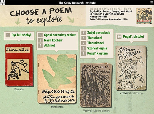
The final design of the Explodity interactive, launched today
The online interactive highlights the interplay of word-image-sound in Russian futurist poetry. It presents full-screen digital reproductions of the selected poems; to experience the fusion of word-image-sound, just click “Listen.” It also has tools for non-Russian speakers: English translations help untangle the verbal component, and Russian transliterations offer those who do not read Cyrillic a means to follow along with the audio.
Here are some key features of the finished product:
- Audio—In high-quality recordings, the Russian poems are read by Slavic languages and literature expert Vladamir Paperny.
- Independent exploration—On/off buttons allow users to choose how they want to explore the poems.
- Context—English translations convey the look and feel of the original poems so English speakers can get the meaning without losing the visual context.
- Minimalist design—Controls for operating audio, transliterations, and English translations are simple and restrained, and the original poems are in a single uncluttered interface.
- Intuitive usability—A curl at the edge of the page makes flipping between books and poems intuitive.
- Research tools—Includes links to full digitized versions of each artist’s book; links to online catalog records so that researchers may access these works in the Research Library, and a link to purchase the print book.
We hope you’ll enjoy exploring the Explodity interactive site and will let us know what you think!
Comments on this post are now closed.