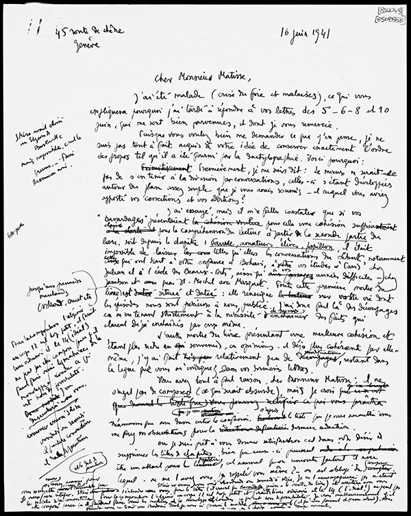
Draft of a letter from Courthion to Matisse, 16 June 1941. Los Angeles, Getty Research Institute, ID no. 88-A259. © 2013 J. Paul Getty Trust
What was it like to chat with Henri Matisse? In advance of this Sunday’s discussion between arts journalist Tyler Green and Chatting with Henri Matisse editor Serge Guilbaut, a taste of Matisse’s strong opinions on a subject he knew perhaps better than anyone: color.
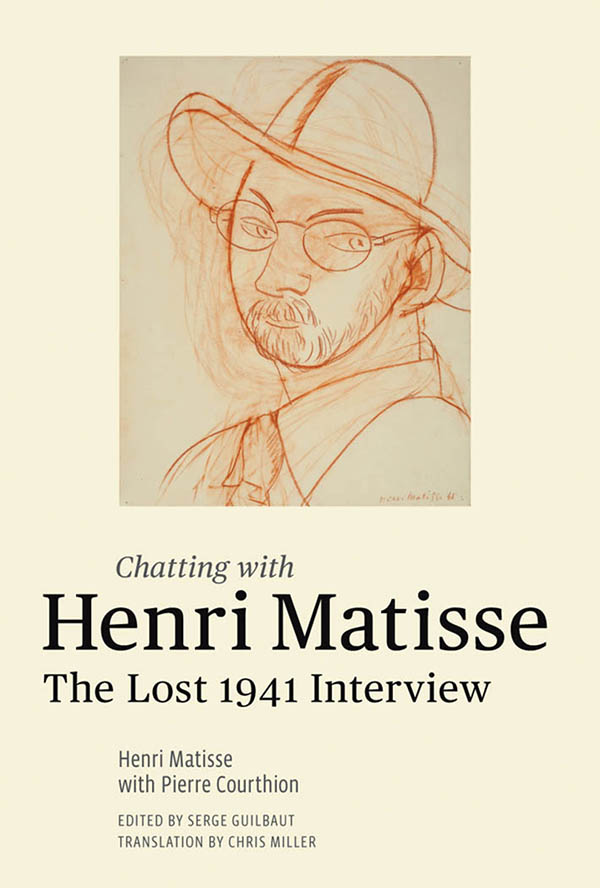
This past summer the Getty Research Institute published Chatting with Henri Matisse, a series of interviews with the artist that spans his long life, delves deep into his artistic philosophy, and presents a singular and penetrating view of the turbulent art world of early-20th-century Paris.
These interviews, originally intended for publication when first given in 1941, were suppressed by Matisse himself soon after. This edition makes them widely available for the first time in English—and even though Matisse’s opinions have not been long shrouded in mystery, nor his biography unknown, this series of conversations offers a rare glimpse into the mind of a master.
The interview covers a range of fascinating topics—from the role of the artist, to the bohemian life in fin-de-siècle Paris, to color. Matisse’s use of color is one of his most extraordinary talents, and his discussion of the evolution of his palette and theory of color is a highlight of these dynamic interviews. In this passage he speaks about embracing and then rejecting the approach to color favored by the neoimpressionists such as Seurat, which had a large impact on his thinking:
Neoimpressionist theory is very convenient because it’s complete in itself, but in terms of expressing the spirit—in terms of the artist’s creation—it’s completely inadequate. It has one huge advantage: it can guide the work of the painter and make proportioning colors easier because you lay them on in strokes, and by removing certain strokes you can completely modify the color harmony. . . . I also found that if you applied the theory strictly, it stopped you from putting very expressive colors side by side. And from a decorative perspective, the color range was very limited. It’s always violet, it’s always a little rainbow-like, it’s a flageolet.
He then talks of creating his own way of conceptualizing colors:
I finally came to consider colors as forces, to be assembled as inspiration dictates. Colors can be transformed by relation; a black becomes red-black when you put it next to a rather cold color like Prussian blue, blue-black if you put it alongside a color that has an extremely hot basis: orange, for example. From that point on, I began working with a palette especially composed for each painting while I was working on it, which meant I could eliminate one of the primordial colors, like a red or a yellow or a blue, from my painting. And it goes right against neoimpressionist theory, which is based on optical mixing and color constraints, each color having its reaction. For example: if there is red, there has to be a green…. In a picture, neoimpressionist color reactions involved dominants. These dominants create reactions, but they have to remain dominants…. In terms of intensity, my reactions aren’t subordinate to the dominants, they’re on the same level… All the colors sing together; their strength is determined by the needs of the chorus. It’s like a musical chord.

For Matisse, this theory of colors—as forces working in concert—stood in direct contrast to those of previous generations of painters:
One day, I brought him some of my paintings, my pictures. Renoir was surprised to see, in a little picture painted in my room at the Hôtel Beau-Rivage on the promenade des Anglais in Nice—it showed an open window: a palm tree twisting in the wind, a high swell, all silvery gray, and inside the room, the curtains and the dark mahogany pelmet; then in front of the window, a table and a little suitcase on the table; the foreground was all flowery carpet that went right up to the window. Renoir was astonished to find the dominant note in my painting was the mahogany pelmet, the darkest color in the whole thing. He was surprised that this dark tone didn’t press into the foreground but stayed where its position in the room dictated. He had me put the picture some distance away from him, considered it, then looked close up again: “But how do you do that? If I put black like that in my picture, the black would come forward.” I couldn’t find an explanation on the spot and yet the explanation is very simple; it’s done by a combination of forces that constitute the picture and this is my generation’s contribution.
One of the most revealing moments in the book in terms of Matisse’s relationship to color, is this statement, which brings an intense poeticism to a description of color in Tahiti:
What is special about Pacific light is the intoxicating quality it has—intoxicating to the mind; it’s like the light produced in a gold chalice when you look right into it. The sea is blue, the sky is blue, and the trees are green—although the greenery of the Pacific is not like ours: it’s a very rich dark green, more or less the green of acanthus. There’s lots of hibiscus in the bushes, the hibiscus with strong, fleshy leaves pressing around the blood red of the flowers.
I hope that many other readers will have the realization I had after completing the book: reading Matisse actually enhances viewing Matisse. Madame Matisse’s red madras headress bursts anew from the page against the blue black and hits against the turquoise in ways heretofore unnoticed. The movement in The Joy of Life becomes a product of colors intermingling. Through his own unique voice, Matisse and his work come alive in new and unexpected ways.


Thank you for this unique little gem. It will lead to great things for a lot of people interested in colour theory.
Great reading, thanks!
Thank you for sharing these thoughts and insights into Matissue and his use and approach to color!