
Vija Celmins’s 1966 painting Freeway is dramatically spotlit in Pacific Standard Time: Crosscurrents at the Getty Center. (Collection of Harold Cook, Ph.D. © Vija Celmins)
As you move through Pacific Standard Time: Crosscurrents in L.A.: Painting and Sculpture, closing this Sunday, the colors of the walls or the unusual angles of the wall panels might not be the first thing you notice. But Museum designers have plotted your journey through the galleries as meticulously as the curators have selected the artworks that populate the space.
To follow up on the walkthrough of the artworks in Crosscurrents we posted when the show opened, here’s a second, farewell tour—through design eyes.
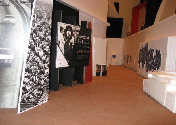
When crafting an exhibition, designers begin with a long list of considerations: How should the space flow? What’s the best light, and the best viewing distance, for each piece? What colors and type express the personality of the show? After many discussions and plans comes a detailed foam-core mockup hung with tiny artworks—all to scale—so the team can scrutinize the smallest detail.

Foam-core mockup of the assemblage gallery featuring scale replicas of every artwork on display
I wanted to know how Getty Museum designers Emily Morishita and Irma Ramirez approached Crosscurrents and its varied visual feast, which features hard-edge paintings side by side with large-scale ceramics, radical assemblages just around the corner from resin orbs and Pop canvases.
The answer? Understatement. “We knew we wanted to make a modern, white-walled space because we wanted a minimal look,” Emily told me. “We wanted this to be a blank canvas.”
The look may be minimal, but the design is full of thoughtful details. Setting the stage is a title wall featuring vintage photos of L.A.’s iconic freeways. John Mason’s wall-sized ceramic beckons you into the first gallery, a bright white expanse that’s the perfect foil for intensely colorful paintings and ceramics. Tall text panels jut out of corners at an angle; each panel has a few thematic words, marked in bold—a parallel to the punctuated moments of L.A. art on view in the show.

Title wall of Pacific Standard Time: Crosscurrents as installed (above), and as crafted in foam-core and cardboard during the design process (above)
The next gallery is the opposite: it’s intimate, dimmer. Small sculptures and assemblages hang close together as in a salon. The walls are a warm tan. The labels for each work are gathered together in spaces off to the side so they don’t intrude into the experience.
From there, you turn into a dark passageway that transports you back to postwar L.A. of the ’60s and ’70s. Louis Hock’s cinemural Southern California loops images of urban life and the ocean lapping against the sand, while a Julius Shulman photomural lets you hover above the glittering lights of Hollywood. You’re invited to reflect, take a breather before absorbing more.
The space provides a thematic transition into the next chunk of the exhibition, which explores how California’s industrial, surf, and car cultures influenced the art made here. This gallery has dramatically spotlit pieces featuring clouds and freeways, as well as a sculpture that, well, leans. Emily and Irma allowed plenty of room around this resin plank and made sure there’s a long sight line so you can spot it—and avoid knocking against it—as you walk through the small gallery.
Presiding over this space is the larger-than-life figure of Walter Hopps, holding court on his own circular island. Look up at the mirrored oculus, and you can see yourself and the art-world impresario side by side.
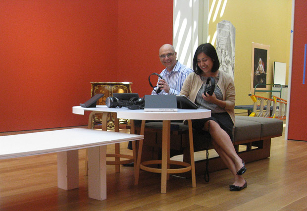
This smaller space gives way to a dramatic gallery with large, colorful paintings blanketing the white walls, including the exhibition’s signature piece, Ruscha’s Standard Station. Overhead, louvers are left open—for conservation reasons, during the first and last weeks of the exhibition only—to allow the great big L.A. paintings to appear under their hometown light. A seating station with iPads features oral-history videos about the art you see around you, bringing you into connection with the works through the artists’ eyes.
Irma Ramirez (right) and design manager Merritt Price refine the design for the iPad seating station
The final gallery presents stunning, luminous works. Both lighting and colors are dramatic here; for example, Mary Corse’s Untitled (White Light Grid Series-V) seems to glow from within thanks to a trio of spotlights hung on a brace from the ceiling.
For both the designers and the curators, putting huge, astonishing works at the end of the trip was intentional, just like every inch of every room. “It’s like a finale,” Emily said.


Comments on this post are now closed.