We recently posted about an exhibition-in-development, scheduled to open in January 2018, that examines images of “out-groups” in illuminated manuscripts. We were both grateful for and energized by the numerous comments here on The Iris, as well as on Twitter and Tumblr. We have taken many of your suggestions to heart and continue to refer to them as we make edits to the exhibition.
For those of you who have followed our project with interest, we would like to share some of our work on the show, highlighting four of the objects we have selected for the show and our draft texts for the wall labels that will accompany them in the exhibition space. As always, we are eager for any and all comments, suggestions, and critiques, in the comments here on the Iris or by contacting us directly by email.
But first, a little more context about the exhibition. Each year, the Getty’s Manuscripts Department mounts between three to four single gallery installations from the permanent collection. These so-called “rotating shows” usually include 20–25 manuscripts and are intended to keep at least some portion of our light-sensitive collection on view throughout the year. While modest in scale, the rotating exhibitions create a platform for programming that can connect with the public, our own research interests, and in this case, with issues of social justice. As the recent reconsideration of Civil War monuments has demonstrated, art is not neutral—including even “rotating” gallery presentations.
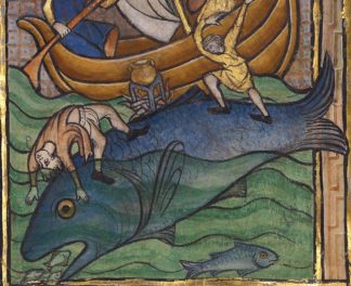
Many of you cautioned against a conflation of medieval and modern understandings of race and color, which is an essential point for a consideration of racialized thinking in the Middle Ages. If we were able to add to the show with loans, we might display Gerald of Wales’ Topographia Hibernica to demonstrate the complexities of race, identity, and the creation of the “other.” In a copy of this text from The British Library (Ms. Royal 13 B. viii), the Irish race is distinguished from the English by its immoral behavior—Gerald describes Ireland as a medieval freak show, complete with a bearded lady and reports of bestiality. But more importantly for this discussion, Gerald distinguishes between the different tribes or peoples of the British Isles: gens Hibernica, gens Anglorum, gens barbara, and gens nostri (the Irish, the English, the “barbarians” [sometimes Celts], and “our people” [Cambro-Norman or Marcher or Welsh]). As this map of peoples demonstrates, in Gerald’s world there were powerful racial hierarchies that were at times predicated on geography, language, religion, and place of birth.

The Naked Bearded-Woman of Limerick and the Naked Man-Ox of Wicklow (detail) in Topographia Hibernica, ca. 1196–1223, Gerald of Wales. Colors and ink on parchment, 27.5 x 19 cm. The British Library, London, Royal 13 B. viii, fol. 19. Manuscript: no known copyright restrictions. Digital image: via bl.uk, Digitised Manuscripts
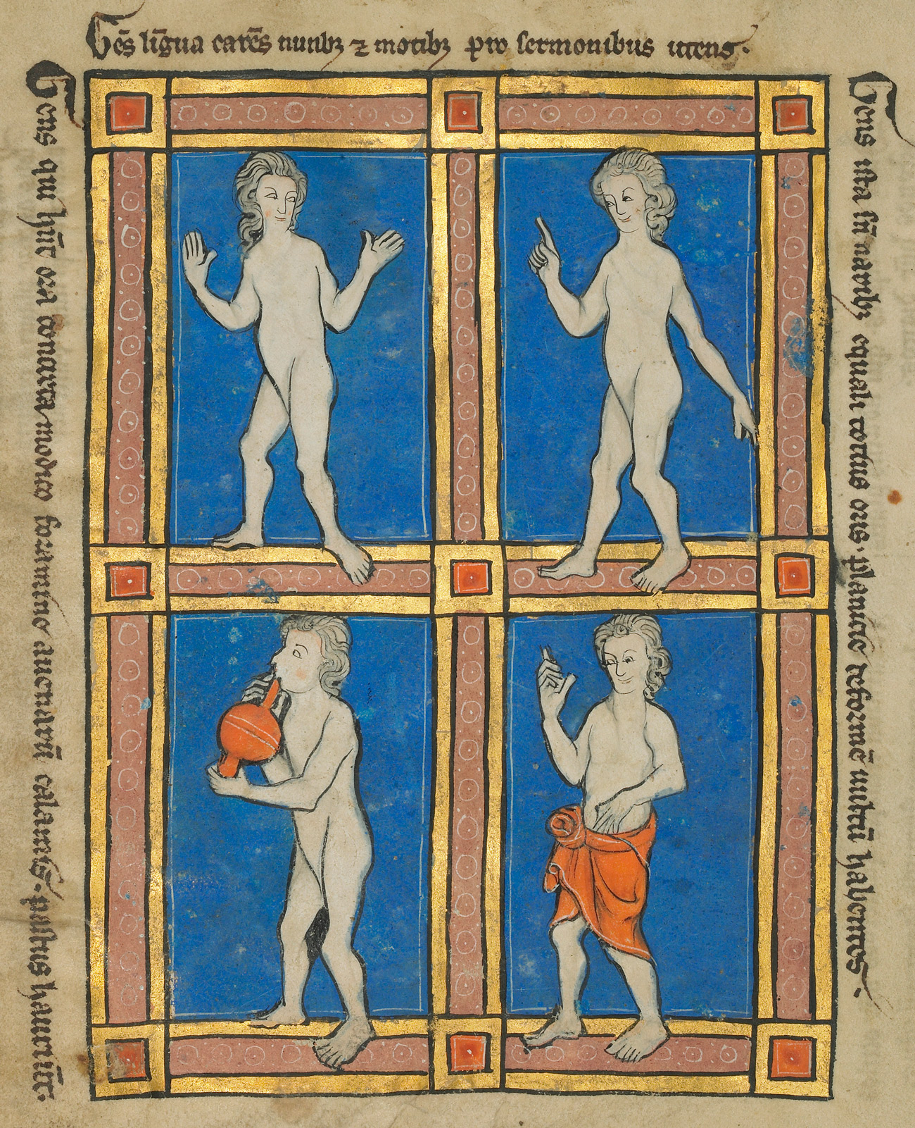
While Gerald’s text makes this point through particularly vivid language and illustrations, we are able to discuss the ways in which medieval peoples categorized their world, and the peoples in it, with an object in the Getty Museum collection: a collection of texts known as The Wonders of the World. Here is our label for this object—and, full disclosure, we have a 125-word limit for labels in our gallery:
After describing the physical traits and habits of animals and drawing moral lessons from them, the compiler of this encyclopedic text included a section on the “Wonders of the World.” A series of images and short captions depict the so-called “monstrous races,” peoples living at what was imagined as the far reaches of the world. The writer distinguished between hominum (human/people) and gens (tribe/people), whose lack of clothing and misshapen or exaggerated physical features in effect created a category of subhumans or nonhumans. Inscriptions added throughout these pages indicate geographic origins for such beings in Africa or somewhere beyond India—places that were in fact inaccessible to most Europeans at the time.

The Monstrous Peoples from The Wonders of the World, about the fourth quarter of the thirteenth century (after 1277). Tempera colors, pen and ink, gold leaf, and gold paint on parchment, 9 3/16 x 6 7/16 in. The J. Paul Getty Museum, Ms. Ludwig XV 4 (83.MR.174), fol. 118v. Digital image courtesy of the Getty’s Open Content Program
While the manuscripts above show the way that race was nuanced in the Middle Ages, color also contributed to racialized thinking. Here’s another label-in-progress:
Color conveyed a range of meanings in medieval art. Blackness at times signified race and ethnicity, as seen in the image of the black Magus nearby, but could also symbolize the absence of light (and thus, of God). Demons were often rendered in shades of black or dark browns and grays. In a miniature from a Psalter in the Getty collection, color appears to have been used in both ways: the bearded demon resembles caricature-like representations of Africans, Jews, and Muslims found elsewhere in the late twelfth and early thirteenth centuries, a period of extreme intolerance and violence. In a jealous rage, King Saul draws a sword on the young David. His melancholic temperament is conveyed not only through his actions but also by the dark-skinned demon who whispers in his ear, urging him on to violence.

Initial Q: David Before Saul from a psalter, after 1205, Master of the Ingeborg Psalter. Tempera colors and gold leaf on parchment, 12 3/16 x 8 5/8 in. The J. Paul Getty Museum, Ms. 66 (99.MK.48), fol. 55. Digital image courtesy of the Getty’s Open Content Program
In the later Middle Ages, particularly in Northern Europe, standard religious iconographies began to include black African figures such as the Queen of Sheba or the Black Magus. Here’s what we’ve written about such a leaf from a book of hours at the Getty:
The Magi were stargazers who brought precious gifts to the Christ Child. The illuminator Georges Trubert followed a late-medieval tradition of symbolically depicting each Magus as a ruler from one of the continents known to Europeans: the kneeling figure as Europe, and the standing kings as Asia and Africa (identified by their turbans, used stereotypically in art to identify Muslims, Jews, or peoples of the eastern and southern Mediterranean and beyond). The late-fifteenth-century black African Magus is a paradoxical figure, whose presence reveals the racial diversity in Europe at a time when ecumenical church councils brought delegates from Ethiopia to Florence and Rome—at the same time that Europeans began to engage in the African slave trade.

The Adoration of the Magi from a Book of Hours, about 1480–90, Georges Trubert. Tempera colors, gold leaf, gold and silver paint, and ink on parchment, 4 1/2 x 3 3/8 in. The J. Paul Getty Museum, Ms. 48 (93.ML.6), fol. 59. Digital image courtesy of the Getty’s Open Content Program
_______
As we continue to refine our texts and interpretations for this exhibition, we invite your continued comments—see more posts on the Getty tumblr over the coming months.


You might find this interesting.
https://www.theguardian.com/artanddesign/jonathanjonesblog/2016/dec/08/bearded-woman-of-abruzzi-magdalena-ventura-jusepe-de-ribera-gender-hero
Edward Shaw -School Docent
In MONSTEROUS PEOPLE, top, I appreciate that the artist is imagining in some way, even if it is unflattering, that people may look different. Sort of a StarWars Bar of the Middle Ages. It strange to me that figures seldom show features different than the region in which the work was created.
I appreciate that the figures in the grid like work are stepping out of their box, i enjoy the loose rendering and expressions shown through hands, and facial expression. To me it looks like a 1950s rendering of a mideval manuscript. I’m not sure I completely understand the page.
The Q page, I enjoy the stare they seem to be locked in. I love that the harp is the visual answer to the weapon, not a shield. That’s just great. The ethnic depiction shows a lack of exposure. But I believe we must judge the work in it’s time.
In the ADORATION OF THE MAGI, I believe the artist is demonstrating with star- light that the travelers are indeed, very special people. Light is a very powerful religious symbol. It is used very deliberately. (I named my son Jasper, so of course this one is my favorite piece.)
The final work, NUN FEEDING A LEPER, absolutely beautiful in its meaning and rendering. I think your description is perfect. To the AIDS dialogue it reminds me that ST VINCENTS and ST CLAIRS were the first hospitals in NY to care for those affected by HIV virus. Both figures hands, and the caregiver’s tilted head indicates compassion and communication between the figures. Lovely.