How do you get from a blank piece of paper to a work of art? Practice. Lots of practice—and a few mistakes along the way.
Masterpieces aren’t made overnight. Artists typically make dozens of early sketches, to develop composition, form, and other artistic elements. “Any time you see a finished painting,” curator Stephanie Schrader told me, “there could have been many drawings that were made to prepare first.” These sketches made for study, for practice, and for experimentation are often recognizable by their lack of finish, but also by the presence of fervor, speedy action, and sudden strikes of inspiration.
An exhibition at the Getty Museum, Drawing: The Art of Change, featured sketches that show off innovative progressions of ideas and unique solutions to mistakes. As Stephanie told me, “I wanted this show to be, an inspiration to people—to realize it’s okay to make mistakes, to change your mind. It’s part of the process. Creativity is messy and not straightforward. The path is not linear.”
Stephanie pointed out a few of the wonderful examples she uncovered in the collection in which artists evolved their ideas on paper, and how what seem like blunders often contribute to a more spectacular finished product.
Fill the Page
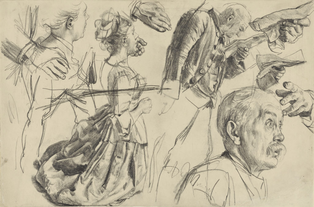
Study for Heinrich von Kleist’s “The Broken Jug,” about 1877, Adolf von Menzel. Graphite on paper, 9 3/4 × 14 3/4 in. The J. Paul Getty Museum, Gift of Dr. Richard A. Simms in honor of Lee Hendrix, 2016.80. Digital image courtesy of the Getty’s Open Content Program
Artists struggle to portray their subjects convincingly. When dealing with weight, proportion, and emotion, they try out multiple options before settling on a final solution.
In the study above, artist Adolf von Menzel plays with several ways to show emotion. The figures depict a shocking scene from the play The Broken Jug. The female figure on the left is comforted at the climax of the play. The artist draws her with a male hand supporting her chin at this literally jaw-dropping moment. Then, at top left, the artist plays with placing the man’s hand on her shoulder, and then he continues to elaborate on the detailing of the hand in the center.
To the right we find a male face expressing shock, and additional studies of hands—one with a letter that plays a role in the drama. Drawing the note multiple times helped Menzel visualize the best way to portray this scandalous revelation.
Draw It Again
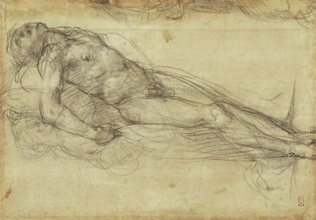
Dead Christ (verso), about 1517–18, Pontormo (Jacopo Carucci). Black chalk on paper, 15 15/16 × 11 3/16 in. The J. Paul Getty Museum, 83.GG.379. Digital image courtesy of the Getty’s Open Content Program
Paper is readily available today, but in centuries past it was expensive and handmade. Because of this, artists never wanted to waste a sheet, and would often use as much of each side as possible.
Erasers were also unknown before modern times. In the drawing above, artist Pontormo began to draw a standing female figure, but abandoned it. So he just rotated the page and began a completely new composition: the one we see here of the dead Christ.
The remarkable thing about this intense work is that he used the mass and weight of the figure he had previously created and balanced Christ on top of it. This approach generates energy and vigor, slightly elevating Christ’s body to foreshadow his resurrection. It’s a brilliant use of the previous drawing; the figure probably wouldn’t have as much emotional impact if Pontormo hadn’t incorporated his own previous thoughts.
Paste It Over
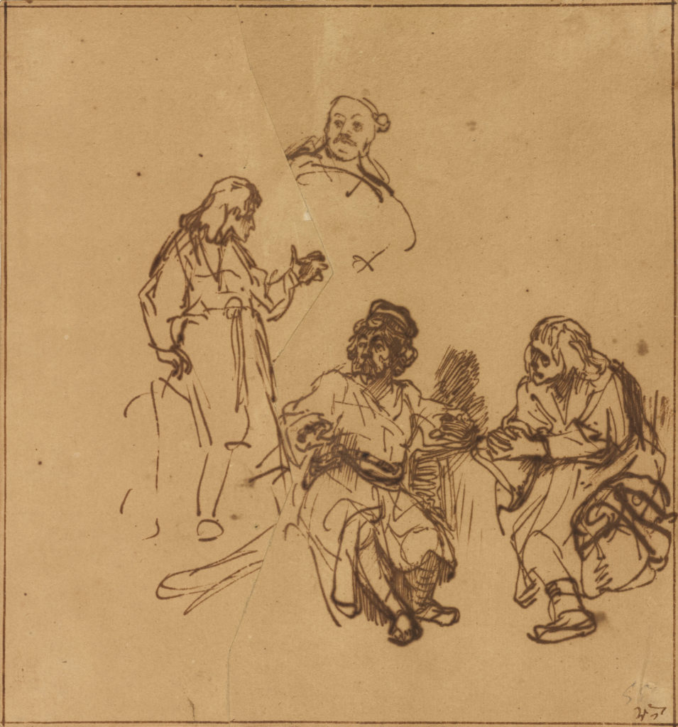
Joseph in Prison Interpreting the Dreams of Pharoah’s Baker and Butler, about 1639, Rembrandt Harmensz. van Rijn. Pen and brown ink on light brown prepared paper, 7 7/8 × 7 3/8 in. The J. Paul Getty Museum, 95.GA.18. Digital image courtesy of the Getty’s Open Content Program
Here’s a fascinating case study in how to make the most of your errors, from the one and only Rembrandt van Rijn. Because he used ink in the sketch above Rembrandt was unable to successfully cover up a mistake by simply crossing out the form. How did he bounce back? He pasted a zigzag-shaped piece of paper on top of his first try so he wouldn’t have to start from scratch, then redrew the figure on the left. He further showed his frustration with this study by working the face of the central figure into something almost unrecognizable, then redrew the facial expression more cleanly above.
Scratch It Out
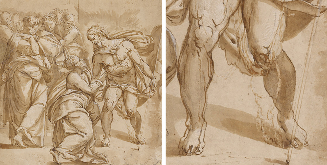
The Incredulity of Thomas, about 1565, Pellegrino Tibaldi. Pen and brown ink and brown wash, heightened with white bodycolor, over black chalk, 11 1/16 × 10 3/4 in. The J. Paul Getty Museum, 96.GB.318. Digital image courtesy of the Getty’s Open Content Program
When all else fails, sometimes you just have to scratch out your slip-ups. In this work by artist Pellegrino Tibaldi, the position of the main figure’s left leg was not accurate. Perhaps the foreshortening was off, or maybe it was looking a little too slim, but either way he wasn’t happy with his first try. Luckily, the artist had only used a thin line to establish the form at that point. Tibaldi adjusted the appendage slightly, and built up the calf muscle to better match the robust figure. He then scratched out the previous marking, leaving behind a ghostly impression of the original leg—still visible if you look closely.
The artist also developed the figure’s other leg with minor adjustments that didn’t require obscuring the first leg quite so completely.
Paint It Over
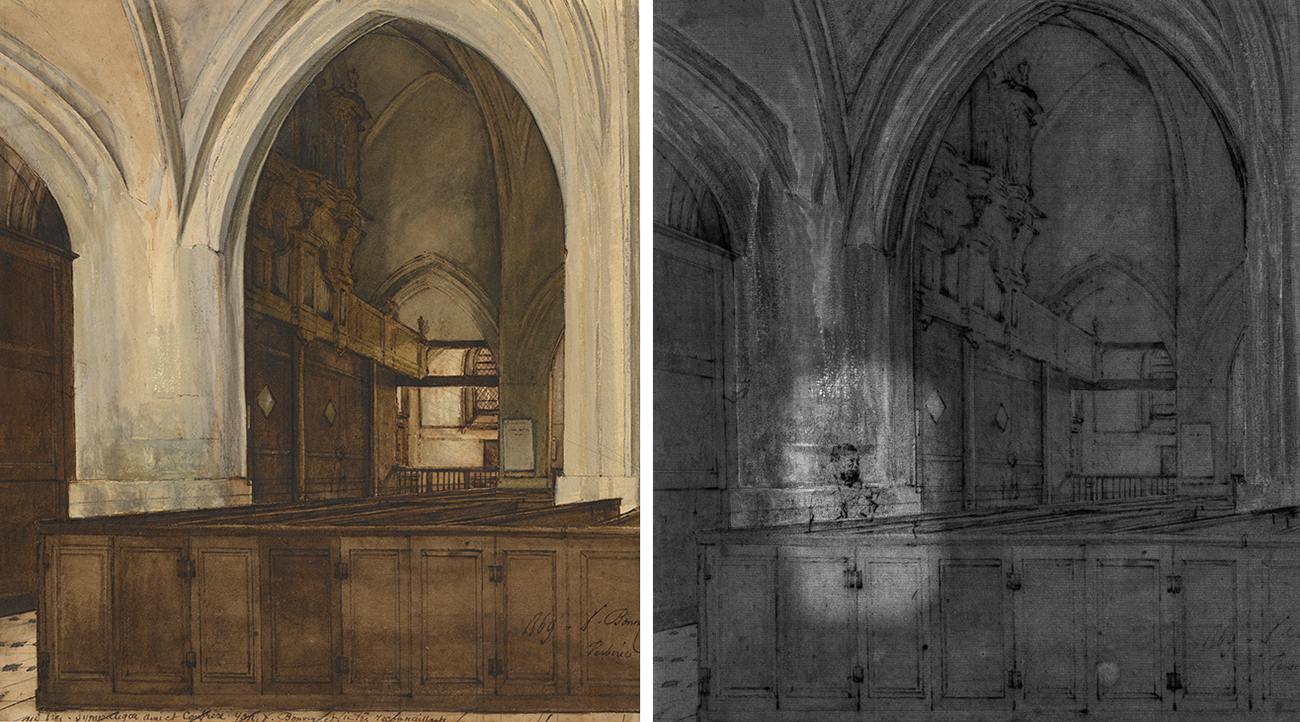
Interior of Abbey of Aramont at Verberie, 1869, François Bonvin. Brush with brown wash and watercolor and white gouache over graphite, 12 1/8 × 10 15/16 in. The J. Paul Getty Museum, 2000.34. Digital image courtesy of the Getty’s Open Content Program
The ethereal monastery in this work might seem empty, but Stephanie knows from looking at it through transmitted-light photography that there was once a figure in this place of contemplation, in the spot of the central pillar. The artist must have decided that the stoic abbey already looked somber enough, so he painted over the figure with opaque wash.



Not mistakes, reconsiderations. There is a world of difference.
I remember being obsessed with Rembrandt’s sketch “The French Bed” because there are too many hands on one side of the bodies. Now every time I look at sketches by famous artists I search for corrections/mistakes.