
Twelve undergrads at ArtCenter College of Design in Pasadena spent winter quarter developing experimental designs for the upcoming Getty Museum exhibition Golden Kingdoms: Luxury and Legacy in the Ancient Americas, which explores luxury arts in pre-Columbian cultures over a span of 2,500 years.
The project grouped students from various design majors into small teams to be exhibition designers for 14 weeks—considering everything from space planning to casework to digital engagement. They developed their designs in collaboration with exhibition curator Kim Richter and research assistants Marissa Del Toro and Emma Turner-Trujillo; Getty designers Robert Checchi, Francois Aubret, and Merritt Price; and ArtCenter course instructors Robert (Rob) Ball and Chiara Ferrari.
Completing this real-world, cross-disciplinary project enabled students to “make a huge leap in understanding experience design, and gaining skills outside their comfort zone,” Rob told us. It also offered real-life experience in how to fulfill a design brief, added Chiara, “learning how to design for a client, as opposed to expressing their own identity.” In other words, it was hard! Students found out how challenging and complex the exhibition designer’s job is, and how many moving parts (and opinions) are involved.
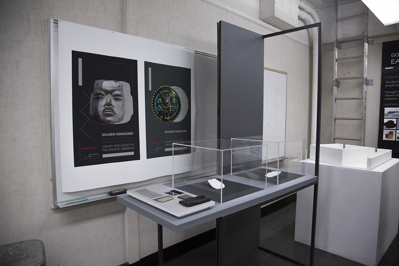
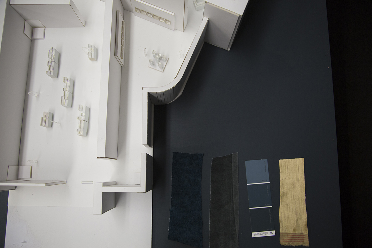
We sat in on the students’ final presentations, which included display boards with key concepts, color schemes, floor plans and elevations, and graphics; scale mockups of artwork cases; and ideas for marketing, social media, and retail. Here is each team’s big idea, and a sample of the feedback—what worked best, what didn’t hit the mark, and what emerging designers should keep in mind for next time.
Concept 1: “Celebration of Details”

Maryam Aziz (illustration), Mana Koike (product design), Behnia Rahmati (environmental design; not pictured)


Students’ concept: Artwork details are the guiding principle for this design. The gallery interior is painted a rich eggplant that offers a visual contrast with the luxurious materials of jade, gold, and feathers used in the artwork on display. Graphics of key details from specific artworks appear on the walls and as metal cutouts on freestanding cases, which have wraparound wood moulding to emphasize the objects’ connection with the earth.
Pros’ take: The use of objects’ iconography as metal cutouts next to object labels is extremely visually effective, serving as beautiful graphic elements and potential retail inspiration. They would have been more effective, however, if given a stronger interpretive or educational purpose. Some of the proposed elements—street banners made of cutout metal, for example—are beautiful, but impractical.
Students’ biggest challenges: The product designer on the team was used to problem-solving for very specific target users, so designing an experience that would work for all visitors was a challenge. The illustrator, meanwhile, had to learn to relinquish her personal style to design graphics that would be faithful to the artwork in the show.
Students’ tips for designers-in-training:
- Understand your client’s brand before beginning a project. Early designs featured bright colors, for example, that didn’t harmonize with the sophisticated approach preferred by the Getty. (“Sophisticated” was a word the students used a lot to describe us.)
- Learn Rhino, a software program for designing 3D environments.
- Go to museums and look at how the public interacts with art. Find out what they like and don’t like. Don’t imagine that visitors are just like you: Interview! Ask!
Concept 2: “Earth and Sky”

Mario Rosado (product design), Yichieh Wang (environmental design), Phylicia Leinweber (environmental design), Dwayne Jeon (product design)


Students’ concept: This design plays with intersecting horizontal and vertical planes that evoke earth and sky. Inspired by the idea that past and present are one, tall cases with gradient mirrors offer viewers an opportunity to glimpse themselves with the objects, while also framing the space and suggesting “travel through the clouds.” Materials including limestone, basalt, and glass take inspiration from the artwork while lending a contemporary feel.
Pros’ take: The play with horizontal and vertical formats, and the use of mirrored glass and limestone that evoke the materials of the artwork, are brilliant conceptually. But will mirrors distract from the experience of the art (or are they a clever selfie experience that marketing could harness for promotion)? As a practical matter, the cantilevered high-back cases pose real-world challenges for lighting objects and navigating the space, especially for visitors using wheelchairs.
Students’ biggest challenges: The project had so many constraints, students said, set by the space, the Getty, the exhibition narrative, and the many small artworks (nearly 300 items). Team members had to find ways to work together despite their differences: the environmental designers favored emotion and big-picture thinking, while the product designers gravitated toward details and research.
Students’ tips for designers-in-training:
- Learn how to work in a team. Understand your teammates’ styles and motivations. Balance the workload fairly, then hold one another responsible and accountable. Learn trust: Figure out what you’re good at and do that, instead of trying to do everything.
- Make mistakes fast and early.
- Get all the specs up front: What anchoring system will be used? Is this ADA compliant? What is the height of the light tracking panel?
- When designing for a space, spend time there to understand how people interact with it.
Concept 3: “The Borderless Journey”
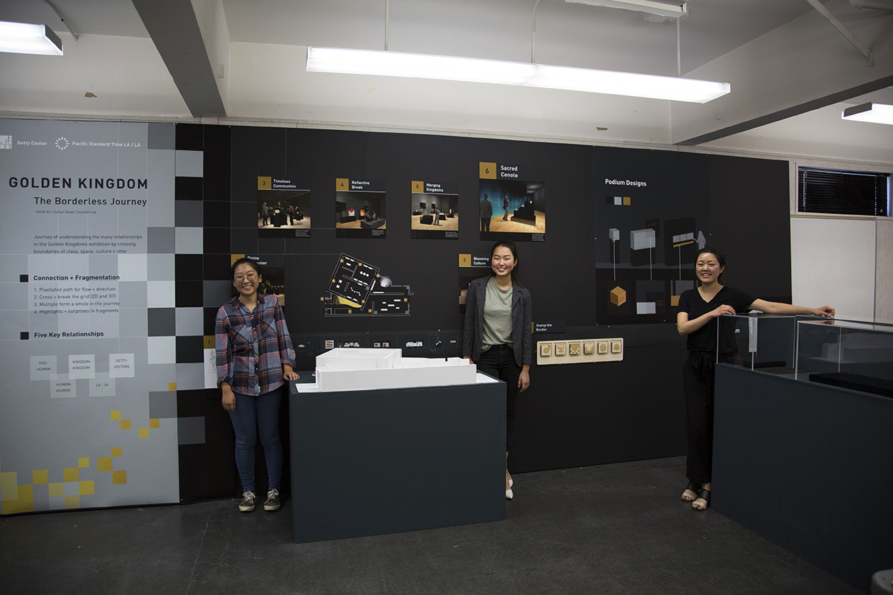
Su sun Kwak (environmental design), Hanbi Ko (product design), Scarlett Lee (product design)


Students’ concept: Playing with the concept of “connection and fragmentation,” this proposal uses the visual metaphor of the single pixel to form design multiples in signage and furniture that lead the viewer through the exhibition journey. The center of the journey features an immersive experience evoking a cenote, while the final gallery invites visitors to use large stamps (in square form, again like a pixel) to share their favorite artwork from the show.
Pros’ take: Standout details are a golden vinyl map running up the stairs to the Getty’s Exhibitions Pavilion and a nose-ornament-shaped lollipop (yes really) for the exhibition shop. The modular cases are beautiful, adaptable, and practical, and “will look as good in 10 years as they do today.” The graphics, however, sometimes foreground the design over the artwork they are meant to showcase, and more variation in color would have increased visual interest as well as helped lead viewers through the sections of the exhibition.
Students’ biggest challenges: It’s hard to see an exhibition as a whole when it has so many aspects, students said—research, marketing, graphics, mount making, lighting, traffic flow. On this project, it was a challenge to create a design that was informative yet creative, high-concept yet practical, and that matched the Getty brand: sophisticated, modern, classic, and “not too crazy creative.”
Students’ tips for designers-in-training:
- Have a strong concept you believe in, and let all your decisions come from there.
- When working with teams and clients, find a balance between compromising and pushing your idea forward.
- For each and every object, ask: Is this object what we think it is? Are we as designers interpreting it the right way?
- Be willing to try crazy things.
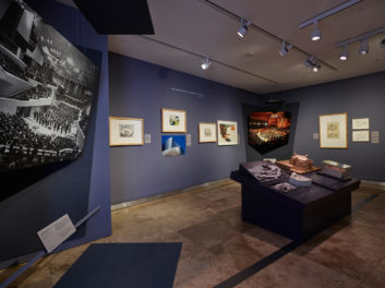
The final part of students’ journey with Golden Kingdoms will be a visit to the completed exhibition (September 16, 2017–January 28, 2018) with a tour by senior Getty designer Robert Checchi—he’ll discuss how he approached the challenges of the exhibition’s design and describe the many details involved in creating the final product.

Lucky! Maybe if I dress up like an Art Center student can I blend in and join what should be a fascinating tour by Robert Checchi.