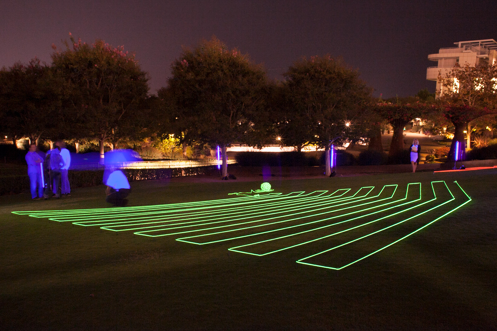
Yellow Lawn Drawing, installation at the Getty Center, October 14, 2017. Photo courtesy of and © Krysten Cunningham
I’ve always been drawn to the neo-Concrete artworks of the Brazilian artists Lygia Clark and Hélio Oiticica. When I was approached by curator Zanna Gibert to make a new artwork in response to the exhibition Making Art Concrete: Works from Argentina and Brazil in the Colección Patricia Phelps de Cisneros at the Getty, I was intrigued by the fact that many of the works shown in the exhibition predated the neo-Concrete shift away from the purely formal geometric work of the Concrete artists. I was inspired by the idea of the moment before a big breakthrough or major shift in practice. It seemed like a very generative moment. What were the edges of the geometric problems with which these artists were struggling? What brought them to the next step in their work?
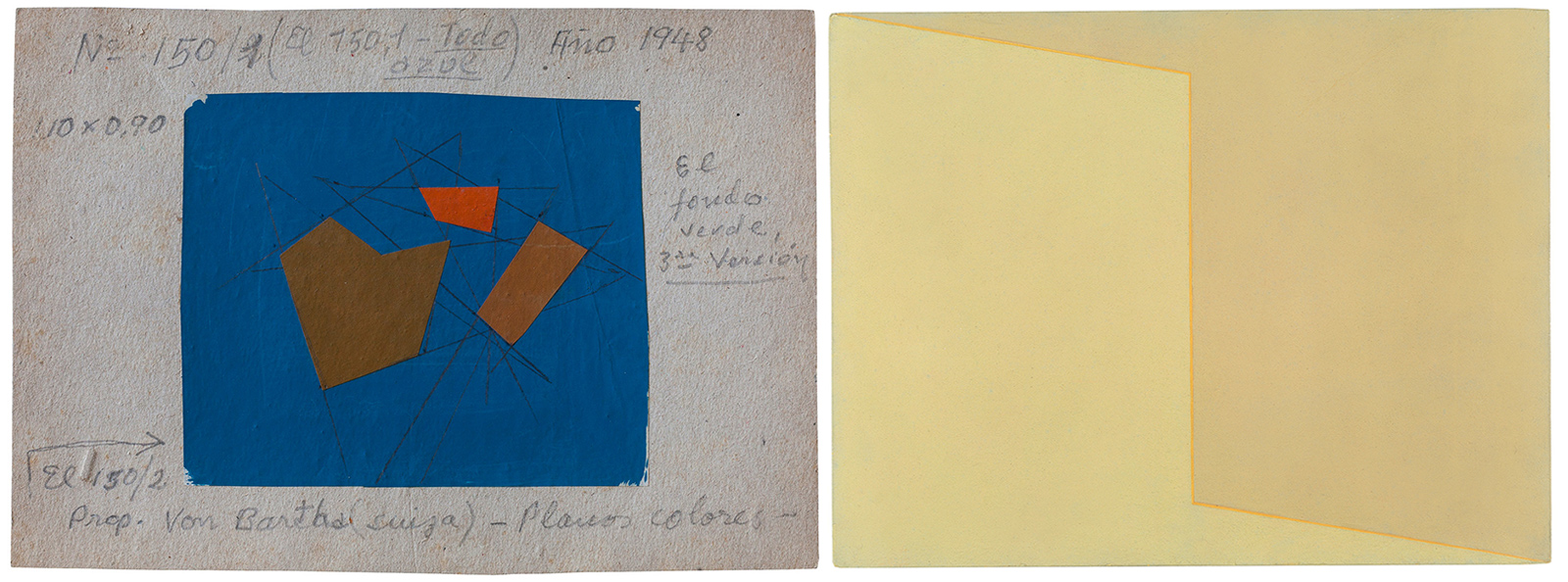
Left: Sketch for Invención no. 150, 1948, Raúl Lozza. Gouache and graphite with collage of cut paper on board, 6 3/16 x 8 13/16 in. Raúl Naon Archive. Courtesy Elida Lozza. Right: Cromática 6 (Chromatic no. 6), 1960, Aluisio Carvão. Alkyd, drying oil, and beeswax on hardboard, 10 3/8 × 13 1/2 × 9/16 in. Colección Patricia Phelps de Cisneros. Courtesy of Andréa Proença
I knew that I wanted to make large-scale geometric drawings on the Getty lawn and was looking for a shape to which I could apply projective geometry in order to create the illusion of three-dimensional space. I liked the Sketch for Invención no. 150 by Raúl Lozza and Aluisio Carvão’s Chromatic no. 6. The shaped canvases of Juan Melé and Camelo Arden Quin in the exhibition catalogue were also points of departure. But when I applied projective geometries to their shapes it overcomplicated their forms; none of the results satisfied me. Interestingly these were all paintings, and I felt the artworks worked best as paintings, in two dimensions. Then I discovered Lygia Clark’s Casulo(Cocoon) and it changed the game.
Conceptually, Clark demonstrates a very different sort of geometry than the other artists in the group. In Clark’s work the z-dimension is at play in an intuitive, mathematical way. The Casulosare made from folded sheet metal, so they are three-dimensional works manipulated out of two-dimensional sheets. They are relief sculptures folded back in on themselves, seeming to reside between two and three dimensions.
The mind has to work a little harder to understand this ambiguity—harder than if one were looking at a painting of the same shapes. I find that the Casulos are quite complex pieces to look at; maybe that’s why Clark gave in to the whole haptic in the end. At first I only had photographs of the Casulos to work from, which forced a particular angle of reference and flattened the forms. But even photographic images of the Casulos provoke a complex set of signals for the parts of our brains devoted to spatial recognition. It’s difficult to say how exactly, but this is what I sense.
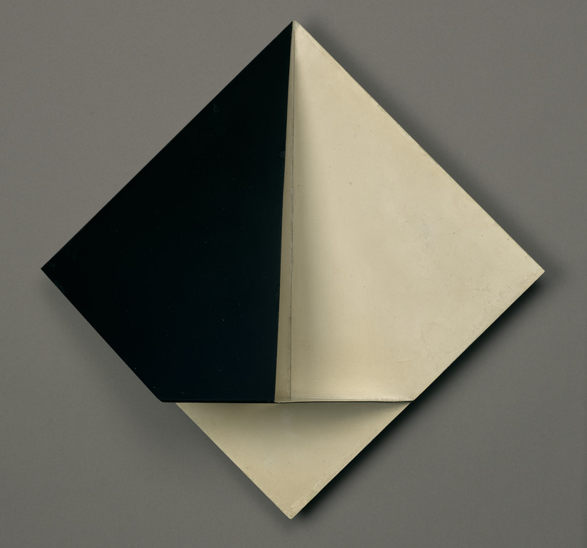
Casulo no. 2 (Cocoon no. 2), 1959, Lygia Clark. Nitrocellulose on sheet metal, 11 7/8 × 11 7/8 × 4 5/16 in. Colección Patricia Phelps de Cisneros. Promised gift to the Museum of Modern Art, New York, through the Latin American and Caribbean Fund in honor of Kathy Halbreich. Courtesy of “The World of Lygia Clark” Cultural Association
I was also thinking about the Poincaré Conjecture that Grigori Perelman essentially solved in 2000. He did this by tucking and folding three-dimensional space around a sphere. For whatever reason, the conjecture hadn’t been solved in 90 years. This dangling topological problem must have intrigued artists like Max Bill and Piet Mondrian. They were thinking about extra spatial dimensions and could have even attended some of the public lectures that Poincare gave in Paris in the early 1900s. Bill and Mondrian influenced the Concretists. Clark, in particular, obviously took on some of these mathematical quandaries. Her Caminhando is one of the most beautiful and mysterious demonstrations of topological manifold separations in the history of modern art.
When Zanna showed me Clark’s Casulo No. 2 at the Getty, I was excited by its complex folded form. I was perplexed about how Clark actually made it; I attempted to recreate it and eventually gave up. Working from photographs totally confused me. What I took away was the triangle, the predominant shape in the Casulo. To arrive at my Lawn Drawing shapes I simply cut out a triangle from a piece of paper and folded it in three-dimensional space. Then I drew pictures of how I perceived the shape from different perspectives. I created the illusion of three-dimensionality by folding rather than projecting. The two methods are really different. Moreover, the act of folding my shape brought the work out of the two-dimensional realm of geometry and into the three-dimensional realm of topology.
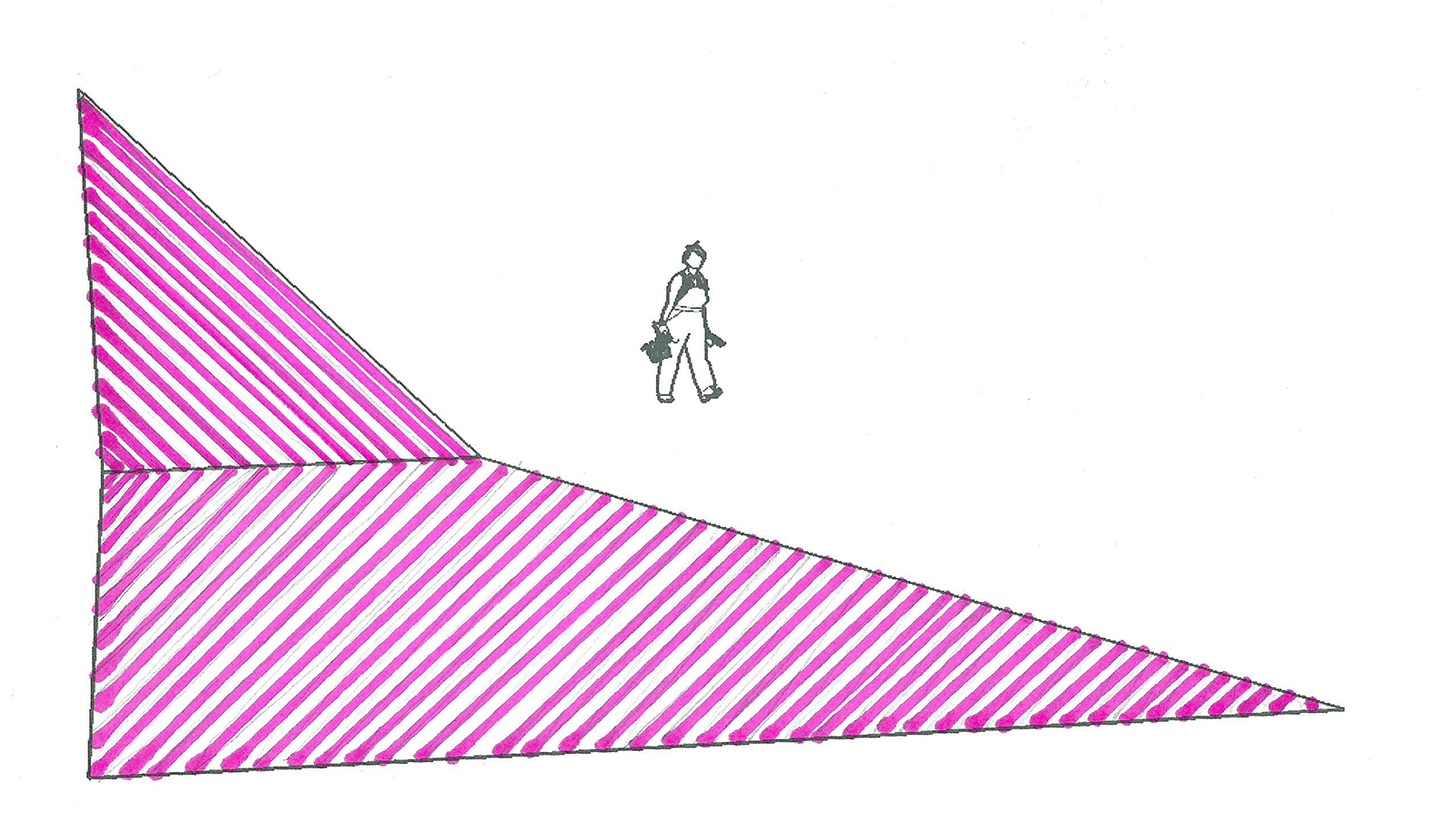
Sketch for Pink Lawn Drawing, 2017, Krysten Cunningham. Image courtesy of and © Krysten Cunningham
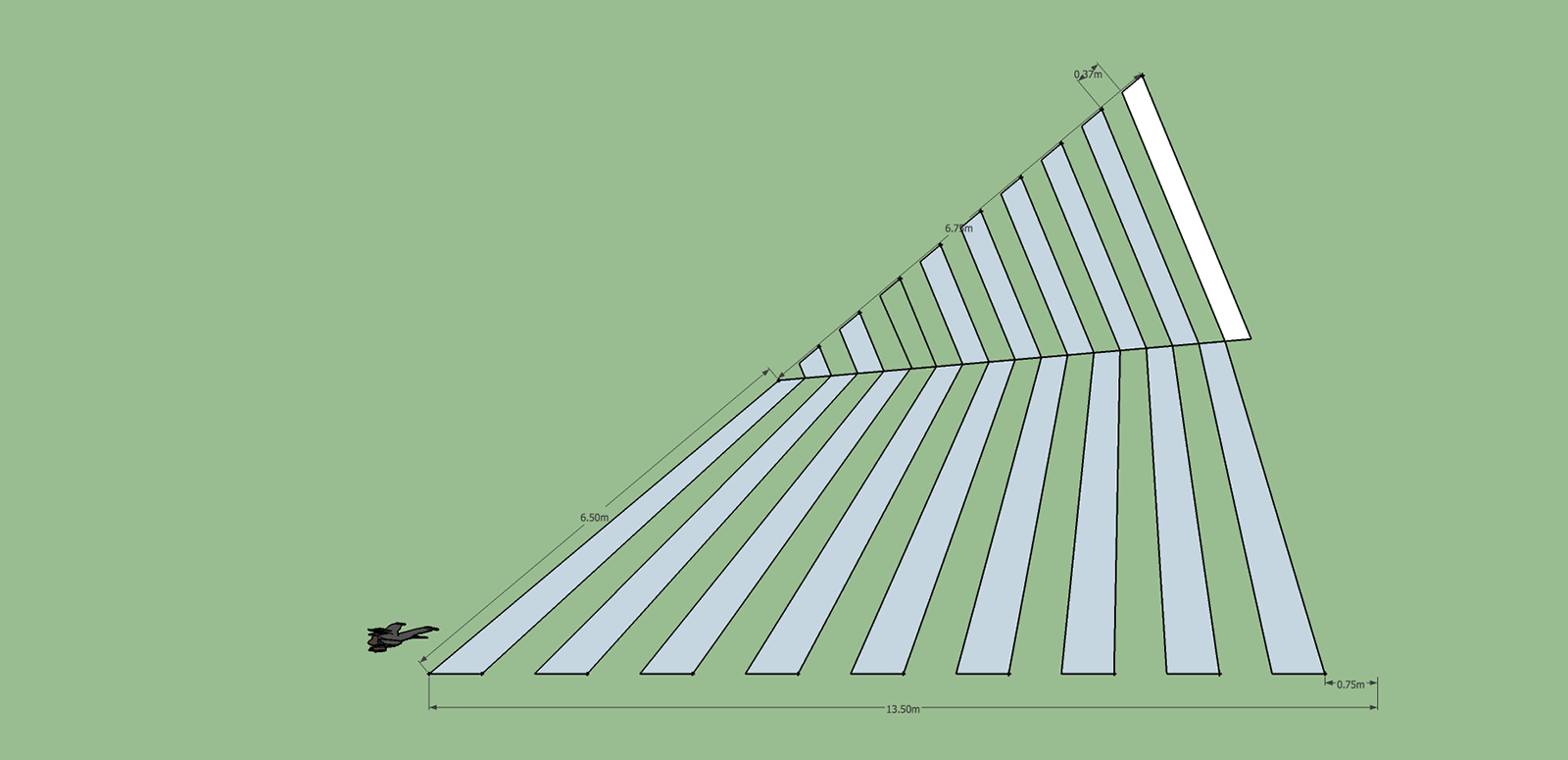
Sketch for Yellow Lawn Drawing, 2017, Krysten Cunningham. Image courtesy of and © Krysten Cunningham
Placing the works was tricky because the architecture of the Getty Center is complex and labyrinthine, and we wanted people to be able to interact with the works. We decided to place them on the lawn of the Central Garden (itself an artwork designed by Robert Irwin), where people hang out and picnic and kids run around. We wanted the pieces to be visible from the multiple levels of the entrances and exits of the exhibition spaces. This worked out really well in the end. Some of the best views were from a third-floor balcony far above the garden. I preferred the intimacy of being in the garden with the pieces, but after seeing so many people on the third level taking photos of the work, I think it was a successful visual situation from any vantage point.
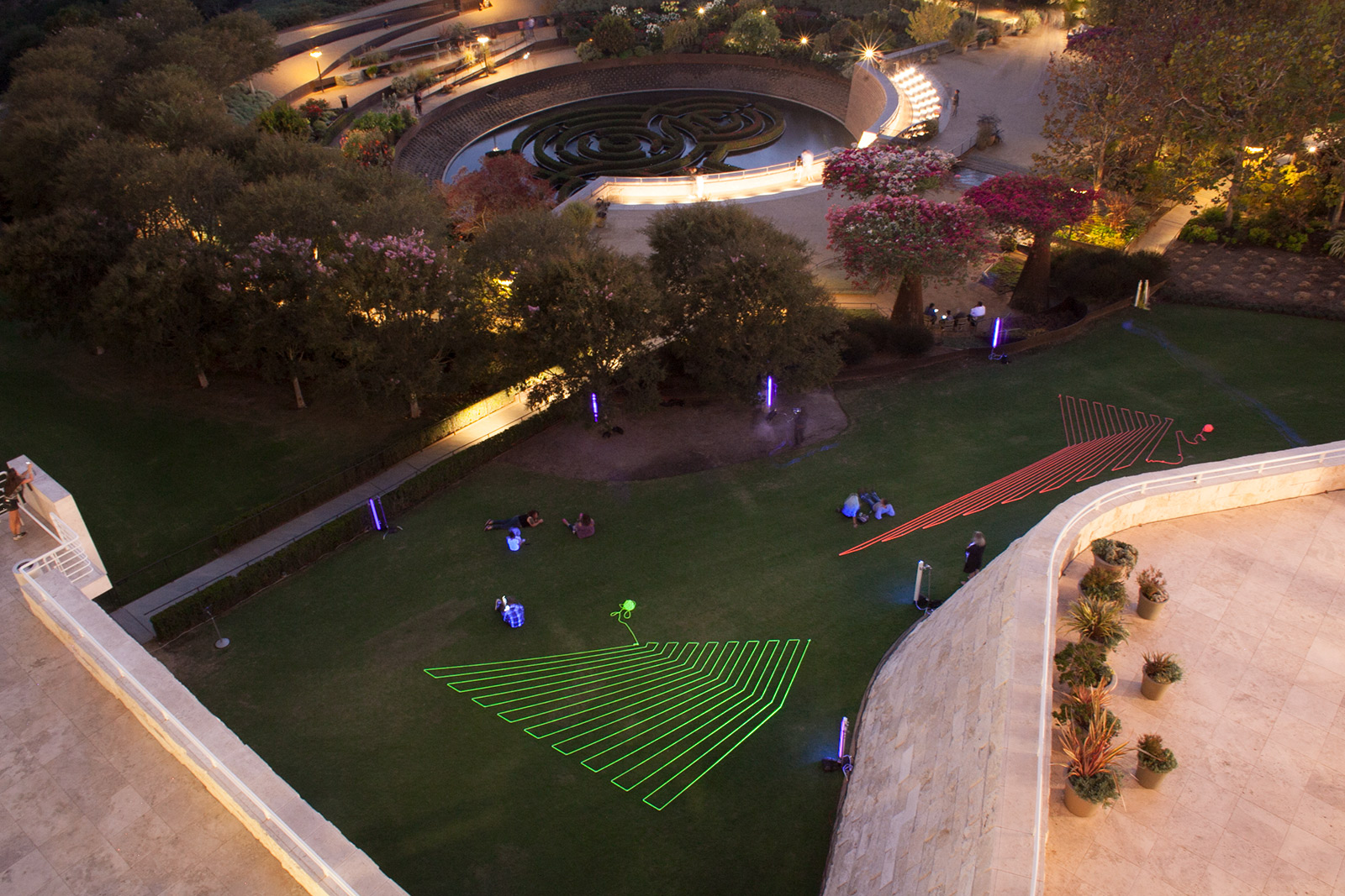
Lawn Drawings, installation at the Getty Center, October 14, 2017. Photo courtesy of and © Krysten Cunningham
By lighting the pieces with black lights, we also made them glow at night. It was quite enchanting—people were drawn down to the gardens after seeing the pieces from above. Throughout the night there was a steady stream of visitors who milled around, sat, and chatted by the sculptures. (Of course everyone tried to photograph the pieces, too. But I don’t think they got very good images because they were using iPhones without tripods, and probably couldn’t control their exposures very well.)
The fact that the drawings fluoresced was important. I had just made a series of day-glow hammocks for an exhibition at the Mt. Wilson Observatory titled Knowledges. I lit the hammocks with black lights and liked the effect within a natural landscape. It had a similar effect as looking at the stars at night—a feeling of the infinite. The Getty pieces required more light because we had to cover a larger surface area, but the fluorescence made the garden a mesmerizing space that evening. The rope had to be hand-painted with fluorescent paint, so the pieces are paintings as well as drawings.
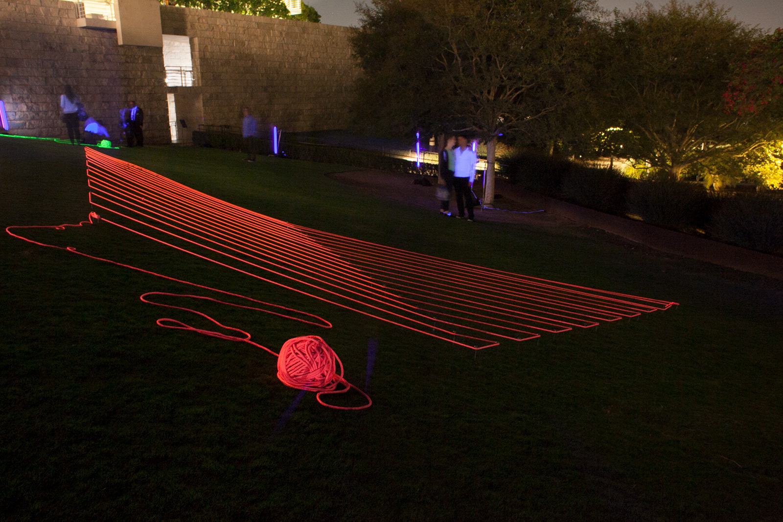
Pink Lawn Drawing, installation at the Getty Center, October 14, 2017. Photo courtesy of and © Krysten Cunningham
Because I had to complete the installation within one day, there was a performance-art aspect to the work, too. In preparation for the final installation, I installed and deinstalled the pieces a couple of times. Mostly I practiced on a baseball field at the Shady Rest Park in Mammoth Lakes at 8,000 feet, where there is less oxygen, because I was doing a residency there at the time. When I executed the final work at the Getty at 1,000 feet in 94-degree heat, I was glad that the initial practice conditions had been so tough. At the Getty, I worked with fellow artist Antonia Pinter to measure out all the angles over the course of an afternoon. We almost passed out in the heat. We wore contractor badges and had the garden cordoned off; I think people enjoyed seeing us work in a pedestrian way.
There were lots of decisions to make about angles. At a 20–30-foot scale and with my rudimentary measuring tools there was also a large margin of error. I had to approximate the angles and lengths of the lines on site, but this didn’t matter aesthetically. The forces of tension and gravity that were acting on the pieces were also a little challenging, but since they were designed to be temporary I just soaked up the experience. I learned a lot about what I could do to make the pieces next time.
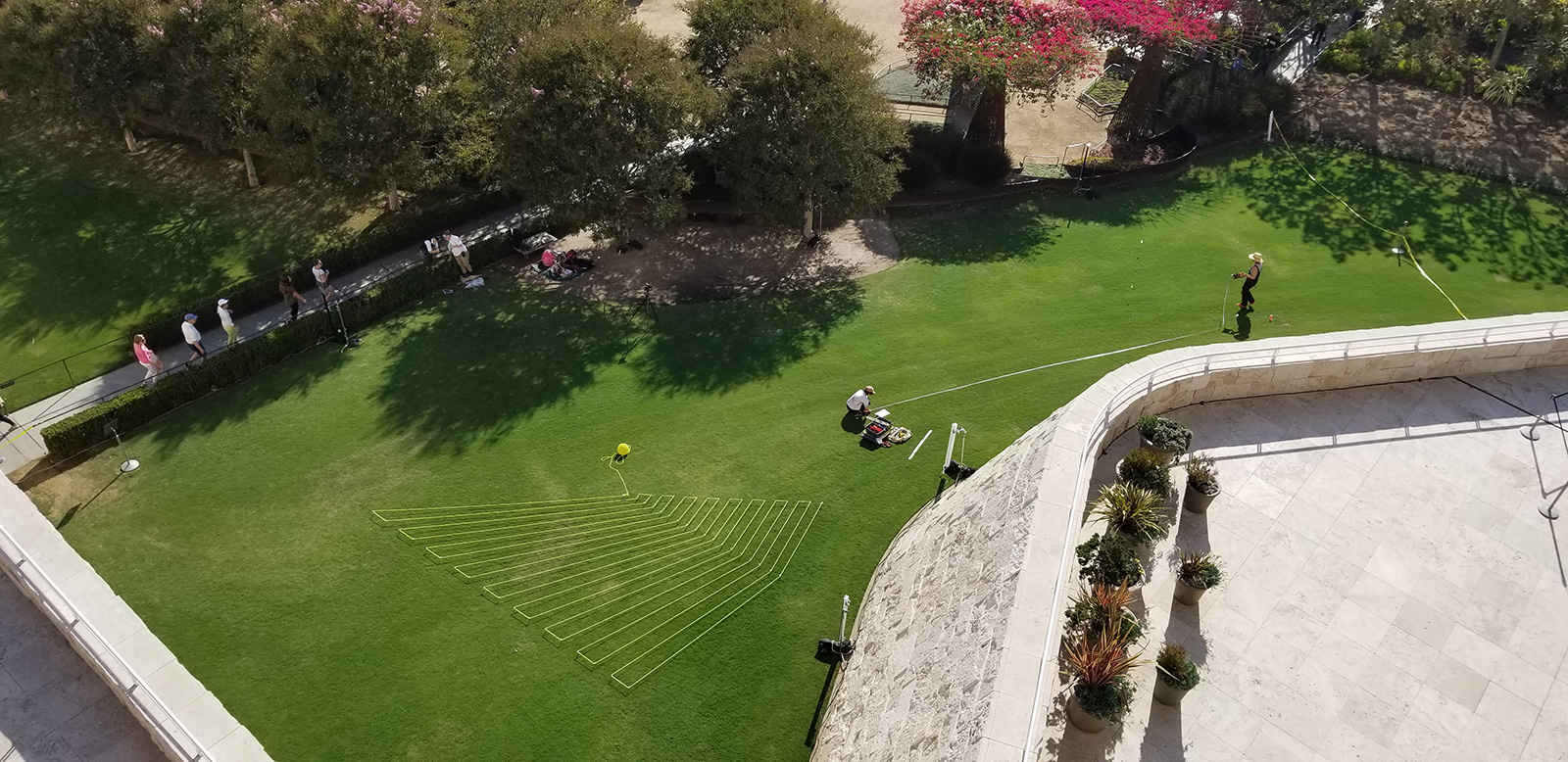
Krysten Cunningham and Antonia Pinter installing Lawn Drawings at the Getty Center on the morning of October 14, 2017. Photo: Daniela Alvarez
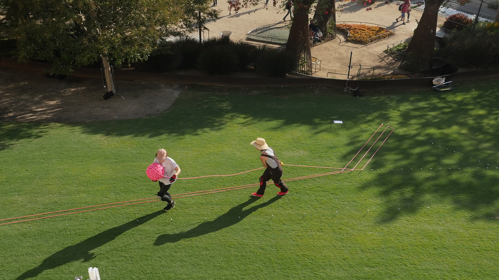
Installing Pink Lawn Drawing. Photo: Daniela Alvarez
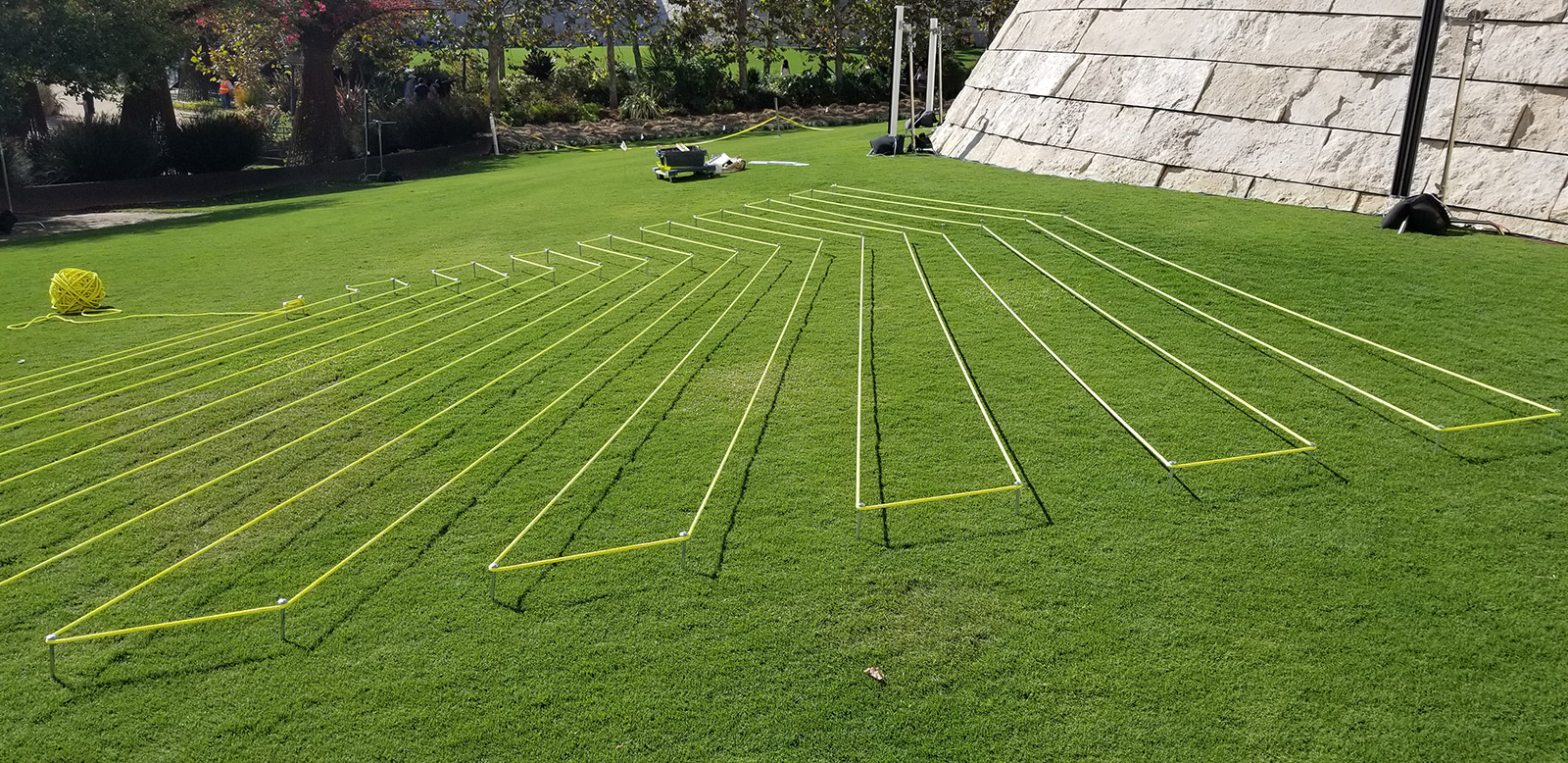
Yellow Lawn Drawing, nearly complete. Photo: Daniela Alvarez
We wanted to leave Lawn Drawings standing for longer than one day so that more people could experience the work, but the way it was conceived was as an “event”—and it was worth it to see the work installed and active. One of the ways I work is by winding and rewinding different tie-ups on armatures. So I am very used to making my pieces and then unmaking them.
I really enjoyed working at this large scale. This was also the first time I applied this kind of work to a horizontal surface and in the outdoors. So for me, the whole experience was transformative.
This project also prompted me to think about geometric functions as entities that have character and even personality. For instance, I was completely filled with admiration for points in space. A point is very forgiving and has a lot of potential, even if it is also slightly invisible. The clarity of angles started to amaze me in new ways. They create an incision into space that is such a clear event. And drawing out the lines within the shapes, pulling the rope taught, was incredibly rewarding—to see the work appear suddenly.
So much labor went into Lawn Drawings. It wasn’t just me drawing at a desk, it was much more architectural. I started to appreciate obtuse angles in a way that I had not before. I had a prejudice against them before this project—I’m not sure where the prejudice came from, maybe the book Flatland where an angle’s degree is related to the object’s intelligence? But that doesn’t make sense. I think I also got teased for being “obtuse” when I was a teenager and didn’t want to be seen in that way. I guess I was taking out my frustrations on mathematical shapes. Now I see how important obtuse angles are for creating harmony and stability and for establishing horizontality itself.


Comments on this post are now closed.