What goes into making an exhibition? A look inside the design process at the Getty Villa
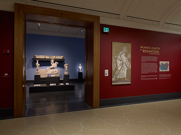
Installation view of Heaven and Earth: Art of Byzantium from Greek Collections at the Getty Villa
What does it take to design a museum exhibition? Many more steps than many visitors ever realize. Heaven and Earth: Art of Byzantium from Greek Collections—like all exhibitions—did not come about overnight. It took over a year of careful planning and decision-making to design an environment in which the artwork could be displayed safely and beautifully.
 To create this “effortless” and intuitive environment, Getty Museum designers and curators had to take many steps that led to the ultimate installation and opening. Aesthetic and practical considerations dominated the decisions of both the exhibition curator, Mary Louise Hart, and the designer, Robert Checchi, who shared their behind-the-scenes journey with me.
Planning the Layout

SketchUp model of the galleries for Heaven and Earth
The design process for Heaven and Earth began in the Getty Museum’s annual exhibition-planning period, almost a full year before the show. The first step for Mary and Robert was to plan the exhibition’s layout—what artwork and information panels would go where, and how visitors would move through the space—and decide how many cases would be needed to properly display the objects.
Robert drew plans in the autocad software Vectorworks, and together they began to decide the placement of art on the floor and the walls. Robert then recreated the digital plans in a 3D model using SketchUp, complete with artworks, to better manipulate and arrange the objects. The last step in the process was to revise the plans and add wall elevations in Vectorworks to create a finalized drawing set.
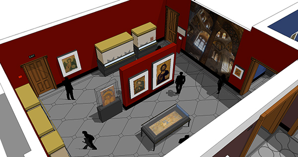
Digital rendering showing paint colors, visitor flow, and scale of the artworks in the space
Positioning Works of Art
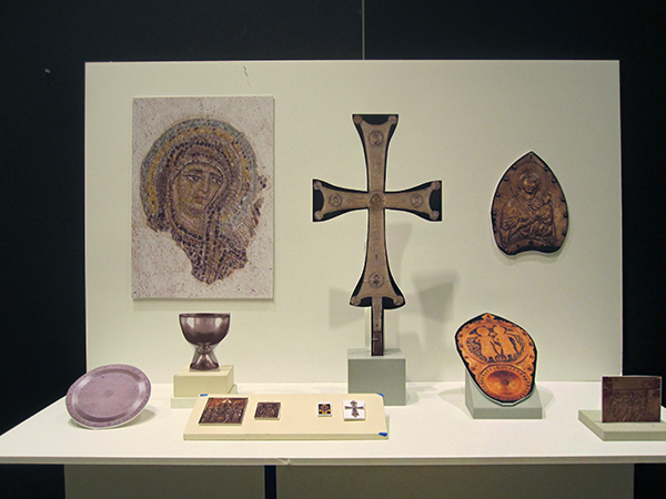
Mockup of case seen in Heaven and Earth
The objects and paintings in Heaven and Earth come in a wide range of materials and sizes, from extremely large icons to tiny pieces of golden jewelry. Deciding where to place these works was equal parts design and science.
Each piece was placed at a height and position that optimizes viewing. For example, the sculpted figures in the center of the first gallery (shown below) are placed at eye level with a standing adult viewer in order to provide direct interaction with each piece. Mary and Robert worked with full size printed mock-ups in order to determine object relationships and placement within each case. The texts next to the objects are equally well considered. The font sizing changes, making reading the placard comfortable at any level. These small but important considerations create a comfortable and intuitive experience for visitors, allowing them to focus directly on the artwork.
Choosing the Wall Colors
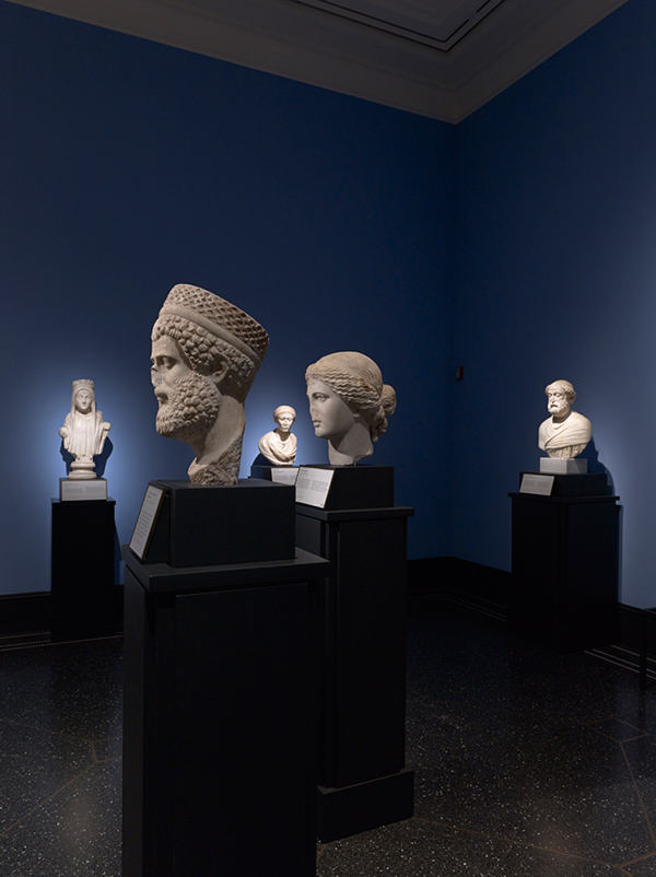
The first gallery of Heaven and Earth glows a deep blue
During the planning stage, Robert and Mary also worked together to select paint colors for the many spaces of the exhibit, including the three main galleries, the corridor galleries (which are also part of the show), and the small passage between the second and third galleries.
For this exhibition, decisions were based on the cultural context of the works in each individual gallery. Mary explained that the first gallery is painted a bright blue (Benjamin Moore “Sky Blue”) to reflect the Mediterranean sky, while the two other large galleries are painted the same vibrant red (Benjamin Moore “Raspberry Truffle”), both to draw out the gold of the dynamic Byzantine icons and to emphasize the connections between the artworks in the two spaces.
The color of the corridor gallery that links the three spaces, Benjamin Moore “Raisin Torte,” was intended to reflect the porphyry stone used in the Byzantine era and to act as a bridging component between the two other colors and their represented eras. The harmony of these colors creates a peaceful and logical adjustment for the viewer moving through each section of the exhibition.

Icons glow against “Raspberry Truffle” walls.
Protecting the Art
In making decisions about displaying the exhibition, the team had more to consider than story and visuals. They had to take into account two external factors that come with being on the California coast: earthquakes and humidity.
Some of the most vulnerable marble sculptures are fastened to their bases via hidden technology that allows them to gently sway during an earthquake. Inside the bases supporting these works are forty-four-inch square twin isolators that make it possible for the art to move up to eighteen inches horizontally, all the while remaining securely fastened to their display furniture. As a mountmaker shared with me, “to topple the marble pieces, the earthquake would have to be catastrophic, likely taking down structures as well as objects.”
Works mounted on the walls are equally well protected. At the Getty Villa, the walls are equipped with steel beams to safely and securely support the weight of almost anything—even an automobile (given the proper mount, of course!).
Humidity resulting from the Villa’s oceanside location is also a further complicating factor in displaying and monitoring works. Each icon is enclosed in a plexiglass vitrined shadowbox that is meant to seal it from the surrounding elements. As an added precaution, within each of the sealed boxes is a layer of desiccants to absorb any latent moisture that could enter the space. Finally, in addition to both of these measures, each work is also equipped with a data logger that is read every few days by a conservator to verify the internal humidity, ideally 50%.
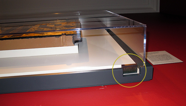
Data loggers like this one (indicated by the yellow circle) monitor environmental conditions inside the artwork frames
Installing the Galleries
Once all the decisions about layout, design, and safety had been made—and all the wall panels and labels written and artwork shipped—the exhibition was ready to be installed. Before any works even arrived in the galleries, each frame was mounted and each case installed so that every work could be placed directly in its temporary home.
Each pedestal or case also contained notes drawn up by the designer and conservators indicating precisely how, and under what conditions, each piece should be installed. This was done in order to make the installation process as controlled and smooth as possible. With many pieces on loan from other institutions, the installation process can be tiring and time-consuming, since each work must be installed in the presence of the courier who has transported it from its original locale and is charged with overseeing its safekeeping while on loan.
Once all is installed and done, the exhibition team is free to finally breathe again…at least until the exhibition closes.
Text of this post © Laura Horan. All rights reserved.


Comments on this post are now closed.