
Kurt in the design space
Kurt Hauser is a book designer who has worked at Getty Publications for over twenty-five years, skillfully merging text and images into volumes that are art objects unto themselves. Two of his recent projects spotlight the thoughtful decisions and creative license that goes into every aspect of book design, from the choice of paper and typeface to the texture and feel of the cover.
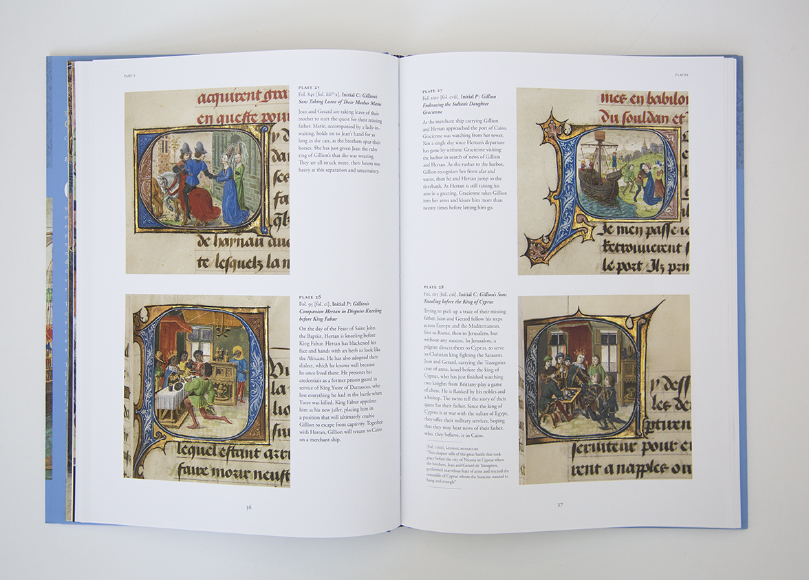
The book Noir: The Romance of Black in 19th-Century French Drawings and Prints, which accompanies the exhibition of the same name now at the Getty Museum, focuses on dark drawings and prints by artists such as Francisco de Goya, Gustave Courbet, and Odilon Redon. The Adventures of Gillion de Trazegnies: Chivalry and Romance in the Medieval East explores the 15th-century illuminated manuscript known as The Romance of Gillion de Trazegnies, which follows the exploits of a medieval nobleman who travels to the Middle East on a pilgrimage.
Both of these assignments came with interesting challenges. For Noir Kurt needed to design pages that would evoke other works on paper, and for Gillion he was tasked with designing a book about a book. I asked Kurt about the design process behind these two projects, and he offered insights into the artistry that shapes, sometimes invisibly, our reading experiences.

Subliminal Design Cues
The two books vary in size and texture, suggesting that the feel of a book is as important as its appearance. Indeed, printed books are sensory objects whose shape, size, color, and materials reinforce their text and tone. Noir is printed on uncoated paper, which, as Kurt told me, is “appropriate for the reader’s experience, as it is a subliminal reminder of the paper of the original drawings and prints” presented in the book.

The Noir cover features a black fabric binding along the spine. Kurt told me it “was inspired by the almost-iconic art school and artists’ portfolios, which are paper-covered boards with a black cloth spine that wraps around a bit.” In contrast with the matte binding, the word “Noir” on the cover is glossy, making the title legible from a distance. This clarity is a matter of both practicality and marketability, for as Kurt points out, “On a bookstore shelf, a book cover acts as its poster.”
Under the jacket for The Adventures of Gillion, by contrast, the cover is made from fabric stamped with a unique pattern. Kurt was inspired by a Flemish script in the Getty’s original illuminated manuscript. “The design is meant to look and feel like the tooled or carved bindings on old manuscripts,” is how he put it. The printer translated the design to a metal die and then stamped the bookbinding before it was bound with pages.
Swashbuckling and Sans Serif

The title for The Adventures of Gillion uses two typefaces. Why? “The words ‘The Adventures of’ just needed something a little on the swashbuckling side. It reflects the Gillion story and adventure set in both the medieval European and Islamic worlds.”

Victorian poster advertising Pablo Fanque’s circus
For Noir, the typeface for the title was inspired by the strength of the word itself. Sans serif type, which generally has a more contemporary look, started to become popular in the mid to late 19th century, the same era as many of the artworks featured in the book. Mixing typefaces was common during this period, and sans serif type was often used for emphasis.
Kurt told me about a 19th-century poster advertising a circus performance by Pablo Fanques as an example of this design aesthetic, adding an interesting fact: “John Lennon purchased a poster like this at a flea market, inspiring him to write a song for the Sgt. Pepper’s Lonely Hearts Club album.” The song—“Being for the Benefit of Mr. Kite”—references much of the poster’s text in the lyrics.
From Originals to Illustrations
In both Noir and The Adventures of Gillion, each chapter opens with a full-page detail of an artwork. Kurt selected these artful details, choosing ones that reflect the content of the section ahead. “If it is a full-page detail it should be a dynamic addition to the design, and also give the reader a chance to examine a magnified example of the artist’s work,” he says. It is also an opportunity for designers “to enhance the book with a bit of their own creativity.”
In an art book the quality of illustrations is key, particularly for colorful, highly detailed ones such as those in The Adventures of Gillion. Kurt traveled to Hong Kong to be on press with the printer while the book was being manufactured. “The Getty works with the best printers in the world, but many times the designer or production coordinator will supervise the printing,” he says. “We are entrusted with reproducing artworks as closely as is possible with ink and paper.” The designer has a heightened familiarity with the slight nuances of color in the original objects and can therefore help ensure that the final illustrations accurately reflect the prints, drawings, or paintings themselves.
From design to printing, Kurt and his fellow designers at Getty Publications deftly engage with the source material to create books that look and feel at one with their content. As he puts it, the ultimate goal is “to present the package of text and artwork in a design that is attractive, an accurate portrayal of the artwork concerned, and expressive of the author’s intent.”


Comments on this post are now closed.