How do you build a usable, beautiful, long-lived web publication for scholars? That’s the task a team of us across the Getty tackled over the past four years in creating the recently released Web publication Pietro Mellini’s Inventory in Verse, 1681: A Digital Facsimile with Translation and Commentary. As a user experience designer (Ahree) and a content strategist and project manager (Susan), we worked closely together to conceptualize this publication from the ground up. Here’s how we went about it and what we learned.
What Is a “Digital Scholarly Publication”?
When Web developers and designers create a new website, they can look at other sites as examples of what to do. The same is true for book editors and designers, as centuries of refinements have honed the basic design of the book into a standard format. But what should a “digital publication” look like? What is it, exactly?
Digital publishing is in its infancy, and publishers, scholars and authors, web developers, and designers are still working out the best ways to translate the features and content of a book into digital form. Several features of scholarly print books, such as footnotes and citations, are particularly difficult to translate into digital.
But more important than a book’s features are the familiar aspects of a scholarly publication—the authority and stability of its content. The reader needs to know that the publication will still be available in 10, 20, even 50 years, and that the content will remain unchanged—or if it is edited, that changes will be meaningfully tracked.
Goals for the Project
For Pietro Mellini’s Inventory in Verse, we sought to incorporate all these aspects of scholarly publishing and authority. We also wanted to let readers browse and read a digitized version of the 17th-century manuscript that is the topic of the publication, and access the database of research created by the scholars who studied the manuscript.
The original manuscript was scanned in high resolution and made viewable online. However, we realized that this unusual document—which features terza rima, marginal notes, and other intriguing features—would need context and explanation.
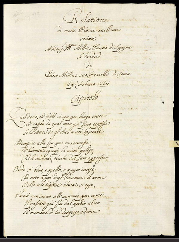
Digitized page from Pietro Mellini’s 1681 rhyming inventory of paintings and drawings in his family’s collection in Rome, the subject of the digital publication. Folio 1 recto
The research on the manuscript was created by four scholars in Europe and the U.S. using a web-based tool for collaborative research. (Learn more about the research project here.)
This research process generated much more than text. In addition to the digital facsimile and a series of essays, our digital publication would need to feature:
- annotations on the manuscript written by scholars,
- connections to an earlier inventory,
- a chart mapping mentions of artists in the manuscript,
- images of paintings and drawings connected to the manuscript,
- a bibliography, and
- analyses about all of these connections.
We wanted to provide all of this information to readers in an interactive, hyperlinked environment that would allow them to find connections themselves.
After much discussion, we decided that the digital publication would take the form of a website, and that we would establish the authority of the content via traditional scholarly mechanisms, such as citations, references, footnotes, and purls (permanent URLs).
The Problem = Many Unknowns
We faced a lot of unknowns. We had few models for the web-based publication we imagined. We also had unusual subject matter that would be hard to explain, and we needed to create a clean and elegant way for our readers to make sense of the vast quantity of information. Another big unknown we faced was that the digital needs of our target audience—humanities scholars—is largely unresearched.
The Solution = Prototype and Test
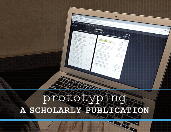
The answer to all of these unknowns was to test a prototype of the website with real users. Our prototype was a simple, “undesigned” mockup of part of the website with real content and links. Prototypes are a powerful way to work through information design challenges before our designs were locked down. Testing the prototypes with scholars would give us much-needed insight into the needs of this audience, allowing us to design a site that is easy to use and understand, and has the scholarly tools they need.

Prototype for the folio-and-transcription view of the Mellini manuscript
Our Prototyping Method
After establishing a basic layout and navigation for the website, we created prototypes of the pages via clickable PDFs, using the wireframing application Balsamiq. This tool creates pages that look like sketches, which made it clear to the scholars that these were not designed webpages. This allowed us all to focus on the functionality of the site and not get distracted by design. It also helped the scholars feel more comfortable giving us honest feedback, because they knew it wasn’t a finished product.

Testing the Mellini prototype with art historian Nancy Um, a professor at Binghamton University. Tests were captured on video for later review.
We did the first round of usability tests with four scholars. Each session lasted about 50 minutes and covered three of the main areas of the website. Using the insights we gained from those sessions, we made some changes to the manuscript section of the site to address issues the scholars encountered. These included confusion about how the manuscript itself is formatted, and how the manuscript browser worked on the website. We also completely redesigned and merged two sections because we discovered that scholars did not understand an entire section called “Concordance.”
In a second round of tests with four more scholars, we found that the improvements we’d made on the manuscript section did improve the experience, and the redesigned section, called the List of Artworks, provided helpful layers of content.
We also learned that citations, footnotes, and bibliographies are all important signals of authority to scholars, and had to be included.

Examples of the persistent “cite” feature throughout the website, and footnotes in the Essays section
Prototyping Outcomes
The two rounds of testing on the prototypes for the Mellini website had huge impact on the final design. We gained insight into the ways that scholars are now using digital tools to do their research. We learned about the kinds of information and resources scholars are looking for, their methods for browsing through and gathering vast amounts of online data and scholarship, and the physical and intellectual challenges they face in trying to organize and absorb the fruits of their research. These insights led us to add small features throughout, such as a prominent link to cite the publication on every page, and PDF downloads of the manuscript transcription and translations, that would aid the scholar’s work process.
We also learned that (surprise!) not all scholars are alike. Those who don’t study the period and topic of the publication needed just as much help understanding the context of the Mellini manuscript and the research project as did members of the general public. With this realization, we created several help prompts throughout the website, as well as introductory slideshows that provide an overview of the Mellini document and the website itself.

The “Get Started” section explains the structure and features of both the original manuscript and the website
Inviting key stakeholders to observe the user tests was another important decision. Each of us went into the user tests with our own points of view as developers, editors, content producers, or designers, but came out focused on one point of view: the user’s. It’s one thing to look at a usability report, another to see a usability test happening in front of you. Having first-hand information on what scholars needed made our team’s decision-making much more focused.
And because we used a prototype to test instead of a finished publication, it was easy to make necessary changes. If we had waited to test a near-final publication, we would’ve had to make a choice between missing deadlines or living with a publication that was frustrating to users.


Comments on this post are now closed.