Throughout 2013, the Getty community participated in a rotation-curation experiment using the Getty Iris, Twitter, and Facebook. Each week a new staff member took the helm of our social media to chat with you directly and share a passion for a specific topic—from museum education to Renaissance art to web development. Getty Voices concluded in February 2014.

First day on the job. Looking east from the Getty Center, January 2013
Let’s rewind to January 2013 for a moment. It’s a sunny and warm day in Los Angeles—a bit of a weather shock to me after 11 years of Seattle’s cold and rain. I’ve been officially on the job in the web department for all of 12 hours. I’m sitting in a conference room at a big wooden table, surrounded by my new coworkers and team members in the Getty’s web group. A big monitor is displaying the prototype of the newly designed and almost-built Getty Iris. We’re discussing The Iris logo you see at the top of this page, its multiple iterations, and, quite frankly, the pain involved in trying to get it to look right.
Wait-wait-wait, let’s pause for a moment.
Introductions
 Hi. My name is Will Lanni. I’m a Web production specialist at the Getty, which is a complex way of saying I’m a developer and designer, which is a nice way of saying that I’m basically a “web monkey.” Before I started at the Getty, I worked as a partner in a small web design and development firm for several years. I had some experience working for the Getty—I built the Pacific Standard Time at the Getty site, the Pacific Standard Time Festival site, as well as the interactive Getty Impact map. And, at the time of my hiring, I was not only working on the new design and build of The Iris, due to go live in only a month, but also the soon-to-be-launched website for Pacific Standard Time Presents: Modern Architecture in L.A. So I wasn’t exactly new to projects at the Getty, even though I was a brand-spanking-new full-time employee.
OK. Now that you know who I am, let’s get back to that moment. The Iris logo, and the hair-pulling it was causing for all of us—which is a pretty good representation of the steps that Web projects go through as we move from idea, to execution, to setback, to solution.
Iterations
By the time we’re sitting in this conference room in January 2013, The Iris logo has gone through a couple iterations already. Without any clear direction, I’d knocked out a couple rough ideas. As you can see, they’re really not “logos” by any means, but more of a banner treatment.
Is This a Logo or a Banner?

A blue and white banner idea for the Getty Iris, based on the original Iris type treatment from the original design

A gray and white banner idea for the Getty Iris, based on the original Iris blog design
Let’s Get Jiggy with This
These were all fine, but they weren’t very exciting. That’s when one of our designers came up with this version. I liked this—it’s fun and playful, but unfortunately too monotone, and a little too busy for what The Iris was supposed to be.

An early Iris banner concept
Can Someone Please Make This Pop?
Though I liked that last logo version, it didn’t quite match Iris editor Annelisa Stephan’s vision. The Iris was transforming from mere blog to a “web magazine.” So, we wanted a logo that really popped off the page. Annelisa and art director Maria Velez took a couple stabs at designs based on a hand-painted color sphere (“Farben-Kugel”) made by Philipp Otto Runge in 1810. I’ve included the page of art from that book below, as well as the resulting draft logos.

Two early Iris logo drafts, by Annelisa Stephan and Maria Velez, based on Philipp Otto Runge’s Farben-Kugel, 1810

Page in Philipp Otto Runge, Farben-Kugel, oder, Construction des Verhältnisses aller Mischungen der Farben zu einander, und ihrer vollständigen Affinität (Hamburg, 1810), plate opposite p. 15. Hand-colored etchings. The Getty Research Institute, 85-B14127
The Moment I Realize Where It Is, Exactly, I Work
So, as you can see, we had been struggling with the visuals for months. And so there I am, sitting in that conference room in January of 2013. The logo has landed on my plate because…well, I’m a designer as well as a developer, I’m intimately involved in this project as the WordPress developer, and to be honest, everyone else has gotten really frustrated trying to get this thing looking right. So we’re sitting there, and while we’re talking about the versions of this logo, the ideas, and what we can do with it, I ask about the book that the color wheel came from. Annelisa pulls up a PDF of Runge’s color-wheel book on the Internet Archive for me to see. We start flipping through the pages of the PDF. (Go ahead, click that link, and have a look!)
I look closer at the digital copy, and realize that the quality of the photos isn’t quite good enough for me to convert into a sharp, scalable vector image.
A Vector Image Is What, Exactly?
OK, pause again. What’s a vector image?! Well, first, let’s talk about what a vector image isn’t: A vector image isn’t a raster image like a photograph, where the image is comprised of a billion little dots of color. Instead, it’s an image that is computed using math and geometry. This makes the image scalable and lossless. Have you ever tried to take a tiny copy of a photograph and blow it up on your computer, only to find it gets fuzzy and blurry? A vector image will scale up without losing any quality, because it uses math to define its shape and edges. This is really helpful when designing logos, as you never know what your logo may be used for, or what size it may be blown up to. A vector image ensures that no matter what, the logo will remain crisp and clear.
So, in looking through the PDF, I can see that the images aren’t high enough quality to make converting them into a vector image easy. I shake my head.
“Too bad,” I say. “I wish we had a better image to work from.”
Annelisa shrugs. “Well, I can just go take a better picture of it,” she says. “That book is over in the Research Institute.”
Wait…What Did You Say?
I sit stunned for a second. Where do I work again? Oh yeah…one of the biggest arts organizations in the world, with an entire Research Institute and art library full of objects like this. How cool is that!?
My voice cracks like a teenager. “Yes! Of course! Can I come with you and see this thing?” I’m totally excited. Holy crap! It really hits home in that moment. This is where I work! We actually have this book somewhere where I could look at it! That’s…unbelievable!
Believe It

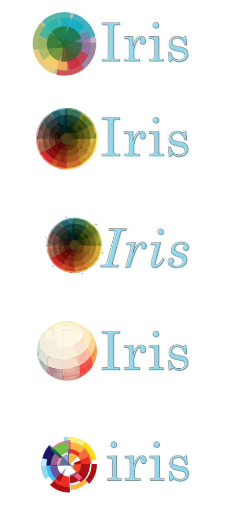
A series of logo concepts using vectorized color wheels
And so, a day or two later, I’ve got new images to work from. Time to get to work.
First I convert the color wheels into vector images, and set up some extra options besides Maria’s and Annelisa’s.
Annelisa Stephan’s concept is on top. Maria Velez’s version is on bottom. In the middle are my first draft digitized graphics, just to get a feel for what the original graphics are going to look like without much treatment.
As you can see, the second and third vectorized versions are a little muddy. The white space and fragmentation in the bottom option doesn’t quite say what we want it to. The second-to-last option is too washed out. But this gives us a little more perspective, and we all agree that our favorite is the one on top. It’s soft, it’s colorful.
But not quite right. The typeface definitely isn’t right. And the color wheel…it’s a little heavy, and the shape is a little too soft.
Almost…There…
The next iteration almost nails it, as far as the color wheel. The type is still wrong, but I figure I’ll get to that later. We like how the colors retain definition, gain some transparency, and keep their full color without too much white space showing through. But…something’s wrong with the shape. It looks like it got a bad haircut. We nickname this one “Death Star.”

A refining draft of the color wheel introduces some of the hard edges, but retains the full color.
Nailed It
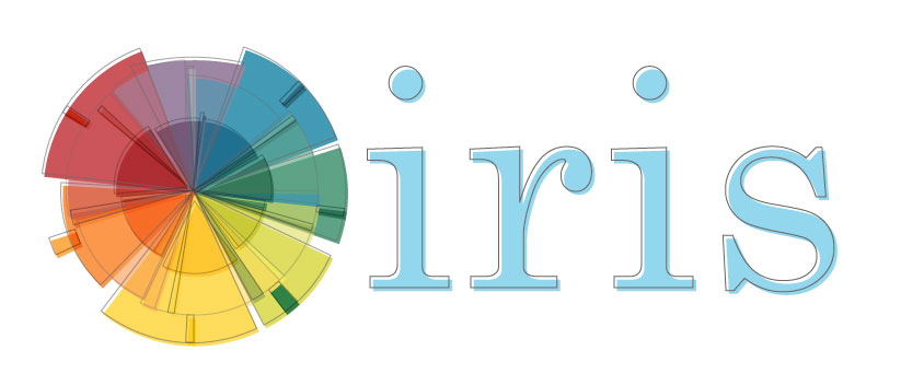
Finally, I get the shape right. Nice and round, not too busy, scales nicely. So now it’s time to get the typeface right. We get word from our leadership that the logo should include “The Getty” in it. Oh right… 😛 So, I go back to Maria’s concept and draw inspiration from her mockups from way-back-when. I liked how “The Getty” floated above the text, so I make a small adjustment to include the dot over the ‘i’. Then I grab some color out of the wheel, focusing in the orange/red spectrum. Lastly, I provide a slightly different size ratio of color wheel-to-text, and drop the analog metaphor of the registration error (subtle, eh?) that Annelisa kept mysteriously agitating for.

The two finalists. One has slightly heavier font-weight than the other, and a couple options for color.
And as you can see, the top option was the winner. So, that’s how we put together the logo design—a small element of the whole, maybe, but one one that served as a great intro for me to what working at an arts organization should be: incredibly creative and full of chances to work both with beautiful artwork and with smart people whose different opinions and visions add up to a greater whole.


Comments on this post are now closed.
Trackbacks/Pingbacks