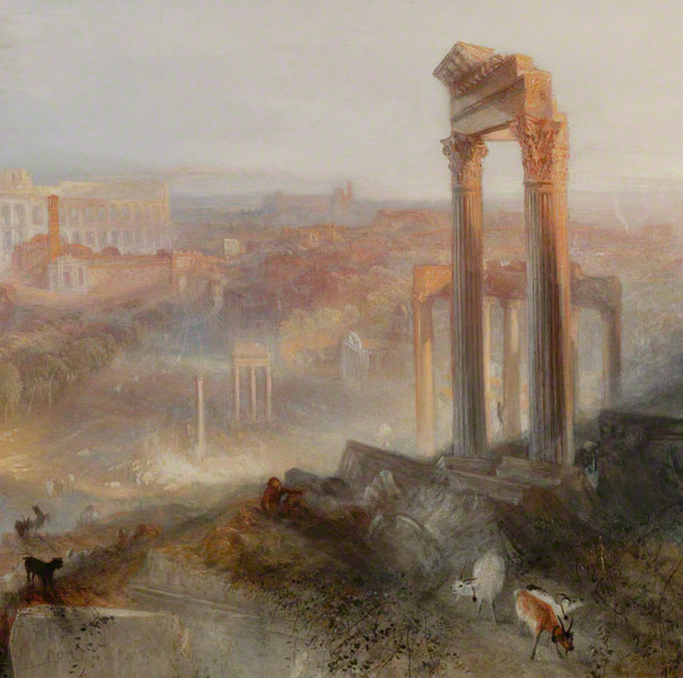
Modern Rome–Campo Vaccino, Joseph Mallord William Turner (English, 1775–1851), 1839. Oil on canvas, 36 1/8 x 48 1/4 in. (unframed), 48 1/4 x 60 3/8 x 4 3/8 in. (framed). The J. Paul Getty Museum, 2011.6
Writing the gallery label for a painting can sometimes feel like an art form in itself, a kind of circumscribed descriptive poetry not unrelated to haiku. How, in fewer than 100 words, do you capture the essence of an object, explain its subject and style, tell its story? Of course, no label—however carefully crafted, whether 100 words long or 1,000—can really accomplish all of this, so curators usually set themselves a more modest goal: to give the visitor a jumping-off point for his or her own exploration of the work at hand. The label can provide a friendly introduction, but the visitor’s personal acquaintance with an object is formed through close looking.
When Scott Schaefer, senior curator of paintings, asked me whether I’d like to collaborate on a label for J.M.W. Turner’s Modern Rome—Campo Vaccino, which goes on view Tuesday, my response was an immediate and emphatic “Yes!” The painting is a masterpiece. It belongs to a small group of works, most of them still in England, that give us 19th-century Britain’s greatest painter at the peak of his powers.

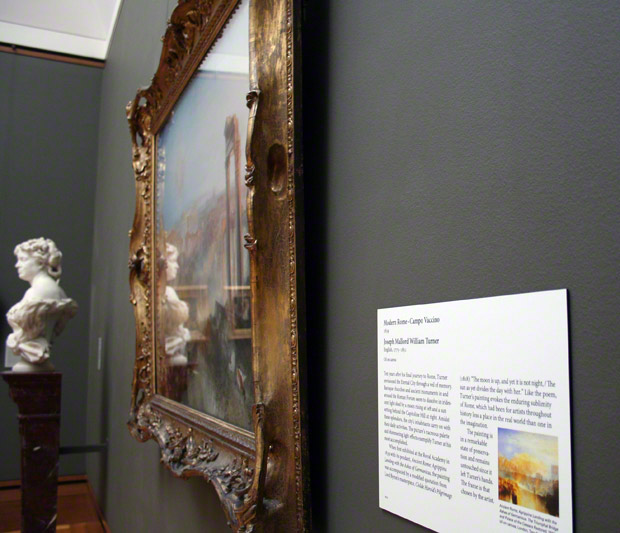
Turner’s Modern Rome–Campo Vaccino newly installed in the West Pavilion at the Getty Center (Gallery W202)
A master of light and color, Turner occupies a pivotal position in the history of art. His extraordinarily free brushwork and high-keyed palette redefined landscape painting, to the mingled shock and delight of his Victorian public. Modern Rome—Campo Vaccino is a luminous, even iridescent, picture. It exemplifies both the artist’s skill at topographical description and his late visionary style. The picture’s extraordinary state of conservation—it is unlined and seems never to have undergone restoration—means that it comes down to us as if fresh from Turner’s brush. The painting is undoubtedly one of the Museum’s most spectacular acquisitions in recent years. So the task of writing a label was at once thrilling and slightly daunting: where, after all, to begin?
Should we discuss Turner’s love affair with Rome, long a mecca for artists, which he visited first in 1819 and again in 1828–1829, and from which he drew inspiration throughout his career?
Should we address Turner’s revolutionary chromatic scheme, the brilliant whites and cadmium yellows that led one sarcastic critic to diagnose him with “yellow fever”?
Should we enumerate all the ancient monuments (from right to left: the Temples of Vespasian and Saturn, the Colosseum, the Temple of Antoninus and Faustina, and the Arch of Septimius Severus) and Baroque churches (from left to right: Santi Luca e Martina, San Lorenzo in Miranda, and Santa Francesca Romana) represented in the picture?
Should we describe Turner’s habit of rapidly reworking canvases like this one before an awestruck audience on the “varnishing day” that preceded the opening of annual exhibitions at the Royal Academy?
Should we include the few lines from Byron’s poem Childe Harold that accompanied the painting upon its first exhibition in 1839? Or discuss the pendant work, Ancient Rome; Agrippina Landing with the Ashes of Germanicus, The Triumphal Bridge and Palace of the Caesars Restored, which originally hung beside it? For that matter, should we attempt to explain Turner’s often lengthy, orthographically eccentric titles?
Should we raise the question of Turner’s veneration for 17th-century landscape painter Claude Lorrain? Or his seeming anticipation of work by modern artists from Claude Monet to Mark Rothko?
Should we mention Turner’s critical ally, John Ruskin, who described him as the genius of his generation, a man who had risen “past clearness to become dark with excess of light”?
Should we point out that, painted from memory a decade after Turner’s final visit to Rome, the picture conforms to the definition of poetry as “emotion recollected in tranquility” posited by the painter’s fellow Romantic William Wordsworth?
Should we outline the painting’s provenance—its sale by the painter to his friend and patron Hugh Munro of Novar, its subsequent purchase by the Fifth Earl of Rosebery, its descent through the Rothschild family?
Should we talk about the picture’s neo-Rococo frame, chosen by the artist himself?
There were many questions, but one thing was certain: 99 words wouldn’t cut it. Unless, of course, we were willing to take a more radical approach and write an actual haiku—
Evening light
the city a seashell
goats among the ruins
—or something along those lines.

Fortunately, our label designer, Irma Ramirez, came to the rescue with an alternate format that allowed us space for 200 words. Armed with this extra room, I wrote a draft. Label composition is, of necessity, an exercise in omission, and I am not (as you’ve probably realized by now) a naturally succinct writer. I relinquished Wordsworth and Ruskin, but the text still hovered around 300 words. Scott, a more gifted (and ruthless) streamliner than I, eliminated the list of Roman monuments and cut out my digression about Claude Lorrain, adding in a line about the picture’s condition and frame. Gone were varnishing day and “yellow fever,” Rothko and the Rothschilds, but the resulting draft still squeezed in the most important information—what we felt a first-time viewer might want to know—and even indulged in the occasional descriptive flourish.
Clarified and condensed by Maite Alvarez (project specialist and didactic materials maven in the Museum’s Education Department), spiffed up by Chris Keledjian (heroic editor of all our collection labels at the Center), the text was soon ready to be laid out, printed, and hung beside the painting in the West Pavilion, where we hope it will be useful, though I secretly imagine it may go unread, as visitors lose themselves, enraptured by the painting itself.

Modern Rome–Campo Vaccino
1839
Joseph Mallord William Turner
English, 1775–1851
Oil on canvasTen years after his final journey to Rome, Turner envisioned the Eternal City through a veil of memory. Baroque churches and ancient monuments in and around the Roman Forum seem to dissolve in iridescent light shed by a moon rising at left and a sun setting behind the Capitoline Hill at right. Amidst these splendors, the city’s inhabitants carry on with their daily activities. The picture’s nacreous palette and shimmering light effects exemplify Turner at his
most accomplished.When first exhibited at the Royal Academy in 1839 with its pendant, Ancient Rome; Agrippina
Landing with the Ashes of Germanicus, the painting was accompanied by a modified quotation from Lord Byron’s masterpiece, Childe Harold’s Pilgrimage (1818): “The moon is up, and yet it is not night, / The
sun as yet divides the day with her.” Like the poem, Turner’s painting evokes the enduring sublimity of Rome, which had been for artists throughout history less a place in the real world than one in the imagination.The painting is in a remarkable state of preservation and remains untouched since it left Turner’s hands. The frame is that chosen by the artist.


Gatti ci sono
la citta arrosita
in Foro Romano
Can you please tell if the painting has ever been cleaned, even if ever so lightly? I was not sure what you meant be pristine never touched condition.
Thanks for your reply.
Getty conservators continue to investigate the history of the painting’s surface. Under glass since 1878, the picture appears never to have been restored; its current varnish seems to have been applied by Turner himself at the end of his working process. We hope to find out more as research continues. Stay tuned!
I will go to see this painting as soon as I can… meanwhile, could you please post your Turner label, I can’t read it in the photo. I’m anxious to see what it says!
It’s hard to imagine that any painter (even a genius) could paint a view like this from memory ten years after. One would need, at the very least, a map and sketches to make the monuments recognizable and correctly placed. Depicting a goat from memory is difficult enough!
Hi David — Thanks for your comment! The final text of the label is right below the last image in the post. –Annelisa/editor
Is the painting going to remain on view over the summer?
Label writing is indeed an art in and of itself. I worked on them for many years at the GRI and had many vigorous debates with the curators about the language we used. Do you expect most people comprehend the word “nacreous”? I’m an art history major but I would be willing to bet most lay people are unfamiliar with it.
I am sure that “nacreous” is an exotic word in the sense that most of us will have to look it up. It took a minute for me to realize it was based on a word I have known since childhood. In Spanish “nacre” is “mother of pearl” and we see it here in California as the inner layer of an abalone shell as it plays with the light in dazzles of colors. The use of the word is absolutely perfect in context. Once used it becomes definitive for what Turner does again and again in his fantasies. I think it is an inspired and powerfully accurate word and if you were to put a nacreous sea shell next to the painting on a small plinth, people would rejoice at how art and nature evoke one another. Bravo!
I have long been enthralled with Turner’s extravagant use of color and light to immerse the viewer into the heart of his paintings and am already planning my pilgrimage to see the Getty’s latest inspired acquisition. But I have a long-standing question to ask: Why are some oil paintings covered by glass and others (by the same artist/same period) not?
Hi Marilyn,
Great question! Glass is placed on artworks that are deemed vulnerable to damage by touch. Pictures that seem tempting for people to point at or paintings that attract a closer-than-average inspection by visitors will often be placed under glass. Turner’s “Modern Rome” is no different. In addition, this particular work has been in an extraordinary state of preservation and has been under glass since 1878. Glass will help to keep it that way.
Steve, Social Media Coordinator
What font did they use for the wall label?
Hi Mara — Thanks for your design question. I just checked with Irma, and the font is Minion Pro, which is what we use for all our permanent collection labels. It’s a classic, highly legible serif font. -Annelisa, Iris editor
Dearest Emily: I learned much reading your write up of labeling Turner’s “Modern Rome—Campo Vaccino” and thank you greatly. As my friends that go with me to museums have said, I seem to read every word of every label on every piece of art work in the museum. With my next visit to the Getty I will savor reading again the written art you have produced next to the visual art it enlightens. Bravo!Monte bene! Grazzi!